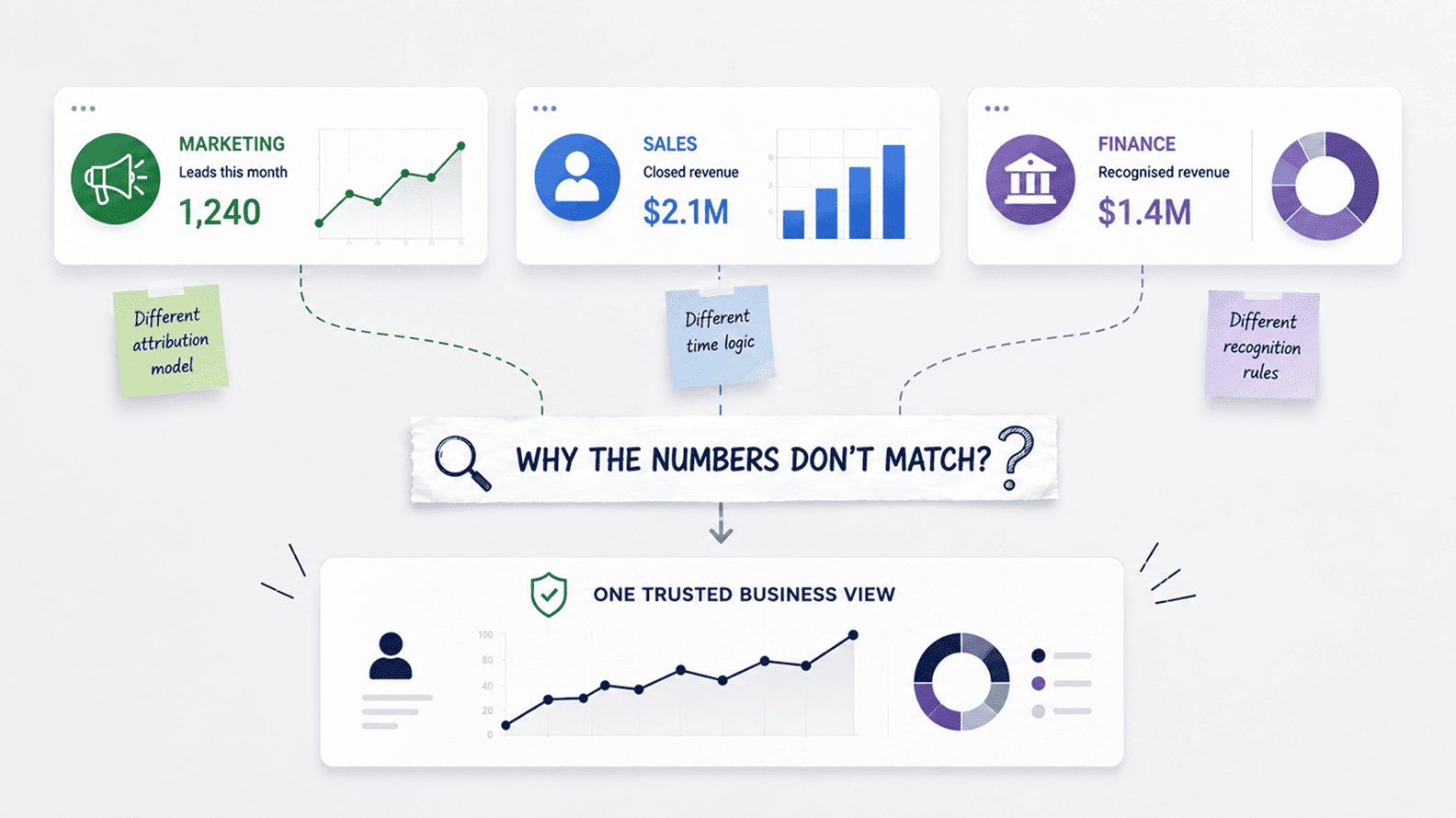
Why Marketing, Sales, And Finance Reports Do Not Match
Aug 04, 2026 / 27 min read

A practical look at why dashboards fail to become part of business decisions, even when the data is accurate, the design looks clean, and the BI tool keeps refreshing every morning.
Dashboards go unused when they sit too far away from the decisions they are meant to support. The issue is rarely just the chart. It is usually a mix of weak ownership, poor timing, unclear design, missing context, low trust, and no obvious next step for the person looking at the number.
The most useful dashboards answer a live business question. They show what has changed, why it matters, where attention is needed, and what the user should do next. Adoption should be treated like product adoption: who is this for, where will it be used, how often will it be opened, and does it reduce rework or improve decisions? An accurate dashboard that nobody uses is still a failed analytics asset because it has not changed how the business works.
An analytics dashboard is a focused view of business data designed to help people monitor performance, understand change, and make faster decisions. It is more than a collection of charts on one screen. A good dashboard gives a specific user a clearer view of what is happening, why it matters, and where action may be needed.
An unused dashboard is different. It may still refresh every morning and look clean in Tableau, Power BI, Looker, or another BI tool, but it has lost its place in the company’s operating rhythm. The sales head does not open it before a pipeline review. Finance does not trust it during close.
Marketing still asks for a separate cut before adjusting spend. Leadership still asks someone to pull the real numbers. That is where dashboard failure begins: not when the report breaks, but when the business stops using it to think, decide, or act.
Airbnb saw the problem before many companies had a name for it. As more teams created tables, reports, dashboards, and metrics, the harder problem was no longer only access to data. It was whether people could discover the right asset, understand where it came from, and trust that it was still useful.
Airbnb’s engineering team described this clearly when it built Dataportal, a system intended to improve data exploration, discovery, and trust across the company. The important point is easy to miss. Airbnb did not have a dashboard shortage. It had the more mature problem of making sure the right dashboards, tables, and definitions could still be found and trusted as the company grew.
Most dashboard failures happen in a quieter way. The report is launched, the first reaction is positive, and for a short while it feels as if the company has solved the reporting problem. Then the dashboard begins to drift away from use. It may still refresh, load cleanly, and sit inside the BI tool with all the signals of something official.
The failure begins when people stop treating it as the place where decisions happen. They may still open it occasionally, quote it in a review, or use it for a quick reference, but the real work has moved elsewhere.
That is the danger with unused dashboards. They do not announce their failure. They simply lose their place in the company’s rhythm until they become a polished version of something nobody truly depends on.
The business can point to a BI tool, a report library, and a central data warehouse, while important decisions still happen through exported spreadsheets, private reconciliations, inbox attachments, and side conversations. The dashboard exists, but the work has moved around it.
A practical test is whether the business would feel the dashboard’s absence. If a revenue dashboard disappeared before the leadership meeting, would the meeting become harder to run? If a campaign dashboard failed to refresh, would budget decisions slow down? If a customer-health dashboard broke, would renewal risk become harder to see? When the honest answer is no, the dashboard may be visually complete, but it is operationally irrelevant.
A useful dashboard is not the one with the most complete view of the data. It is the one people return to when a real decision has to be made. Business users do not adopt dashboards out of loyalty to the analytics team. They adopt them when the dashboard makes a meeting clearer, a forecast easier to defend, a risk harder to miss, or a decision less dependent on someone pulling a separate spreadsheet at the last minute.
National Grid’s Triton digital twin and data visualisation tool is useful here because it was built around a specific operating decision: where the electricity network may need reinforcement. By creating a digital replica of transmission infrastructure and allowing teams to test network scenarios, National Grid said Triton could reduce the time needed to analyse and decide where reinforcement is required by 70 percent.
The lesson for ordinary business dashboards is not that every company needs a digital twin. The lesson is that adoption becomes much easier when the dashboard is tied to a decision people already care about.
The same pattern appears in a more familiar commercial setting. In Forrester’s case study on Software AG’s CMO dashboard, the value was not simply that marketing leaders received another set of charts.
The dashboard helped create a more consistent way to discuss marketing performance across business units, regions, and countries, and Forrester notes that reporting which had previously seen limited use became more widely adopted once the work was redesigned around decision-making and review rhythm. The dashboard found a place inside the way management already worked, which is where adoption really begins.
This is where many dashboards go wrong. They are built from the data outward, rather than from the decision backward. The team starts with available fields, source tables, filters, and chart types, and only later asks who will use the report and what it is supposed to change.
That approach can still produce something accurate and visually polished, but it often leaves the dashboard floating outside the business. People may appreciate it, even praise it in the first review, but they will not depend on it unless it helps them do something they already care about.
A dashboard earns its place when people know exactly why it exists. It belongs to a review, a decision, a risk, a target, or a recurring business question. When that connection is clear, the dashboard does not have to beg for adoption. It becomes part of how the company notices problems, challenges assumptions, and decides what should happen next.
A dashboard earns adoption when it fits naturally into the way people already make decisions. It should help a sales leader walk into a forecast review with a clearer view of risk, help a marketing manager understand whether campaign volume is turning into quality demand, help finance explain movement without rebuilding the numbers, or help operations see pressure before it becomes a bigger problem.
The dashboard may be accurate, well-designed, and technically sound, but if it sits away from the decision, users will eventually return to the tools and habits that help them get the work done faster.
Docebo’s work with embedded analytics shows the same principle in a product setting. In its embedded QuickSight analytics case study, the company increased analytics adoption by putting insights directly inside the learning platform, so users did not have to leave their normal environment and start a separate reporting journey. That is the adoption lesson. People are more likely to use data when it appears close to the moment where they already need it.
The same idea applies inside ordinary business teams. A campaign dashboard is useful while budget can still move, not after the campaign has ended and the money has already been spent. A customer-health dashboard matters before the renewal conversation, not after the account is already in trouble.
A pipeline dashboard earns trust when it helps people see which deals deserve scrutiny before the forecast is submitted. A finance dashboard becomes valuable when it reduces the month-end scramble rather than adding one more number to reconcile.
| What The Dashboard Should Do | What It Replaces |
| Show the change that matters | Manually comparing old reports and exports |
| Explain where pressure is coming from | Asking another team to pull a deeper cut |
| Fit into a review or decision rhythm | Opening the dashboard only when someone remembers |
| Reduce repeated reporting work | Rebuilding the same spreadsheet every week |
| Make the next action clearer | Staring at a number without knowing what to do with it |
Coca-Cola Bottling Company gives a useful scale example because the point was not only visual reporting. Its BI team supported reporting across sales and delivery operations, and Tableau’s Coca-Cola Bottling case study describes how bringing together up to 200 million lines of data from around 100 systems could take days before a usable dashboard was built.
The value of dashboard adoption, in a situation like that, is not the beauty of the chart. It is the removal of repeated work between the business question and the usable answer.
The strongest dashboards do not feel like extra reporting. They become part of how the business moves through the week. People use them because they make a meeting cleaner, a risk easier to see, a decision easier to defend, or a repeated task easier to stop doing manually. That is the real test of dashboard adoption. The dashboard has to earn a place in the work, not just a place in the BI tool.
People ignore dashboards when the number on the screen feels disconnected from what they already know about the business. This does not mean every instinct is right. It means adoption becomes difficult when the dashboard cannot explain why its view differs from what users are seeing in the field, in the CRM, in finance, or in customer conversations. Once people feel the need to check the real number somewhere else, the dashboard has already lost ground.
This is especially common when a dashboard carries a technically correct number but misses the business context around it. A campaign dashboard may show lead volume improving while sales is seeing weaker conversations. A customer-health score may show an account as safe while the account manager knows the renewal is becoming politically difficult.
A pipeline dashboard may show growth while old opportunities are ageing quietly beneath the total. In each case, the dashboard does not need to flatter the user’s memory. It needs to help explain the gap between what the user expected and what the data now shows.
Hyundai Mobis offers a grounded example of trust being tied to shared use. In its Tableau case study on bottom-up data culture, the company described moving from information scattered across individual PCs toward structured dashboards that could be checked in real time across sites once the data input was accurate.
The detail that matters is the connection between shared data and the meeting or KPI review. A dashboard becomes more trustworthy when it helps people come into the same conversation with the same view of the business.
A trusted dashboard does not remove every question. It makes the next question better. People should be able to see whether a gap comes from timing, exclusions, definitions, missing data, source-system delay, or a genuine change in performance.
When the dashboard helps users understand why their operating knowledge and the number disagree, it becomes useful. When it simply presents the number and expects belief, people return to the conversations, files, and private checks they trusted before.
Dashboard design matters, but it cannot rescue a dashboard that has no clear job. A clean layout, a restrained colour palette, sensible filters, and readable charts all help the user move through the page. Yet the first design question is not where to place the bar chart. It is what the user should understand faster after opening the dashboard.
A sales forecast dashboard should lead the eye toward risk, not simply display pipeline by stage. A campaign dashboard should help separate cheap volume from useful demand. A customer dashboard should make renewal pressure easier to see before the account is already difficult to save.
A finance dashboard should help the team explain movement without rebuilding the bridge between operating activity and reported numbers. Good design is not decoration. It is editorial judgement applied to data. It decides what deserves attention, what needs context, and what should be quiet enough to stay in the background.
Many unused dashboards suffer because everything has been treated as equally important. The result is a page full of charts that asks the user to do the thinking alone. The dashboard shows performance by region, source, segment, month, team, product, and status, but it never helps the user understand what changed or why it matters. Users do not return to that kind of dashboard because it creates another reading task instead of making the decision easier.
| Weak Dashboard Habit | Better Design Instinct |
| Adding every available metric | Choose the few numbers that matter for the decision |
| Using charts as decoration | Use visuals to expose movement, risk, or comparison |
| Hiding definitions away from the screen | Place key caveats and logic where users need them |
| Making users hunt through filters | Pre-set the view around the normal decision rhythm |
| Treating the dashboard as finished after launch | Watch how people use it and remove friction |
The best dashboards feel obvious to the people they are built for because the logic follows the way those people already think. They show the number, the comparison, the movement, the source of pressure, and the likely place to look next. They do not try to explain the whole company on one screen. They help the right person make sense of the right business question at the right moment.
A dashboard can be well-built on the day it goes live and still become stale six months later. The business changes around it. Sales stages are updated, a new product line is added, finance changes a reporting treatment, marketing splits a channel, or customer success creates a new risk category. If nobody owns the dashboard’s purpose and logic, the report slowly becomes a record of how the business used to think.
This is why important dashboards need a business owner, not only a BI owner. The analytics team can maintain the model, tests, refreshes, permissions, and layout, but it cannot decide alone whether a customer should be counted as active, whether pipeline should include partner-sourced opportunities, whether churn should include downgrades, or whether revenue should be viewed as booked, billed, collected, or recognized.
Those are business decisions, and the dashboard stays useful only when someone on the business side has authority to keep that meaning current.
| Dashboard Responsibility | Best Owner |
| Business purpose and decision context | Business leader or metric owner |
| Metric definition and accepted variants | Business owner with analytics support |
| Data model, calculation logic, refresh, and testing | Analytics or BI team |
| Source-system reliability and pipeline changes | Data engineering or system owner |
| Final call on cross-functional disputes | Leadership or operating forum |
Ownership also changes the tone of dashboard adoption. When people know who owns the number, they know where to take the challenge. The conversation moves from vague distrust to a specific question: has the definition changed, has the source changed, or has the business changed? Without an owner, the same dispute returns in every review, and the dashboard becomes another object people question rather than a tool people use.
Most companies are much better at creating dashboards than retiring them. A new leader wants a new view, a team asks for a slightly different cut, a one-off project becomes a recurring report, and an old dashboard remains accessible because nobody wants to risk deleting something useful. Over time, the BI environment becomes crowded with reports that may still refresh but no longer have a clear owner, audience, or decision attached to them.
Airbnb’s Dataportal story is relevant again here because the issue was not only search. The company wanted to give people richer context around data assets so they could understand relevance and trust, not merely find another object in a large data ecosystem. A dashboard library without context creates the same problem as a messy shared drive. People may find a report, but still have to guess whether it is the right report.
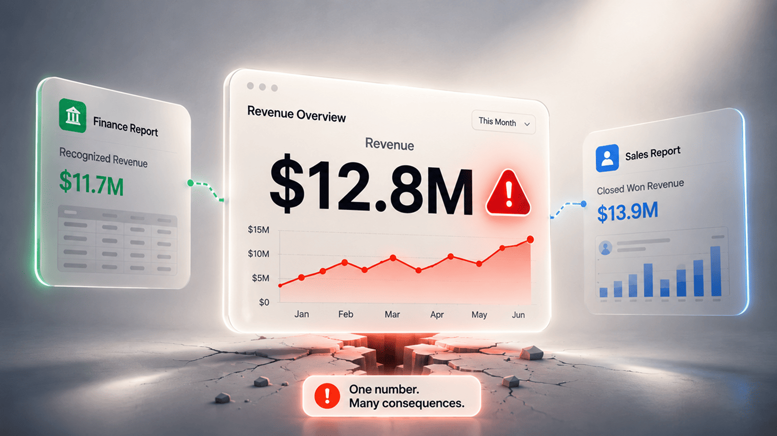
Dashboard clutter weakens adoption because it increases doubt at the exact moment the user needs confidence. If two reports show revenue with different totals, users may not know which one is current. If an old campaign dashboard still appears in search, someone may use outdated logic for a new review.
If a copied dashboard lives on after the original business question has disappeared, it becomes another possible version of the truth. The result is not more visibility. It is more hesitation.
| Dashboard Status | What Should Happen |
| Used in active reviews or decisions | Keep, own, and maintain it |
| Useful but limited to one team | Label its audience and purpose clearly |
| Replaced by a better dashboard | Mark as deprecated and redirect users |
| No owner or recent usage | Review for retirement |
| Built for a one-off project | Archive once the decision has passed |
Retiring dashboards is not a housekeeping exercise. It protects trust. The fewer unofficial versions people have to sort through, the more likely they are to use the dashboards that genuinely matter. A healthy analytics environment should feel curated, not crowded.
AI assistants, copilots, and natural-language analytics tools will not fix weak dashboard adoption by themselves. In many companies, they will expose it. If people do not trust the dashboard, they are unlikely to trust an AI answer that quietly draws from the same unclear metric, stale report, hidden filter, or disputed source. The interface may become more conversational, but the underlying trust problem remains.
This matters because AI makes answers travel faster. A person looking at a dashboard may pause and ask whether revenue means bookings, billing, collections, or recognized revenue. An AI assistant can produce a confident summary before that question is asked. If the dashboard environment is crowded with old reports, weak definitions, and unclear ownership, AI may make the company sound more certain while becoming less grounded.
The companies that benefit most from AI analytics will likely be the ones that have already done the quieter work. They know which dashboards are official, which metrics are trusted, who owns the definitions, where the caveats sit, and which reports should no longer be used. AI can then make access easier and interpretation faster. It cannot create trust from a reporting system the business has already learned to work around.
An analytics dashboard does not fail only when it breaks. It fails when the business stops depending on it. That failure can be quiet because the report may still look professional, refresh on time, and carry the company’s logo inside a respected BI tool. The harder question is whether it has changed how people notice problems, prepare for meetings, challenge assumptions, explain movement, and decide what to do next.
The best dashboards earn trust by becoming part of a real operating rhythm. They belong to a forecast call, a finance review, a campaign decision, a renewal conversation, a capacity meeting, or a leadership review where the number has consequences. They reduce repeated work, give people a shared view, make changes easier to understand, and help teams move from argument to action with less private reconciliation in between.
This is why dashboard adoption should be treated less like report delivery and more like product adoption inside the business. A dashboard has users, moments of use, friction, drop-off, trust signals, competing habits, and a reason to exist. When those things are ignored, the dashboard becomes another page in the reporting catalogue. When they are understood, the dashboard becomes part of the company’s working memory.
A company does not need more dashboards simply because more data exists. It needs fewer, stronger dashboards that people would genuinely miss if they disappeared. That is the real test. The dashboard should help the business see what changed, understand why it matters, and act with more confidence than it could without it.
Dashboards go unused when they are too far away from the decisions they are meant to support. The data may be accurate and the design may look clean, but users stop returning when the dashboard does not help them answer a live business question. If a sales leader still needs a private forecast file, or finance still has to rebuild the monthly view, the dashboard has not earned its place in the work.
The deeper issue is usually relevance. People use dashboards when the report makes a meeting easier, a risk clearer, or a decision faster. They ignore dashboards when the report feels like another place to check without reducing any real friction.
A useful dashboard helps a specific user understand what changed, why it matters, and where attention is needed. It is not simply a collection of metrics. It has a clear audience, a clear business question, and a natural place in the operating rhythm of the company.
For example, a campaign dashboard should help decide whether budget should move while the campaign is still live. A customer-health dashboard should help account teams see renewal risk before the renewal conversation becomes difficult. A pipeline dashboard should help sales leaders see risk before the forecast is submitted.
Users usually return to spreadsheets when the dashboard does not give them the final version they need for a real decision. They may trust a private file because it contains a manual adjustment, a finance-approved number, a missing field, or a cut of the data that the official dashboard does not show.
This does not always mean the spreadsheet is better. It often means the dashboard has failed to absorb the business logic people actually use. Once a spreadsheet becomes the place where the final number is prepared, the dashboard becomes secondary even if it is technically more advanced.
Design matters, but adoption is rarely only a design problem. A cleaner layout may help users read the page faster, but it cannot fix a dashboard that has no clear purpose, weak ownership, missing context, or numbers people do not trust.
The best design starts with the decision. What does the user need to understand quickly? What deserves attention? What comparison matters? What action may follow? Once those questions are clear, chart choices, filters, visual hierarchy, and layout become much easier to get right.
Usage data helps, but it is not enough on its own. A dashboard may receive views because people open it out of habit or because someone asked for a screenshot. The better question is whether the dashboard changes the way a meeting, review, handoff, or decision happens.
A dashboard is being used properly when people rely on it before decisions, quote it without rebuilding the number elsewhere, return to it for follow-up questions, and would feel its absence if it disappeared. Real adoption shows up in behaviour, not only in page views.
Important dashboards need both business and analytics ownership. The business owner should protect the purpose, definition, audience, and decision context. The analytics or BI team should protect the model, calculation logic, refresh, documentation, and quality checks.
This shared ownership matters because dashboards become stale when the business changes and nobody updates the meaning. If a product, region, sales stage, campaign channel, or finance treatment changes, someone needs authority to decide whether the dashboard still reflects the business correctly.
Yes. Old dashboards should be retired, archived, or clearly labelled when they are no longer the right source. Keeping every report alive may feel safe, but it creates clutter and weakens trust. Users search for a number, find several dashboards with similar names, and then have to guess which one is current.
A healthy BI environment should feel curated. The most important dashboards should be easy to find, clearly owned, and visibly current. Old reports that remain useful for history can be archived, but they should not compete with the dashboards used for current decisions.
A report often explains what happened over a period. A dashboard is usually expected to help people monitor what is happening, see movement, and support a recurring decision. The difference is not only technical. It is about use.
A monthly performance report may be read once and stored. A dashboard should be returned to repeatedly because it helps the user understand change, risk, priority, or action. When a dashboard behaves like a static report and does not support a live workflow, adoption usually weakens.
AI can make dashboards easier to query, but it will not automatically make weak dashboards useful. If the underlying dashboard has unclear definitions, low trust, stale data, or no owner, an AI assistant may simply turn those problems into confident-sounding answers.
AI works better when the analytics environment already has trusted dashboards, governed metrics, clear ownership, and retired old reports. In that setup, AI can help people reach answers faster. Without that foundation, it can make confusion travel faster.
Start with the dashboards attached to important recurring decisions. Look at leadership reviews, forecast calls, finance close, campaign budget decisions, customer-health meetings, operational reviews, and capacity planning. Ask whether the dashboard is actually used in those moments or whether people rebuild the number somewhere else.
Then fix the highest-friction dashboards first. Clarify the user, decision, metric definitions, owner, refresh rhythm, and missing context. Remove old reports that compete with the approved view. Adoption improves fastest when the dashboard reduces a real piece of repeated work, rather than asking users to develop a new reporting habit for no clear reason.
Aug 04, 2026 / 27 min read
Aug 04, 2026 / 22 min read
Jul 31, 2026 / 24 min read