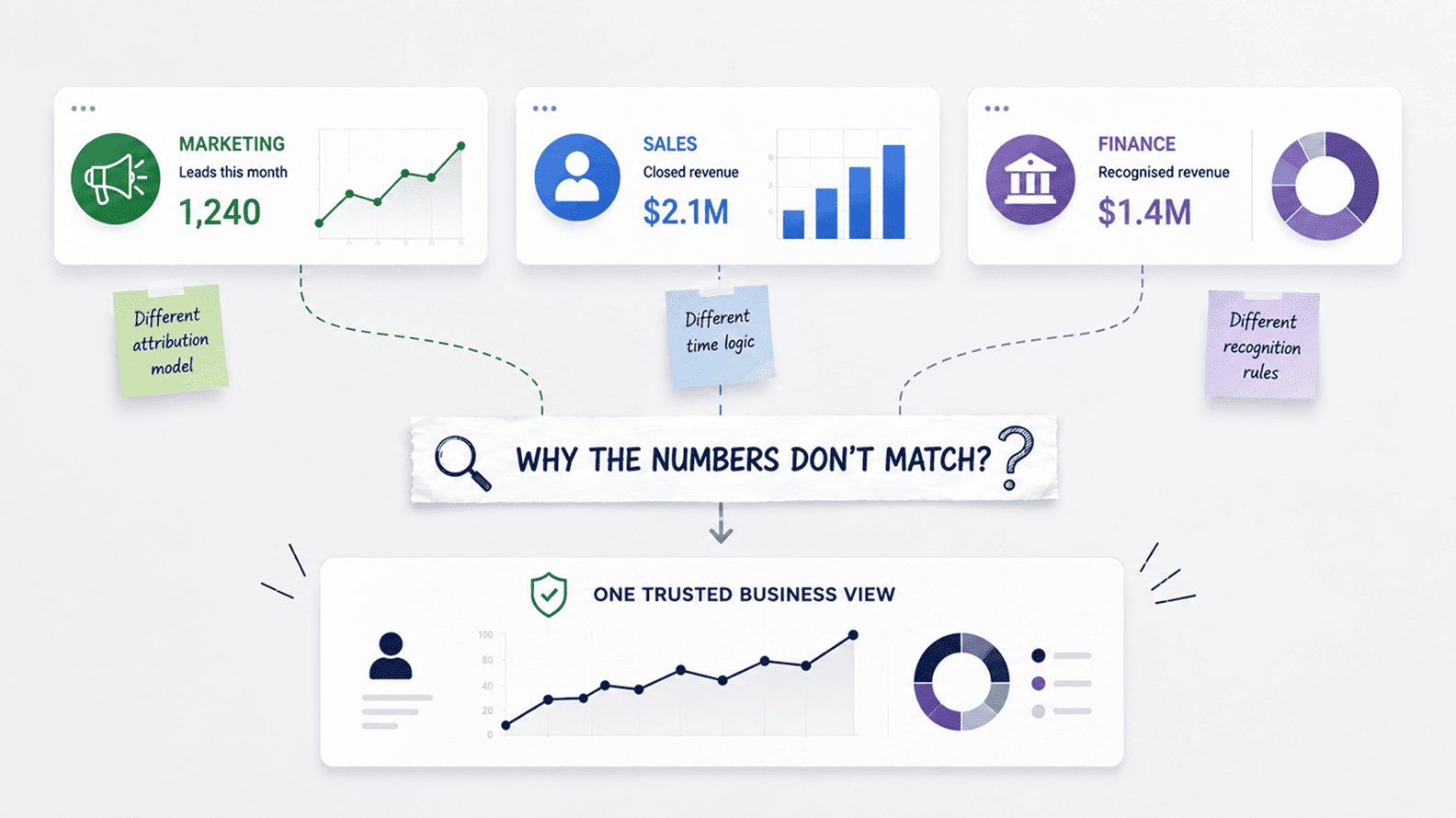
Why Marketing, Sales, And Finance Reports Do Not Match
Aug 04, 2026 / 27 min read

Bad analytics costs more than bad dashboards. It creates slow meetings, duplicated work, bad incentives, weak forecasts, lost opportunities, poor customer decisions, and a quiet loss of trust in the numbers. The technical issue may begin in a data model, a refresh job, a metric definition, or a spreadsheet export, but the business cost appears in places leadership can feel: missed targets, delayed hiring, poor pricing, wrong campaign spend, confused sales planning, and board conversations where nobody is fully sure which number is right.
Most small and mid-sized businesses do not have a line item called bad analytics. They have delayed campaign decisions, disputed board packs, sales forecasts that miss badly, finance teams doing late-night reconciliation, product managers arguing about adoption, and leadership meetings where the first forty minutes are spent asking why three dashboards show three answers.
That is the hidden cost. It hides because the money does not leave the business in one visible transaction as it leaks through rework, delay, duplicated analysis, lost confidence, and decisions made with a false sense of precision.
Gartner has long framed data quality as a business-cost issue, noting in its data quality guidance that poor data quality costs organizations an average of $12.9 million a year. That figure is useful because it gives executives a number to react to, yet even that kind of estimate can understate the daily operating damage in companies where analytics is close enough to look credible and wrong enough to mislead people.
The most dangerous analytics failure is rarely the chart that obviously breaks. It is the dashboard that looks polished, refreshes on schedule, and quietly points the business toward the wrong conclusion.
This is why the hidden cost of bad analytics deserves a deeper treatment than the usual complaint about dirty data. Bad analytics is not only a technical problem sitting inside a warehouse, a BI tool, or an ETL job. It is a management problem. It affects how teams allocate money, how leaders judge performance, how sales and marketing negotiate ownership, how finance explains results, and how quickly a company can respond when the market changes.
In a smaller company, people can sometimes compensate through memory and informal context. As the company grows, that human buffer collapses. The dashboard becomes the shared memory of the business, and when that memory is unreliable, every team starts protecting itself with private numbers.
The visible meeting is usually about revenue, margin, pipeline, retention, product adoption, or operational capacity. The hidden meeting is about whether the underlying number can be trusted. Anyone who has worked close to reporting knows this pattern.
A sales leader opens a pipeline dashboard, finance says the number is inflated, marketing says the source attribution is missing, operations says the region mapping is outdated, and the analyst explains that a CRM field changed two weeks ago. The decision has not started yet. The business is still trying to establish the ground beneath its feet.
Power BI and Tableau both recognize this reality indirectly through their product guidance. Microsoft explains that Power BI usage metrics can help teams see which report pages are being used, which ones should be phased out, and how users interact with reports.
Tableau provides data quality warnings so users can see when data is stale, deprecated, sensitive, or under maintenance. These features exist because reporting is never only about publishing visuals. It is about giving people enough confidence to act without starting every meeting with a forensic investigation.
The cost of that investigation is rarely calculated. If ten senior people spend thirty minutes arguing over a number every week, the company can calculate the salary cost easily. The harder cost is what happens because the decision is delayed. A campaign waits another week. A sales incentive remains misaligned.
A customer issue is diagnosed too late. A hiring plan is approved on the wrong demand forecast. This is where bad analytics becomes expensive in a way that traditional ROI models struggle to capture. It steals speed from the business, then hides the theft inside normal operating rhythm.
A weak analytics system does not usually collapse in public. It loses authority slowly. One team notices that the customer count does not match the CRM. Another team finds that churn is calculated differently in a board deck and a product dashboard.
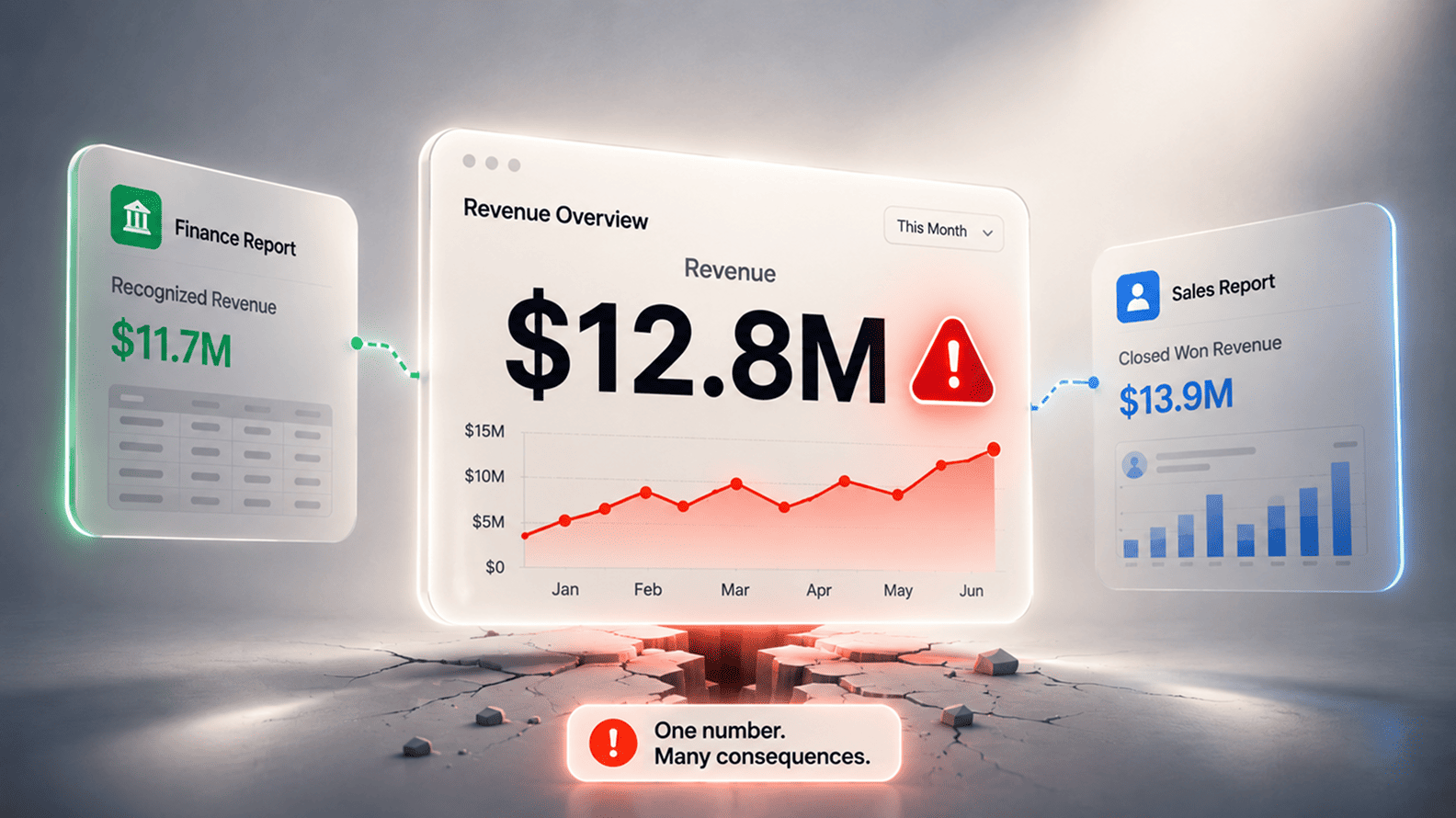
Finance discovers that revenue in the dashboard includes bookings that should never have been treated as recognized revenue. Soon people begin exporting data into Excel, adding personal adjustments, and circulating their own version of the truth.
That behavior often gets mocked as spreadsheet addiction, but it is usually a rational response to low trust. Business users do not return to Excel because they hate dashboards. They return to Excel because they need control, context, and a way to repair what the official system is not handling.
The problem is that every private repair adds another private definition. One manager excludes trial users from active customers. Another excludes internal accounts. A third keeps both but applies a revenue threshold. All three may have a defensible reason, yet the company now has three realities.
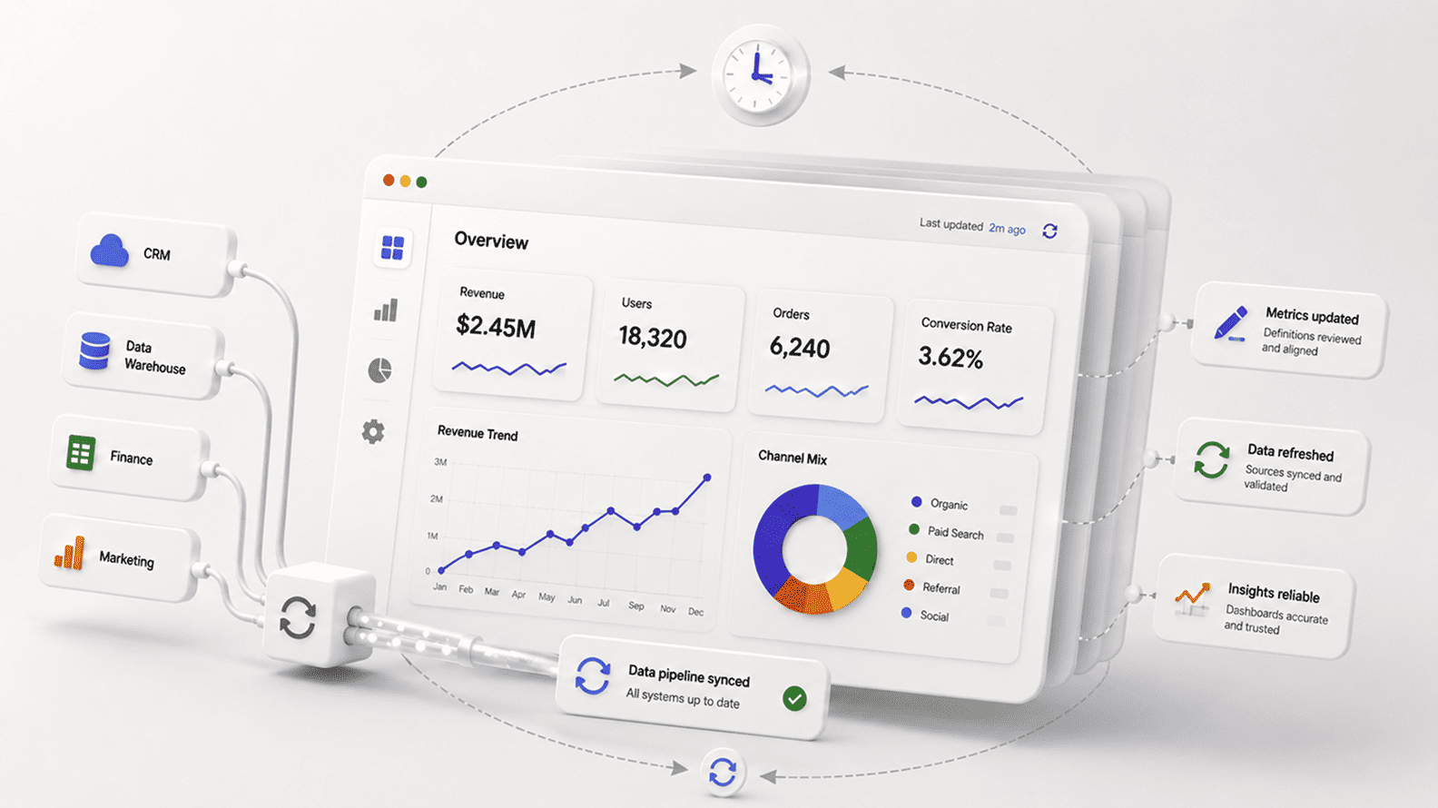
This is why modern analytics teams increasingly talk about semantic layers, metric stores, and governed definitions. dbt describes its Semantic Layer as a way to define metrics centrally so different tools can consume consistent business logic.
Microsoft describes Power BI semantic models as reusable models that reports can build on. The language differs across platforms, but the business need is the same: people need a reliable shared interpretation of core metrics, otherwise the reporting layer becomes a polite-looking battlefield.
Bad analytics become painfully real when money follows the wrong signal. Marketing may keep funding a channel because its dashboard overcredits last-click conversions. Sales may push discounts because pipeline coverage looks weak when duplicate opportunities have been removed unevenly.
Finance may understate margin leakage because cost allocation arrives late or at the wrong level. Product may invest in a feature that appears widely adopted because internal users were never filtered out.
The cost here is not simply that a report is wrong. The cost is that budgets, people, and executive attention move toward the wrong explanation of performance. McKinsey has argued in its work on data-driven B2B sales growth that companies using data-driven sales-growth engines report above-market growth and EBITDA increases in the range of 15 to 25 percent.
That upside depends on disciplined insights. If the analytics engine is weak, the company does not merely lose a reporting improvement. It risks funding the wrong commercial motions with confidence.
This is one of the most damaging aspects of bad analytics. It does not always look like confusion. Sometimes it looks like certainty. A dashboard says paid search is working. A cohort report says onboarding is improving. A margin report says a customer segment is profitable. The team acts.
Months later, the business finds that attribution windows were too generous, onboarding completion was counted before activation, and shared delivery costs were never included in segment margin. The company did not avoid analytics. It used analytics badly, and that can be worse because the decision felt evidence-based.
| Area | How bad analytics shows up | Hidden cost | Typical warning sign |
| Marketing | Attribution, CAC, lead quality, campaign ROI, lifecycle conversion numbers disagree. | Budget shifts toward channels that look efficient because measurement is incomplete. | Teams debate source logic every month before approving spend. |
| Sales | Pipeline, conversion rate, win rate, quota attainment, and forecast coverage are calculated differently. | Managers coach against the wrong bottleneck and leadership overreacts to false demand signals. | Forecast reviews begin with manual spreadsheet corrections. |
| Finance | Revenue, margin, bookings, recognized revenue, and cost allocation do not reconcile cleanly. | Close cycles slow down, board reporting loses confidence, and investment decisions become more conservative. | Finance maintains separate offline reconciliation files. |
| Product | Activation, engagement, retention, feature usage, and churn are measured without stable definitions. | Roadmaps overvalue noisy behavior and undervalue customer outcomes. | Teams disagree on whether usage is real adoption or casual activity. |
| Operations | Capacity, utilization, SLA performance, backlog, and productivity numbers lack shared context. | Hiring, staffing, and delivery decisions lag behind reality. | Managers keep local trackers because central reports arrive too late. |
Forecasting is where small analytics weaknesses turn into large management mistakes. A revenue forecast depends on pipeline definitions, stage hygiene, win probability, sales cycle assumptions, renewal timing, churn risk, pricing changes, and finance recognition rules. A demand forecast depends on seasonality, campaign timing, customer behavior, and operational capacity. The forecast is only as credible as the data chain beneath it.
When analytics is weak, forecasting meetings become negotiations between functions. Sales believe the number because it comes from CRM. Finance discounts it because historical conversion has been overstated. Marketing argues that the pipeline mix has changed. Delivery says capacity cannot support the plan.
Leadership ends up applying judgment on top of numbers nobody fully trusts. Judgment is still necessary in any serious business, but judgment should add context to reliable data, not compensate for reporting failure.
Bad forecasts create second-order costs. Companies hire too late or too early. Inventory is held in the wrong place. Hiring freezes hit teams that were about to see demand. Sales targets become either demoralizing or too easy. Investors and boards hear a story that later needs correction.
The dashboard did not simply show a bad number. It distorted the company’s sense of timing, and timing is often the difference between a smart move and an expensive one.
Bad analytics also burns the data team itself. Analysts become report repairers. Data engineers become emergency responders. Analytics engineers spend their week tracing broken joins, stale refreshes, undocumented fields, and metrics that changed because someone modified upstream logic without telling downstream owners. The company thinks it has hired a data team to create insight, but the team spends much of its energy restoring basic credibility.
This is why testing and observability matter. dbt explains that data tests can check for conditions such as non-null values, uniqueness, relationships, and accepted values, with custom SQL assertions for business-specific logic. Great Expectations describes Data Docs as a way to make expectations and validation results visible to teams.
Monte Carlo uses the term data downtime to describe periods when data is missing, wrong, or otherwise unreliable. These ideas all point to the same operational truth: analytics needs monitoring because data systems change every day.
Without that discipline, the data team becomes a helpdesk for trust. Every stakeholder asks for a quick check. Every dashboard error becomes urgent. Every metric dispute becomes a custom analysis. The team loses the ability to build higher-value work because it is trapped in a loop of firefighting.
In growing companies, this can create a misleading impression that more analysts are needed, when the deeper problem is that the analytics operating system has no guardrails.
Executives rarely say, “I do not trust our analytics stack.” They say things like, “Can finance confirm this?”, “Let us validate before we move,” or “I want the raw file.” Those phrases are symptoms. They show that leadership has learned to treat analytics as advisory rather than authoritative. That is a serious organizational shift because the whole purpose of analytics is to compress uncertainty enough for better action.
Leadership doubt slows strategy. A CEO who does not trust customer profitability will hesitate before entering a segment. A CFO who does not trust revenue dashboards will delay investment decisions. A CMO who does not trust attribution will keep money spread thin across channels rather than making a sharper bet.
A sales head who does not trust forecast hygiene will manage through anecdotes from regional leaders. The company still has reports, but decision-making drifts back toward hierarchy, politics, and personality.
The irony is that many businesses invest heavily in BI platforms precisely to avoid this drift. They want common visibility. They want accountability. They want faster decisions.
Yet if metric definitions are unstable, ownership is vague, and data quality issues are discovered by business users rather than by the system, the BI environment becomes another source of skepticism. The dashboard may still be opened every Monday. It simply no longer settles the argument.
Executives often blame the dashboard because that is where the error becomes visible. The root cause usually sits earlier. A CRM field was optional when it should have been mandatory. Product events were instructed without a naming convention. A finance mapping table was maintained manually.
A marketing platform changed attribution logic. A data model joined account-level and user-level data incorrectly. A dashboard filtered out test records, while another did not. A metric definition was copied into five places and updated in only two.
This upstream reality matters because cosmetic dashboard fixes do not solve bad analytics. A cleaner chart can make a weak metric more persuasive. A redesign can improve usability while leaving the logic broken. A migration to a modern BI tool can move the same old confusion into a more attractive interface.
Analytics quality depends on the full chain from source capture to transformation, semantic logic, refresh monitoring, access control, usage review, and business ownership.
A mature analytics system therefore asks boring questions with unusual seriousness. Who owns the source field? What does this metric mean? Where is the definition stored? Which reports depend on this model? What happens if the refresh fails?
Which business process creates the data? Who approves a change? Which numbers matter enough to test every day? Bad analytics thrives where these questions are treated as admin work rather than decision infrastructure.
| Layer | Failure mode | Business impact | How to detect it | How to reduce the cost |
| Source systems | Missing fields, duplicate records, weak validation, inconsistent entry habits. | Reports become unreliable before data even reaches analytics. | Profile source completeness and error rates by field and owner. | Improve required fields, validation rules, and process ownership. |
| Pipelines | Refresh failures, schema changes, late-arriving data, broken joins. | Teams act on stale or partial information. | Monitor freshness, volume, schema, and job failures. | Use alerts, tests, lineage, and incident response rules. |
| Data models | Metrics coded differently across models and reports. | Departments debate definitions instead of performance. | Compare metric logic across assets and map downstream usage. | Centralize logic in governed models or semantic layers. |
| Dashboards | Low adoption, unclear visuals, weak filters, overloaded pages. | Users export data or ignore reporting entirely. | Review usage metrics, report feedback, and abandoned dashboards. | Prune unused reports, simplify pages, and design around decisions. |
| Business process | No owner, no approval workflow, no definition review. | Analytics decays as the business changes. | Audit ownership and change history for critical metrics. | Create stewardship, review cadence, and executive accountability. |
The hidden cost of bad analytics is becoming more serious because analytics is no longer only consumed by people reading dashboards. Increasingly, data feeds recommendation systems, forecasting models, copilots, search experiences, automated alerts, and AI-assisted decision tools. If the underlying metrics are weak, the error can travel faster and appear smarter than it is.
IBM’s 2025 Cost of a Data Breach Report puts a sharp number around one version of data risk, reporting a global average breach cost of $4.4 million and highlighting an AI oversight gap where AI adoption is outpacing governance.
Security risk is not the same as analytics quality risk, but the lesson carries across: once data systems become embedded in high-speed decision environments, weak oversight becomes expensive. A bad dashboard may mislead a meeting. A bad data product can mislead a workflow.
For companies building AI layers on top of BI, this point matters. A chatbot that answers business questions from inconsistent definitions will not solve metric confusion. It will make confusion easier to access. An AI forecast trained on weak historical data will not fix forecasting discipline.
It will automate yesterday’s measurement problems. This is why analytics fundamentals are becoming more valuable, not less. Data definitions, lineage, quality checks, refresh monitoring, and business ownership are the foundation that AI systems need before they can be trusted inside real commercial decisions.
Companies sometimes avoid measuring the cost of bad analytics because the exercise feels vague. That is fair. Nobody can perfectly calculate every missed opportunity, delayed decision, or meeting wasted on number reconciliation. The goal should not be false precision. The goal should be enough commercial visibility to treat analytics quality as an operating priority.
A practical calculation can begin with four buckets: labor waste, decision delay, financial misallocation, and risk exposure. Labor waste includes analyst rework, business-user reconciliation, repeated report fixes, and manual close adjustments. Decision delay includes slower campaign launches, delayed hiring, late pricing changes, and postponed customer interventions.
Financial misallocation includes budget shifted toward the wrong channel, capacity added in the wrong area, or discounts applied because the forecast was misunderstood. Risk exposure includes compliance issues, security weaknesses, incorrect executive reporting, and customer-facing decisions based on flawed data.
Monte Carlo’s discussion of data downtime cost is helpful because it gives teams a language for treating data incidents as operational downtime, similar in spirit to application downtime. Gartner’s data quality research page gives a broader executive anchor with the $12.9 million average annual cost figure.
The exact number inside one company will vary, but the method matters more than the benchmark. Once leadership sees that bad analytics consumes real operating capacity, the discussion shifts from “why do we need governance?” to “which decisions are most exposed?”
| Cost bucket | What to measure | Simple calculation | Best first action |
| Labor waste | Hours spent reconciling numbers, fixing reports, validating dashboards, and preparing parallel spreadsheets. | People involved x hours per month x loaded hourly cost. | Track recurring metric disputes and report repair tickets for one quarter. |
| Decision delay | Business choices were delayed because the number was not trusted. | Estimated value of delayed action or lost operating window. | Log decisions paused due to data uncertainty and assigned an owner for each cause. |
| Financial misallocation | Budget, headcount, discounting, inventory, or capacity moved based on unreliable analytics. | Amount allocated x estimated error rate or missed return. | Audit the top 10 reports used for budget and performance decisions. |
| Risk exposure | Incorrect executive reporting, compliance gaps, access issues, and decisions based on sensitive or stale data. | Incident impact estimate plus remediation cost. | Create data quality warnings, access reviews, and escalation rules for critical assets. |
The answer is not to make analytics slower. Growing companies often fear governance because they associate it with committees, approval queues, and documentation that nobody reads. Good governance should make decisions faster because the core questions have already been settled. When a dashboard opens, users should know what the metric means, when it refreshes, who owns it, what source it uses, and whether any warning applies.
The strongest analytics environments usually share a few habits. Critical metrics are defined once and reused widely. Data models are tested before changes reach production. Source owners understand that the quality of operational data affects reporting. Business users can see when data is stale or under maintenance.
Reports are reviewed for usage and retired when they stop helping decisions. Leadership treats analytics quality as part of operating performance rather than a side project for technical teams.
This is where tools can help when they are used with discipline. Tableau’s data quality warnings can surface trust context to users. Power BI usage metrics can show whether dashboards are actually used and which pages matter. dbt tests can catch regressions in transformed data.
Great Expectations can make validation expectations visible. Observability platforms can monitor freshness, volume, schema, and downstream impact. None of these replaces business ownership. They make ownership easier to practice consistently.
Bad analytics eventually changes how a company thinks. Teams become cautious in the wrong places and overconfident in the wrong places. They hesitate when the number deserves action. They act quickly when the number is flawed. They protect their own spreadsheets because the central system has failed them before.
Leadership asks for validation again and again. Analysts become translators between versions of reality. The company still talks about being data-driven, but its operating behavior tells a different story.
The hidden cost, then, is not only wasted time or wrong reports. It is the erosion of decision confidence. A business with trusted analytics can move faster because it spends less energy debating the ground truth. A business with weak analytics may still have impressive dashboards, modern tools, and large data volumes, yet it keeps paying a tax every time it needs to make a serious decision.
The practical lesson is simple enough for leadership to act on. Start with the decisions that matter most. Identify the dashboards and metrics that shape those decisions. Audit the definitions, sources, refreshes, owners, tests, and usage patterns behind them. Fix the trust chain where money, customers, risk, and executive confidence are most exposed. Bad analytics is expensive because it sits close to decision-making. Good analytics pays back for the same reason.
Bad analytics means a company is using reports, dashboards, datasets, or metrics that do not reliably represent business reality. That can happen because the data is stale, incomplete, duplicated, poorly modeled, loosely defined, or disconnected from how the business actually operates.
It can also happen when the data itself is technically accurate but the interpretation is weak, such as treating bookings as revenue, leads as opportunities, or feature clicks as meaningful adoption without deeper context.
The important point is that bad analytics is not limited to obvious dashboard errors. A chart can look professional and still be misleading. A report can refresh daily and still use the wrong metric definition. A KPI can be widely used and still be interpreted differently by sales, marketing, finance, and operations. The damage begins when people trust the number enough to act on it, while the number is not strong enough to carry that decision.
The dashboard may be cheap to publish, but the decisions attached to it are expensive. A wrong campaign ROI report can move the marketing budget toward the wrong channel. A weak pipeline dashboard can distort hiring and quota planning. A poor revenue report can affect board communication and investor confidence. The software cost is usually the smallest part of the story.
The larger cost comes from time, rework, delay, and misallocation. People spend hours reconciling numbers, analysts rebuild the same logic repeatedly, finance creates offline adjustments, and leadership waits for manual validation before acting. That operating drag is why poor analytics can cost far more than the visible BI license or the few hours it took to build the report.
A good signal is how often meetings begin with number disputes. If leaders regularly ask why a dashboard does not match a spreadsheet, why finance and sales disagree, why campaign performance changes across tools, or why analysts need to manually validate every major report, the company is already paying a hidden analytics tax. Another sign is when business teams maintain private trackers because they do not trust official reporting.
The company can make this visible by tracking recurring reconciliation hours, dashboard repair requests, delayed decisions, metric disputes, and manual adjustments during reporting cycles. The goal is not perfect accounting. The goal is to show that bad analytics consumes real operating capacity and affects decisions that carry commercial weight.
The data team plays a major role, but bad analytics is rarely owned by the data team alone. The source data often comes from sales reps, marketers, finance users, product events, support agents, or operational workflows. If those processes are weak, the analytics layer inherits the problem. A data team can clean, test, model, and document, but it cannot fully repair a business process that creates poor-quality data every day.
The strongest model pairs technical ownership with business ownership. Data engineers and analytics engineers own pipelines, models, tests, and platform reliability. Business owners define what the metric means, approve changes, and explain how the number should be used. Without that partnership, analytics either becomes technically tidy but commercially shallow, or commercially urgent but technically fragile.
Teams often go back to Excel because Excel gives them control when the official system does not give them trust. They can adjust definitions, exclude records, add context, test scenarios, and explain exceptions quickly. In many cases, Excel is not the enemy. It is a symptom that the governed reporting layer is not answering the business question cleanly enough.
The risk is that private spreadsheets multiply definitions. One department corrects a number one way, another department corrects it differently, and soon the organization has multiple versions of revenue, pipeline, churn, or margin. A healthy analytics environment does not ban spreadsheets. It separates exploratory work from official reporting and makes sure critical metrics have a governed source that people trust.
Bad analytics affects revenue through missed opportunities, poor targeting, weak forecasting, wrong prioritization, and slow response. A company may underinvest in a high-quality channel because attribution is incomplete. It may overinvest in low-quality pipeline because lead scoring is weak. It may discount too aggressively because pipeline coverage appears worse than it is. It may fail to save customers because churn signals are buried in inconsistent product and support data.
The revenue impact is often indirect, which makes it harder to see. The dashboard does not send an invoice for the mistake. The cost appears later as lower conversion, weaker retention, missed forecast, inefficient spend, or slower sales cycles. That is why analytics quality should be linked to commercial decisions, not judged only by whether reports are visually clean.
Poor data quality is one input into bad analytics. It usually refers to issues such as missing values, duplicates, invalid records, stale data, broken relationships, or inconsistent formats. Bad analytics is broader. It includes poor data quality, but it also includes weak metric definitions, bad dashboard design, misleading aggregation, missing context, wrong attribution logic, low adoption, and unclear ownership.
A company can have reasonably clean data and still produce bad analytics if it models the business incorrectly. For example, clean CRM data can still create a misleading forecast if opportunity stages are used inconsistently. Clean product event data can still mislead product teams if casual clicks are treated as real engagement. Analytics quality depends on technical correctness and business meaning working together.
Start with the metrics that influence money and executive decisions. Revenue, margin, pipeline, churn, retention, customer acquisition cost, conversion rate, utilization, inventory, and forecast accuracy usually deserve attention before secondary dashboards. For each metric, check the source, definition, owner, refresh schedule, transformation logic, downstream reports, and known exceptions.
The first audit should stay practical. Pick the ten reports leadership uses most often and trace the numbers behind them. Ask who owns the metric, whether the definition is documented, whether the data is tested, whether the dashboard is used, and whether business teams trust it. That exercise usually reveals the biggest hidden costs quickly because high-impact reports expose the weakest parts of the analytics chain.
Modern BI tools can help, but they cannot solve the problem automatically. Features such as semantic models, usage metrics, data quality warnings, lineage, alerts, and governed datasets are useful only when the company has clear ownership and operating discipline. A tool can surface stale data. It cannot decide whether sales and finance should use bookings, recognized revenue, or contracted ARR for a particular decision.
The trap is believing that a platform migration will fix a management problem. Many companies move from one BI tool to another and carry the same metric confusion with them. The stronger move is to fix definitions, ownership, testing, refresh monitoring, report usage, and decision alignment while improving the tooling. Technology makes the system scalable. Governance makes it trustworthy.
The best first step is to identify the decisions where bad analytics can hurt the business most. Look for reports used in budget planning, revenue forecasting, board reporting, sales performance, marketing spend, customer retention, margin analysis, and operational capacity. Then audit those reports before trying to clean the entire analytics environment at once.
Once those high-impact areas are clear, create business-owned definitions for critical metrics, assign owners, add basic data tests, monitor freshness, retire duplicate reports, and create a visible process for data quality issues. The goal is not to create a perfect analytics system overnight. The goal is to remove the most expensive trust failures from the decisions that matter most.
Aug 04, 2026 / 27 min read
Aug 04, 2026 / 22 min read
Jul 31, 2026 / 24 min read