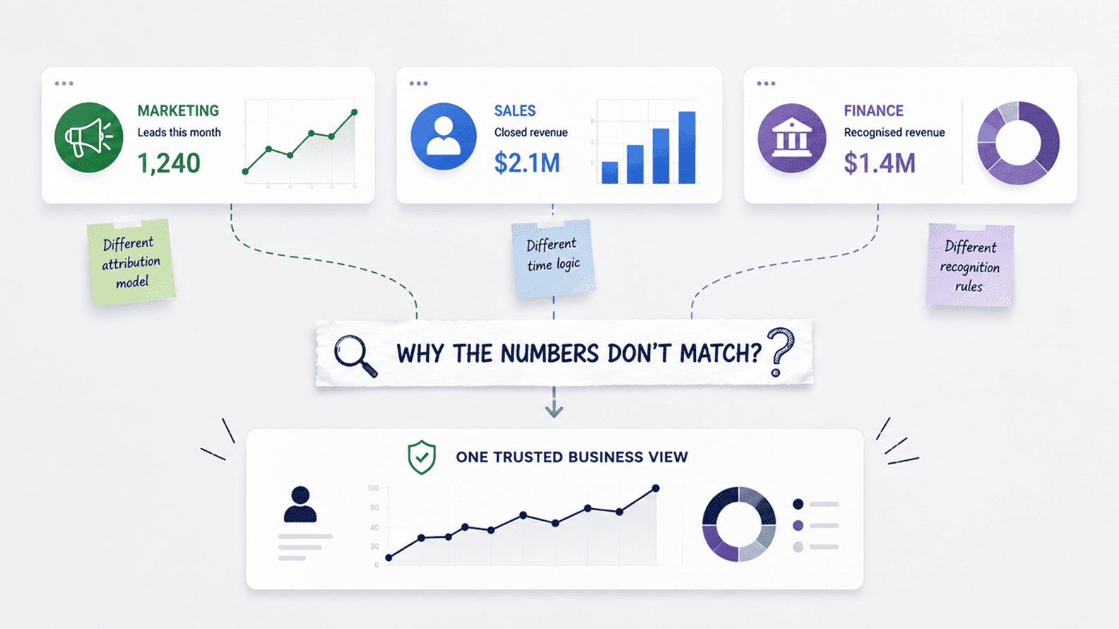
Why Marketing, Sales, And Finance Reports Do Not Match
Aug 04, 2026 / 27 min read
July 24, 2026 / 40 min read / by Team VE
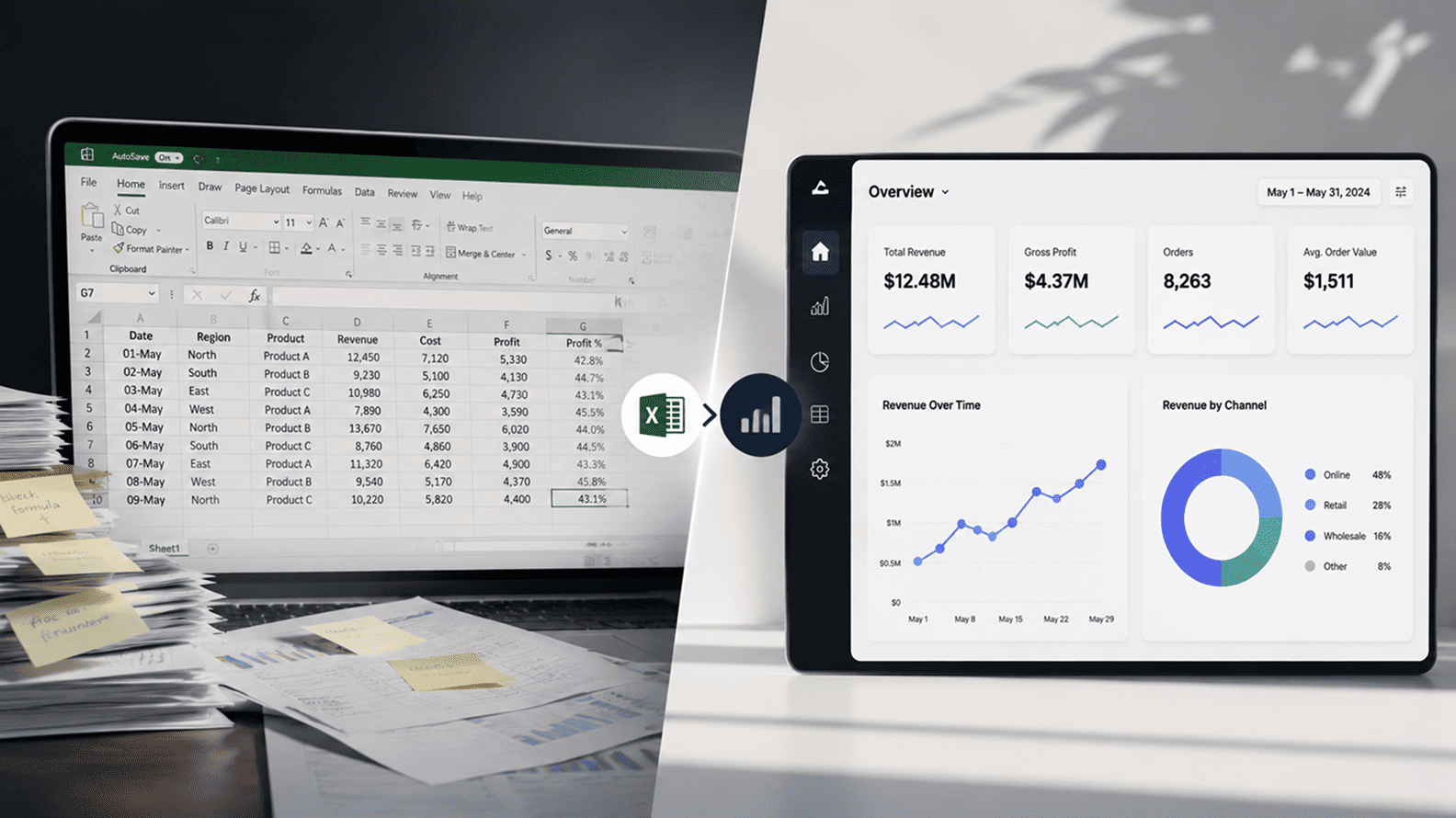
Dashboards give teams visibility while excel sheets give them working space. The difference explains why the spreadsheet keeps surviving every new generation of business intelligence software. A practical guide for leaders, analytics teams, BI owners, finance, revenue, operations, and marketing teams who want to understand why spreadsheet work survives even inside companies with modern dashboards and BI tools.
Business teams still use Excel because dashboards and spreadsheets usually serve different moments in the decision process. Dashboards are strong when the business needs shared visibility, recurring KPIs, operational monitoring, and one approved view of performance. Excel is strong when people need to adjust, annotate, reconcile, model scenarios, test assumptions, prepare commentary, and work through exceptions before a decision is made.
The spreadsheet survives because business work is rarely as clean as the dashboard view. A sales dashboard may show pipeline movement, but a sales leader still needs to judge which deals are real, which close dates are optimistic, and what happens if a large renewal slips.
A finance dashboard may show budget variance, but the finance team still needs to explain timing differences, assign owners, and prepare the version leadership can act on. A marketing dashboard may show lead volume and channel performance, but the team still needs to separate tracking issues from demand issues, campaign issues, sales follow-up issues, and one-off market movement.
Microsoft Excel is a spreadsheet environment for organizing, calculating, analyzing, modelling, formatting, and sharing data. In business analytics, it often becomes more than a spreadsheet. It acts as a personal modelling space, a reconciliation tool, a lightweight database, a planning surface, a commentary layer, a presentation aid, and the working bridge between formal reporting and actual decisions.
On the other hand, a dashboard is a designed analytics interface that presents data through KPIs, charts, tables, filters, alerts, and shared reports. Dashboards work best when the question is known and recurring. Excel works best when the question is still being shaped, tested, explained, or negotiated.
In 2012, JPMorgan Chase lost more than $6 billion in the trading episode that became known as the London Whale. The loss was not caused by a simple Excel mistake, but the official US Senate report on JPMorgan Chase’s whale trades described how the bank’s new VaR model relied on spreadsheet-based calculations with insufficient controls, manual entries, and formula and calculation errors.
The point for business teams is not that spreadsheets are dangerous by default. It is that a spreadsheet can become serious infrastructure long before the organization treats it with the controls serious infrastructure deserves.
That is the uncomfortable truth behind Excel’s survival. For years, companies have been told that dashboards would reduce spreadsheet dependence. The promise sounded logical: put trusted numbers into a BI platform, define KPIs properly, give teams a shared view, and the old cycle of exports, renamed files, copied tabs, and meeting-room reconciliations would slowly disappear.
Yet the spreadsheet did not disappear from finance, sales operations, marketing analytics, supply chain planning, HR reporting, customer success, project management, or board-pack preparation. Dashboards became official, while spreadsheets remained operational.
This does not happen because business teams are old-fashioned or unwilling to use dashboards. It happens because dashboards often answer the cleaner version of the question, while business teams are dealing with the messier version. A dashboard can show bookings, pipeline, win rate, conversion rate, average deal size, and forecast category.
A sales leader still needs to know which deals are inflated by optimism, which account owners have changed close dates three times, which renewals are safe, which late-stage opportunities may slip, and what the quarter looks like if two large deals move by ten working days. That kind of judgement rarely stays inside a pre-designed dashboard path.
Microsoft’s own product design shows this reality clearly. With Analyze in Excel for Power BI, users can connect an Excel workbook to a Power BI semantic model and analyze report data using PivotTables, Pivot Charts, and familiar Excel features.
Microsoft even describes use cases such as enriching report data with other assumptions, performing what-if analysis, or validating numbers from a Power BI visual. That is the honest middle ground. The governed model gives users trusted data, while Excel gives them a working space where the thinking can continue.
The practical lesson for analytics teams is that an export should be treated as a signal, not an act of defiance. When users keep taking dashboard data into Excel, they are often showing that the published view has answered the first question but has not supported the work that follows. Business teams need room to explain variance, test timing assumptions, add account-level context, assign ownership, model the next scenario, and prepare a version of the story that can stand up in a review.
Dashboards are essential for shared visibility, but Excel often remains the working layer where people turn that visibility into judgement, explanation, and action. A better analytics strategy recognizes that difference and designs the handoff deliberately instead of pretending one interface can carry the full life of a business decision.
A good dashboard brings discipline to a business because it gives everyone a common view of the numbers. Sales can look at the same pipeline, finance can review the same variance, operations can track the same capacity view, and leadership can discuss performance without every team bringing a different file to the meeting.
That shared surface matters, especially when the company is trying to reduce metric drift and stop every department from carrying its own version of the truth. The limitation is that visibility is only the first stage of decision-making, not the whole process.
Excel usually enters after the dashboard has done its job. A sales manager may take pipeline data and add notes from account owners, confidence levels, slipped-deal reasons, renewal context, and next actions. A finance team may take variance data and separate true overspend from timing differences, accounting adjustments, vendor delays, and one-off costs.
A marketing team may take campaign numbers and add comments about tracking changes, landing-page tests, lead quality, competitor activity, and sales follow-up. These additions are not always suitable for the official dashboard because some of them are temporary, judgement-based, or still being debated, but they are essential for the meeting where the decision will be made.
This is why Excel keeps surviving inside serious BI environments. It gives users a flexible working space where they can sort, annotate, reconcile, test, format, and reshape the data while the question is still moving. Microsoft’s Analyze in Excel for Power BI exists because users often want the governed model behind Power BI with the working habits of Excel in front of them.
Tableau also supports crosstab exports, which tells the same behavioural story from another platform: users often trust the BI system as the source, then take the data into a spreadsheet because the next layer of work needs rows, comments, formulas, and judgement.
| Business Moment | What The Dashboard Is Good For | Why Excel Still Appears |
| Monthly performance review | Shows approved KPIs, trends, and department-level movement. | Teams need variance notes, owner-level explanations, and a version of the story that leadership can act on. |
| Forecasting and planning | Shows current performance and historical patterns. | Users need assumptions, sensitivity checks, timing adjustments, and scenario modelling. |
| Exception analysis | Highlights outliers, alerts, missed targets, or unusual movement. | Teams need to isolate rows, reconcile records, add context, and decide who owns the follow-up. |
| Executive reporting | Provides consistent numbers from a governed source. | Analysts and finance teams still need formatting, commentary, and board-pack preparation. |
| Ad hoc questions | Supports the designed filters and drill paths. | Users need to reshape the question while they are still figuring out what the real question is. |
The gap is not a failure of dashboards or a victory for spreadsheets. It is a workflow reality. Dashboards are strongest when the company has already agreed what should be measured and how the answer should be consumed. Excel is strongest when the business is still working through exceptions, assumptions, ownership, and next steps.
Analytics teams get better adoption when they design for both moments: the governed view that gives people confidence, and the controlled working layer that lets them finish the thinking without creating a private version of the truth.
When analytics teams complain that users “just export to Excel,” they often miss the more useful question: what happens after the export? In many cases, the spreadsheet is not being used because the user dislikes the dashboard.
It is being used because the dashboard has stopped at visibility, while the business process still needs reconciliation, explanation, judgement, and preparation. The export is less a rejection of BI and more a clue that the analytics product has not carried the user far enough into the decision.
Excel performs several jobs that dashboards often support only partially:
These jobs often sit at the centre of commercial management. A customer success dashboard may show net revenue retention, account health, and renewal dates, but the team may still need a workbook to separate logo churn from contraction, add renewal notes, mark accounts at risk, estimate recoverable revenue, and decide which customer conversations must happen before the next review.
A finance dashboard may show budget variance by department, but the finance team still needs working space to separate timing differences from real overspend, map variance to owners, and prepare commentary that leadership can actually use.
The risk begins when this working layer becomes invisible infrastructure. A one-off spreadsheet used to understand a variance is usually healthy. A recurring workbook that becomes the only place where the forecast, margin bridge, staffing plan, or revenue adjustment exists is a different matter.
At that point, Excel is no longer helping the dashboard. It is quietly replacing a governed workflow with something that may have no owner, no version control, no lineage, and no reliable way to tell whether the numbers still match the source.
Trust is not only about whether the number is accurate. It is also about whether the person using the number can understand it well enough to stand behind it. A dashboard may be correct, governed, and beautifully designed, but it can still feel distant when a manager has to explain the movement in front of a CFO, client, founder, board member, or department head.
Excel gives users the comfort of working close to the detail. They can see the rows, trace the formula, add a note, test an assumption, remove an exception, and understand how the final view was built before they put their name behind it.
That sense of control matters because business decisions are rarely made by reading a KPI and moving on. A sales leader may need to challenge whether a deal belongs in the forecast. A finance manager may need to separate timing variance from real overspend. An operations head may need to explain why utilization looks healthy even though one team is overloaded and another is underused.
A marketing lead may need to check whether a fall in leads is due to campaign performance, tracking changes, geography mix, or sales qualification. The dashboard may provide the official signal, but Excel gives the user the working space to test the story before sharing it.
There is also a social side to this. In meetings, people are not only asking, “What does the dashboard say?” They are asking, “Can I defend this number?” and “Do I understand the exceptions well enough to act?” Excel helps because it allows the user to rehearse the logic.
They can build the bridge from reported number to business explanation: which accounts moved, which costs were one-off, which rows should be excluded, which assumptions are conservative, and which follow-ups need owners. That work may look informal, but it is often how decisions become practical.
The mistake analytics teams sometimes make is treating this behaviour as a lack of trust in dashboards. Often, the opposite is true. Users may trust the dashboard as the starting point, then use Excel because they need to turn that trusted number into a decision-ready explanation.
The risk appears when the workbook drifts away from the governed source and becomes a competing version of truth. The better answer is to keep the connection alive: let dashboards and semantic models provide the trusted base, while Excel remains a controlled working layer for analysis, commentary, scenario thinking, and preparation.
Most dashboards are built around questions the business has already agreed to ask repeatedly. How much revenue did we book? How many leads came in? What is the conversion rate? Which campaigns are performing? What is the average handling time?
How many people are on the bench? Which projects are delayed? These are important questions, and dashboards are good at answering them consistently because the metrics, filters, sources, refresh schedules, and visual paths can be designed in advance.
Business work rarely stops at that first answer. A marketing head may see that paid leads have dropped and then need to understand whether the movement came from budget changes, keyword mix, landing page friction, tracking gaps, competitor bidding, a weaker offer, sales qualification delays, or low-intent traffic from one geography.
A delivery head may see utilization falling and then need to separate real underuse from project ramp-up, leave patterns, bench movement, client-side delays, and reporting lag. A finance head may see margin pressure and then need to know whether the problem is pricing, staffing, exchange rate, vendor cost, one-time adjustment, or timing.
This is the dashboard gap. It appears when the published view gives visibility but does not give enough investigative freedom to finish the decision. The dashboard may be technically correct, but it may not be shaped around the actual workflow that follows the number.
Users then move to Excel because the spreadsheet lets them pull the data into the shape the conversation needs: rows for investigation, columns for assumptions, notes for context, manual tags for exceptions, and quick pivots for the questions that were not known when the dashboard was designed.
This does not mean every dashboard should become endlessly customizable. Too much flexibility inside BI can create the same confusion that companies are trying to avoid with spreadsheets. The better answer is to study the repeated post-dashboard behaviour. If users always export the same view to add ownership notes, the dashboard or connected workflow may need an owner-action layer.
If they always create the same manual segment, the semantic model may be missing a business field. If they always rebuild the same calculation, the metric probably needs to move upstream into the governed model. If they always use Excel to reconcile two systems, the company may have a data quality or integration issue rather than a reporting issue.
The dashboard gap is useful because it shows analytics teams where the product is incomplete. A dashboard should not only display performance; it should help the user move from performance to diagnosis, explanation, ownership, and action. Excel keeps appearing because it fills that missing middle. Mature BI teams do not treat that as a failure to punish. They treat it as user research for the next version of the analytics workflow.
Speed is one of the biggest reasons Excel survives inside companies that already have BI tools. From a business user’s point of view, adding one temporary column, testing a new calculation, grouping accounts differently, excluding an unusual record, or running a quick scenario can feel like a ten-minute task.
From the data team’s side, the same request may touch definitions, modelling, permissions, testing, deployment, documentation, and the risk of creating a metric that other teams may start using as official. Both sides are being reasonable, but they are operating on very different timelines.
The timing gap matters because many business questions are temporary. A sales leader may want to know what the forecast looks like if three deals move to next month, but that question may be relevant only until Friday’s review. A finance manager may want to test whether a variance is still meaningful after removing a one-off vendor cost, but that adjustment may never need to become a formal dashboard filter.
A marketing head may want to quickly separate leads from one geography after a campaign spike, but the cut may be useful only for one weekly meeting. Nobody wants to raise a ticket, define a metric, wait for the backlog, and review a BI release for a question that may die after one conversation.
Excel gives business teams a low-friction path from question to working answer. They can add a column, run a pivot, change an assumption, mark exceptions, add commentary, and decide whether the pattern is worth taking further.
That does create risk when the workbook becomes recurring or starts influencing important decisions without controls, but the initial instinct is practical. People are not choosing Excel because it is more elegant than a well-designed dashboard. They are choosing it because it lets them keep pace with the decision in front of them.
This is also why self-service BI is harder than it sounds. Giving users access to dashboards and exploration tools does not automatically give them the confidence to source data correctly, define KPIs safely, interpret movement, join context from other systems, or build a view that leadership can trust.
Many users still need help from analysts for the deeper work behind the number, and Excel fills the gap because it is the tool they already know how to bend around an immediate business need.
The better response is not to slow business teams down until every question becomes formally governed. It is to create a sensible path from fast exploration to controlled reuse. Let Excel handle the early, temporary, meeting-speed work, but watch for the moment a workbook becomes recurring, cross-functional, high-value, or high-risk.
Once that happens, the logic should move into a governed model, a certified dataset, a controlled template, a planning tool, or a dashboard workflow that gives the business both speed and trust.
There are healthy reasons to use Excel, and there are risky ones. A team that exports governed data for a one-off variance analysis is usually doing normal business work. A finance analyst who uses Excel to prepare commentary for a review is not undermining the BI stack.
A sales operations manager who tests a temporary pipeline cut before asking for a formal dashboard change is behaving sensibly. In all these cases, Excel is acting as a working layer around trusted data, not as a replacement for the company’s reporting system.
The danger begins when the spreadsheet becomes the place where the business quietly runs itself. A workbook that started as a quick fix becomes the weekly forecast. A margin bridge built for one review becomes the official leadership pack. A capacity sheet maintained by one operations manager becomes the only reliable view of staffing.
A pricing file gets copied from month to month until nobody knows which version contains the real logic. At that stage, Excel is no longer just helping people think. It is carrying an operating process without the controls, ownership, documentation, refresh rules, and lineage that the process deserves.
This is usually a design signal, not a user behaviour problem. When teams depend heavily on spreadsheets, analytics leaders should ask what the workbook is doing that the formal environment is not doing well enough. It may be adding commentary the dashboard does not support.
It may be reconciling two systems that do not agree. It may be modelling scenarios that BI was never designed to handle. It may be creating a view for a specific meeting rhythm, client format, board pack, or operational review. The spreadsheet is often the place where the missing workflow becomes visible.
The right response depends on the risk level. Exploratory Excel should remain easy because it helps people test questions quickly and often produces the next useful analytics idea. Operational Excel needs review because recurring work normally requires clearer ownership, better templates, and stronger links to governed data.
Shadow-system Excel needs urgent attention because it can create decision risk, compliance exposure, and dependence on hidden knowledge. A company does not need to eliminate spreadsheets to improve analytics maturity. It needs to separate useful flexibility from uncontrolled dependence, then move stable, repeated, high-stakes logic into a safer operating model.
A dashboard is usually ignored when it does not match the rhythm of the decision. That rhythm includes timing, ownership, vocabulary, explanation, investigation, and action. A dashboard may refresh daily and still be weak for a weekly commercial review if the team needs account-level commentary, risk flags, renewal notes, owner assignments, and next steps before the meeting begins.
A dashboard may have impressive charts and still be bypassed if the manager needs a row-level list of five clients to call, ten invoices to chase, or three delayed projects to escalate before noon.
The deeper problem is often workflow design. Many dashboards show the metric but do not support what happens after the metric appears. Users see revenue movement, but they need to diagnose the movement. They see margin pressure, but they need to separate pricing, staffing, timing, and one-off cost issues.
They see campaign performance, but they need to connect it with CRM follow-up, lead quality, sales conversion, and landing-page behaviour. They see utilization, but they need to know which people, projects, managers, and clients are driving the change. Excel becomes useful because it lets people move from display to diagnosis without waiting for the dashboard to understand every messy branch of the business conversation.
Analytics teams can learn a lot by studying where dashboards lose the user. If a dashboard is opened often but exported immediately, the visual may be doing the monitoring job but failing the investigation job. If users keep rebuilding the same calculation in Excel, the metric layer is probably incomplete.
If they keep adding the same manual tags, the business model may be missing a field. If they keep creating the same meeting pack outside BI, the reporting workflow may need a controlled commentary or decision-preparation layer. The export pattern is not noise. It is product feedback.
Better dashboard design starts by asking what the user needs to do next, not only what the user needs to see first. A revenue dashboard should expose the accepted definition, make the usual drill paths obvious, allow users to move from KPI to segment to customer or owner, and give analysts a reliable way to answer follow-up questions without recreating the same logic in five different workbooks.
A marketing dashboard should help teams move from channel performance to campaign, audience, landing page, lead quality, and sales outcome. An operations dashboard should help managers move from utilization or delay to the people, projects, clients, and actions behind the movement.
When that backbone is missing, Excel becomes the place where every team rebuilds the missing logic locally. The dashboard still exists, but it becomes a display layer rather than a working system. People may respect it, but they will not depend on it when the decision needs more texture than the published view can provide. T
he goal is not to make dashboards behave like spreadsheets. The goal is to design analytics workflows that carry users further into the decision, while keeping the official definitions, governed data, and shared logic intact.
AI is unlikely to make Excel disappear from business analytics. It may make Excel more central, because AI is moving analysis closer to the people who already live inside spreadsheets. A finance manager who once needed an analyst to help summarize a variance may now ask questions in natural language. A sales operations lead may use AI to identify outliers, generate a quick summary, or draft commentary around pipeline movement.
A marketing manager may test campaign patterns, compare segments, and build a first-pass explanation without leaving the workbook. Microsoft’s own Analyze Data in Excel already supports natural-language questions and can return summaries, trends, patterns, tables, charts, and PivotTables, while Copilot in Excel can produce insights such as charts, PivotTables, summaries, trends, and outliers.
That changes the role of the spreadsheet. Excel is no longer only a place where users enter formulas, copy data, and build pivots manually. It is becoming a more conversational working environment where non-technical users can ask questions, generate summaries, explore movement, and test business logic inside the tool they already understand.
The spreadsheet does not lose relevance because AI enters the analytics stack. In many teams, it becomes the place where AI-supported analysis feels most natural because it sits close to the rows, assumptions, commentary, and meeting preparation that business users handle every week.
The opportunity is obvious, but so is the risk. AI can make spreadsheet work faster, but it can also make weak spreadsheet habits more persuasive. A workbook with stale extracts, unclear metric definitions, hidden formulas, inconsistent source data, and no review process can still produce polished summaries.
A forecast built on shaky assumptions can sound more confident when AI explains it fluently. A customer-risk list can look credible even if the underlying health score is poorly defined or the renewal data is outdated. AI does not remove the need for governed data. It raises the cost of not having it.
The better direction is to connect AI-assisted Excel work to trusted foundations. Business teams should be able to use Excel for exploration, scenario modelling, commentary, and quick analysis, but the starting point should be certified datasets, approved metrics, clear refresh rules, and visible ownership.
Microsoft’s Python in Excel also shows where the category is heading: deeper analysis can move into the spreadsheet experience without asking every business user to become a programmer. That is powerful, but only if companies keep the underlying data, definitions, permissions, and review process under control.
AI will not settle the Excel-versus-dashboard debate. It will make the boundary more important. Dashboards should still carry shared truth, official KPIs, recurring monitoring, and executive visibility. Excel will remain the working layer where people test, explain, model, and prepare decisions. The companies that benefit most from AI will be the ones that connect those layers properly, so faster analysis does not become faster confusion.
The smarter analytics strategy is to decide which work belongs where. Dashboards should own the shared layer of the business: official KPIs, recurring reports, executive visibility, operational monitoring, alerts, and the metrics people need to trust across teams.
Excel should remain available for the working layer: analysis, modelling, commentary, reconciliation, planning, exception handling, and decision preparation. The conflict starts when companies ask one tool to do both jobs perfectly.
A dashboard is at its best when the question has become stable. Once the company knows how it defines revenue, margin, pipeline, churn, utilization, campaign performance, project delay, or customer health, that logic should live in a governed model and appear through a shared reporting surface.
People should not have to rebuild official KPIs in private workbooks every month. They should not have to wonder whether the revenue bridge in one file matches the dashboard in another. Shared truth needs shared infrastructure.
Excel is at its best before the question becomes stable, or after the dashboard has produced the first answer and the team needs to work through the consequences. A commercial team may need to test a temporary forecast assumption. A finance team may need to prepare variance commentary.
A marketing team may need to group campaigns differently for one review. An operations team may need to isolate exceptions before deciding what needs escalation. These are legitimate business behaviours, and trying to force all of them into dashboards can make the BI environment heavy, slow, and over-customized.
Smart analytics teams create a connected relationship between the two tools. Excel users should be able to start from governed datasets, approved metrics, and trusted semantic models rather than stale CSV copies. Dashboards should stay focused on shared visibility and recurring truth, while Excel handles the flexible work that is too local, temporary, or judgement-heavy to formalize immediately.
That balance respects how business teams actually make decisions while reducing the danger of disconnected numbers spreading across the company.
The practical answer is controlled coexistence. Excel is going to remain part of the business decision environment because it solves real problems for real teams. Trying to remove it completely usually pushes the same behaviour into worse places: copied tables, private extracts, screenshots, personal files, email attachments, and unofficial versions that nobody can trace.
A better analytics strategy accepts the role Excel plays, then designs the rules, data connections, templates, and ownership model that make spreadsheet work safer.
The first move is to make sure Excel users start from trusted data wherever possible. If finance, sales operations, marketing, or delivery teams need to analyze numbers in a workbook, they should be able to connect to certified datasets, approved semantic models, or governed exports rather than downloading stale CSV files and rebuilding logic from scratch.
That keeps the flexibility business users want while reducing the risk that every team creates its own private version of revenue, pipeline, utilization, churn, or campaign performance.
The second move is to audit the workbooks that matter. Analytics teams do not need to police every spreadsheet on every desktop. They should focus on the files that are recurring, widely shared, decision-critical, manually refreshed, formula-heavy, or used in leadership reporting. Once those workbooks are visible, they can be classified properly.
Exploratory work can remain lightweight. Operational work may need controlled templates, refresh rules, documentation, and ownership. Shadow-system work should be treated as a candidate for formalization because it is already doing the job of a system without system-level controls.
The third move is to feed the learning back into the BI environment. If the same manual calculation appears in ten workbooks, it probably belongs in the governed model. If users keep adding the same comment field, the workflow may need a controlled commentary layer.
If people always export the same dashboard visual, the dashboard may need better drill-through, row-level detail, or decision paths. Spreadsheet behaviour is one of the clearest forms of analytics product feedback because it shows what users actually do after the official report has done its part.
The right answer is controlled coexistence. Excel will remain part of business analytics because it solves real workflow problems: commentary, variance analysis, scenario modelling, exception handling, reconciliation, and decision preparation. Dashboards should remain the shared layer where the company sees approved metrics and monitors performance.
Governed data should remain the foundation that protects definitions, refresh logic, access, and trust. The mistake is letting these layers drift apart until dashboards show one version, spreadsheets carry another, and leadership has to ask which number is real.
| Layer | What It Should Own | What Excel Should Do | What Must Be Governed |
| Governed Data | Source data, metric definitions, refresh logic, access rules, ownership, and validation. | Connect to trusted datasets instead of relying on stale CSV exports. | Semantic models, certified datasets, data quality checks, lineage, permissions, and ownership. |
| Dashboards | Shared KPIs, recurring reports, executive views, alerts, monitoring, and common drill paths. | Serve as the trusted starting point for analysis, not the final container for every business question. | Metric logic, filters, dashboard ownership, refresh cadence, documentation, and interpretation notes. |
| Excel Working Layer | Commentary, scenarios, variance analysis, planning, exception handling, and meeting preparation. | Give users flexible room to work through the messy middle of a decision. | Controlled templates, connected data sources, version rules, review points, and high-risk formulas. |
| Formalized Workflow | Recurring or high-risk logic that has outgrown personal spreadsheets. | Hand over stable calculations, repeated workflows, and decision-critical processes. | Planning tools, BI models, workflow apps, governed templates, automation, and auditability. |
This model gives analytics teams a practical way to decide what belongs where. If a spreadsheet is temporary, local, and low-risk, it can remain flexible. If it becomes recurring, widely shared, decision-critical, formula-heavy, or difficult to audit, the stable parts should move into a governed model, dashboard workflow, controlled template, planning tool, or lightweight data app.
The aim is not to convert every workbook into a dashboard. The aim is to stop important business logic from living only in someone’s private file.
It also changes how teams should read spreadsheet behaviour. A recurring export is not just a bad habit; it may show that the dashboard is missing the next step in the workflow. A manual column may reveal a business attribute that has not been captured in the semantic model.
A widely circulated workbook may show that people need a planning or commentary process, not another visual. A broken forecast file may show that a spreadsheet has quietly become infrastructure and now needs ownership, versioning, documentation, and review.
The best analytics environments keep the chain intact. A finance team can start from an approved revenue model, review movement in a dashboard, and then use a controlled workbook to prepare variance commentary. A sales operations team can rely on the governed pipeline model, use BI for visibility, and then work through deal-level judgement in Excel before a forecast review.
A marketing team can monitor channel performance in a dashboard, then use a connected analysis file to explain a temporary campaign movement without creating a new private definition of success.
A mature company does not ask how to stop Excel. It asks which spreadsheet behaviours are useful, which are risky, and which ones show that the analytics product is incomplete. That question leads to better dashboards, safer Excel usage, stronger metric definitions, clearer ownership, and fewer meetings where people spend the first twenty minutes arguing about which number to trust.
Because the dashboard usually answers the first question, while Excel helps teams work through the questions that follow. A dashboard may show that revenue is down, leads have fallen, utilization has moved, or support response times have worsened. The business team still needs to understand which segment changed, whether the movement is real or timing-related, who owns the variance, what context is missing, and what explanation leadership can act on.
That work often needs row-level detail, comments, assumptions, manual classifications, temporary groupings, and judgement. Those things do not always belong inside the official dashboard because they may be specific to one meeting, one client, one region, or one decision. Excel becomes useful because it lets users move from monitoring to investigation quickly.
The risk begins when the export becomes disconnected from the governed source. A controlled export used for analysis is normal. A copied workbook that later becomes a competing version of the truth is dangerous. The goal should be to let users work in Excel when needed, but keep the starting data, metric definitions, refresh rules, and ownership tied to the trusted analytics layer.
Excel is not bad for business analytics. In many teams, it is still one of the most useful tools for variance analysis, scenario modelling, planning, reconciliation, meeting preparation, and quick investigation. It gives business users a flexible space to think through the number before they explain it or act on it. That flexibility is valuable, especially when the question is temporary or still being shaped.
Excel becomes risky when it quietly turns into a system of record for recurring, cross-functional, or high-stakes decisions. A one-off workbook used to investigate a campaign movement is usually fine. A workbook that becomes the only place where the official forecast, pricing model, staffing plan, revenue bridge, or margin adjustment exists needs stronger controls.
The real issue is governance. Hidden formulas, stale extracts, copied versions, undocumented assumptions, weak review, and unclear ownership create the risk, not the spreadsheet itself. A healthy analytics environment does not ban Excel. It connects Excel to trusted data, controls the important templates, audits recurring workbooks, and moves stable high-risk logic into governed models or formal workflows.
Finance work often sits between reporting and judgement. A BI dashboard can show actuals, budget variance, cost centre performance, revenue movement, collections, margin, and forecast trends. But finance teams still need to explain timing differences, adjust assumptions, prepare commentary, reconcile systems, model scenarios, and create leadership-ready packs. Excel is built for that blend of calculation, formatting, explanation, and review.
Finance also works with many questions that are not always stable enough for dashboards. A CFO may want a temporary view of margin after excluding one unusual cost. A finance manager may need to test how cash collection changes if three clients pay late. A business partner may need to prepare a department-specific variance bridge before a monthly review. These are practical working questions, and Excel gives finance teams the speed to answer them.
The danger is not finance using Excel. The danger is finance running critical reporting through undocumented workbooks that only one person understands. Good analytics teams should preserve the flexibility finance needs while connecting key workbooks to governed data, approved definitions, controlled templates, review rules, and proper ownership.
Dashboards feel rigid when the user’s decision does not follow the same path the dashboard was designed for. A dashboard has predefined fields, filters, metrics, visuals, drill paths, and refresh rules. That structure is useful because it creates consistency. But it can feel limiting when a user needs to test a temporary grouping, add a manual note, exclude an unusual case, combine external context, or prepare a one-off view for a review.
Business users often work in live, messy situations. A marketing lead may want to split campaign performance by a temporary audience test. A sales manager may want to mark which opportunities are credible before a forecast call. An operations head may need to add project-level context that does not yet exist in the source system. Excel feels faster because the user can reshape the analysis without waiting for the BI backlog.
The answer is not to make dashboards endlessly flexible. That can create confusion and weaken governance. The better answer is to identify repeated behaviours. If users keep making the same cut, adding the same field, or rebuilding the same calculation in Excel, the dashboard, semantic model, or workflow probably needs to evolve.
A blanket ban usually creates worse behaviour. Business users still need the data, so they will find another route: screenshots, copied tables, manual extracts from analysts, emailed files, or unofficial workarounds that are even harder to trace. If people are exporting from dashboards, the smarter question is not “How do we stop this?” but “What work are they trying to complete after the export?”
Exports can be perfectly reasonable when they support one-off analysis, meeting preparation, variance commentary, exception review, or temporary scenario modelling. The risk begins when exported data becomes stale, modified, redistributed, and reused as if it were still connected to the governed source. That is how a useful spreadsheet turns into a competing version of the truth.
Companies should allow controlled exports from trusted models, while monitoring where exports happen repeatedly. If one dashboard is exported every week, users may need better drill-through, row-level context, commentary fields, planning support, or a connected Excel template. Export behaviour is valuable analytics product feedback. It shows where the dashboard is useful as a starting point but incomplete as a decision workflow.
The biggest danger is that Excel can turn private judgement into unofficial infrastructure. A workbook often begins as a quick fix for one meeting. Then it becomes a weekly file. Then it becomes the forecast. Then leadership starts relying on it, even though nobody has clearly documented the source, formulas, assumptions, refresh process, approval rules, or owner. By the time the risk becomes visible, the spreadsheet may already be carrying a critical business process.
That creates several problems at once. A formula can break silently. A stale extract can be reused. Two people can update different versions. A manual adjustment can be forgotten. A key employee can leave with the logic in their head. A number can appear in a leadership review without anyone being able to trace how it was produced.
The answer is not to treat every workbook as dangerous. It is to identify which workbooks have become recurring, cross-functional, high-value, or high-risk. Those files need stronger control: connected data, documented logic, version management, review rules, named ownership, and, in some cases, migration into a governed model, workflow app, planning tool, or controlled template.
Analytics teams should start by asking what the user does after receiving the extract. The post-export work usually reveals the real need. The user may be adding commentary, reconciling two systems, building a temporary segment, preparing a client pack, checking row-level exceptions, assigning owners, modelling assumptions, or creating a format needed for a specific meeting.
Once that need is clear, the analytics team can decide the right response. Some requests should remain in Excel because they are temporary and low-risk. Some should become controlled templates because the same workflow repeats every month. Some should move into the dashboard because the question is common enough to support formally. Some should move into the semantic model because the same calculation keeps being rebuilt privately. Some may reveal a deeper data quality or system-integration problem.
The wrong response is to treat the user as the problem. Repeated extract requests usually show where the analytics experience stops too early. Strong BI teams study Excel usage the way product teams study user behaviour. They look for repeated patterns, missing fields, recurring manual logic, and decision workflows that are not yet properly supported by the formal analytics environment.
Yes, and in many modern analytics environments they already do. The strongest setup is not dashboard versus Excel. It is a dashboard plus governed data plus a controlled spreadsheet layer. Dashboards provide shared visibility and official KPIs. Governed datasets and semantic models protect definitions, access, refresh rules, and source logic. Excel gives business users a familiar working space for analysis, commentary, planning, reconciliation, and scenario thinking.
The key is connection. Excel becomes risky when users rely on copied CSV files, hidden formulas, manual refreshes, and private metric definitions. It becomes much safer when users connect to certified datasets, approved semantic models, or controlled exports. That way, the business keeps the flexibility of Excel without allowing every team to create its own version of revenue, pipeline, margin, utilization, churn, or customer health.
Analytics leaders should design the handoff deliberately. A user may begin in a dashboard, move into Excel for variance explanation or scenario modelling, and then feed repeated learning back into the BI model. When that loop works, Excel is no longer a shadow system. It becomes a governed working layer around trusted analytics.
A workbook should be considered for formalization when it becomes recurring, widely shared, decision-critical, or difficult to audit. If several teams depend on it, if it drives financial or operational decisions, if the formulas are complex, if people argue about which version is current, or if the workbook breaks whenever one person is unavailable, it has probably outgrown casual spreadsheet status.
The right destination is not always a dashboard. A dashboard is useful when the workbook mainly exists to show recurring metrics, trends, and performance views. But if the workbook is doing planning, approvals, pricing, workflow tracking, resource allocation, or scenario modelling, the better answer may be a planning tool, data app, workflow system, controlled Excel template, or governed model inside the BI layer.
The test is simple: if the workbook contains logic the company depends on, that logic needs ownership. It may still live partly in Excel, but it should not live only inside an uncontrolled file. The source, refresh rules, formulas, assumptions, access, version history, and review process should be clear enough that the business can trust the output without depending on hidden knowledge.
AI is more likely to change Excel than replace it. As natural-language analysis, Copilot-style assistance, and Python-powered spreadsheet workflows become more common, business users will be able to ask better questions inside the spreadsheet environment they already understand. That may actually increase Excel’s role in analytics because it brings more analytical power closer to finance, sales, marketing, operations, HR, and customer success teams.
The bigger issue is governance. AI-assisted spreadsheets can create faster summaries, cleaner explanations, charts, forecasts, and scenario outputs, but speed becomes dangerous when the underlying data, definitions, formulas, and assumptions are weak. A flawed workbook can produce more persuasive analysis when AI helps polish the explanation. That makes trusted sources, certified datasets, metric ownership, permissions, and review rules even more important.
AI will not remove the need for dashboards either. Companies will still need shared reporting, official KPIs, executive visibility, alerts, and governed performance views. The future is likely to be a connected workflow: dashboards for shared truth, governed data models for consistency, and Excel for flexible analysis and decision preparation. The winners will be the companies that connect those layers instead of letting AI accelerate disconnected spreadsheet chaos.
Aug 04, 2026 / 27 min read
Aug 04, 2026 / 22 min read
Jul 31, 2026 / 24 min read