Why Marketing, Sales, And Finance Reports Do Not Match
Aug 04, 2026 / 27 min read
June 26, 2026 / 35 min read / by Team VE
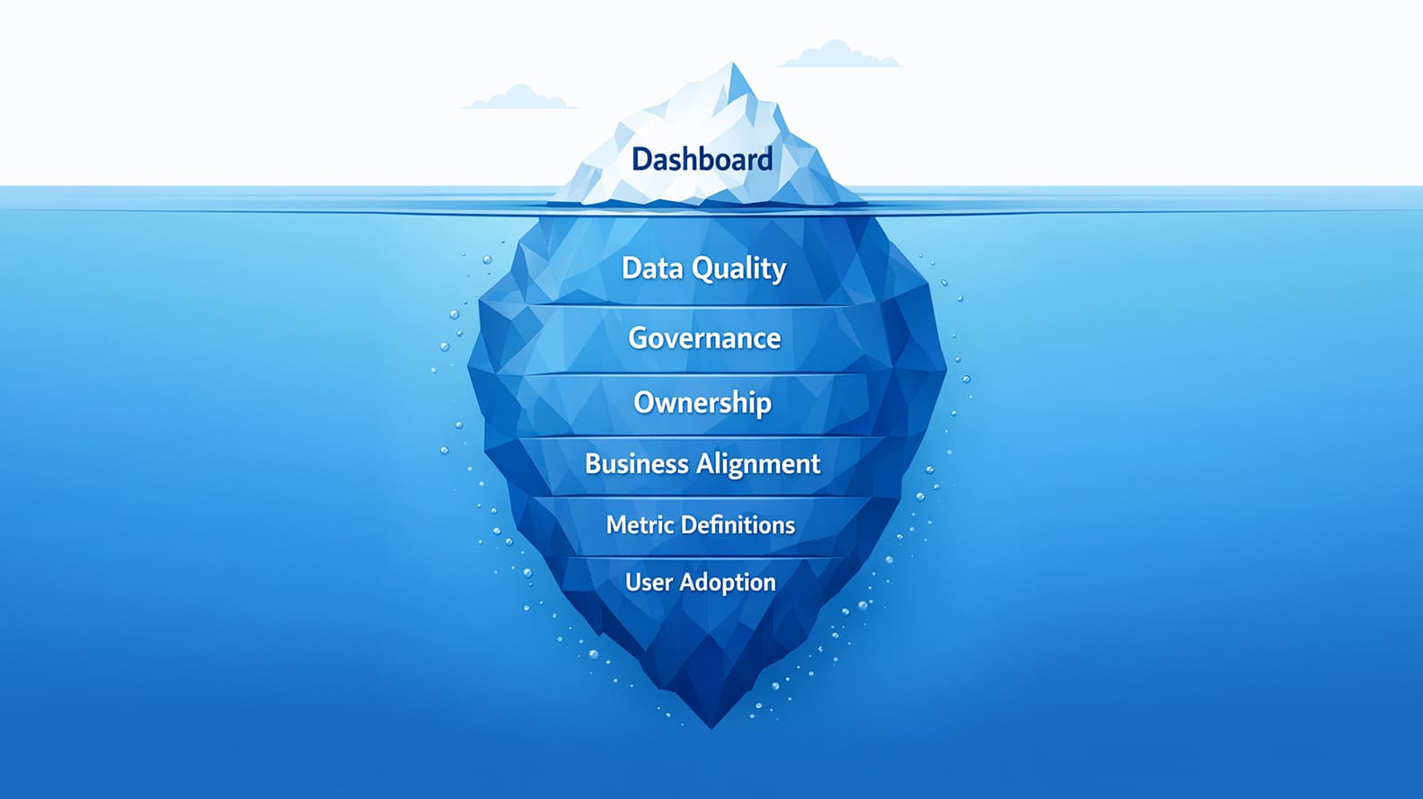
Analytics projects rarely fail because the dashboard tool is weak. They fail because the business has not created the clarity, ownership, data discipline, and working habits needed to turn reporting into decisions.
Analytics projects often fail even when the software is strong because the failure usually sits outside the tool. The company may have a modern BI platform, clean-looking dashboards, connected data sources, and impressive demos, but the project still struggles if the business question is vague, the data is unreliable, the metrics are undefined, the owners are unclear, and the dashboard is not tied to a real decision.
The painful part is that these projects can look successful at launch. The reports go live, users get access, and leadership sees progress on screen. Then the business starts using the numbers in real meetings, and the cracks appear.
Teams question definitions, compare dashboards with spreadsheets, argue over which metric is official, and slowly return to old habits. The tool may have done its job, but the project fails because the business never built the discipline needed to turn analytics into trusted decisions.
An analytics project is a structured effort to use business data for reporting, analysis, forecasting, decision support, performance improvement, or operational control. It may involve dashboards, BI tools, data pipelines, warehouses, lakehouses, semantic models, governance rules, metric definitions, and stakeholder workflows.
It usually fails when it does not improve how the business decides, even if the tool technically works. A dashboard can go live, a warehouse can be implemented, and users can receive access, but the project has still failed if teams do not trust the numbers, cannot explain movement, keep maintaining parallel spreadsheets, or do not change decisions because of the insight.
An analytics project is an attempt to change how a business understands itself, agrees on performance, and makes decisions with less guesswork. The dashboard is only the most visible part of that change. What matters more is the discipline around it: whether the data is good enough, whether the definitions are agreed, whether someone owns the number, whether stakeholders have made trade-offs, and whether the report fits the way people actually work.
The UK Post Office Horizon scandal is an extreme case, but it shows the danger of building decisions around system outputs without enough challenge, ownership, and accountability. The public inquiry into Horizon has documented the scale of harm caused to sub-postmasters, while the Institute of Directors described the scandal as, at its core, a failure of governance around an IT system.
Most analytics projects will never carry consequences on that scale, but the smaller pattern is familiar inside companies: people begin trusting the screen before the organisation has built enough discipline around the number.
In a typical business, the failure is quieter and easier to miss. A new reporting platform goes live, the dashboards look cleaner than the old spreadsheets, and leadership finally has a single place to look before review meetings. For a few weeks, the project feels complete because the visible work has been delivered.
Then the dashboard enters real commercial conversations. Revenue does not match the finance pack. Pipeline still carries stale deals. Campaign performance loses meaning because naming changed mid-quarter. Operational pressure stays hidden because the report captures completed work but not the backlog building behind it.
The tool may be working exactly as expected, yet trust starts slipping because the business has discovered a deeper problem. A dashboard can present data, but it cannot settle what the company means by revenue, which pipeline view is official, how campaign quality should be judged, or whether the numbers reflect how work actually happens.
RAND’s 2024 research on failed AI projects found that teams often struggle when stakeholders misunderstand or miscommunicate the problem to be solved, and analytics projects suffer from the same weakness when the request begins as “build a dashboard” before anyone has agreed what decision the dashboard is meant to improve.
A successful analytics project gives the business a shared way to see movement, explain it, and decide what to do next. When the surrounding discipline is missing, even a sophisticated platform becomes a better-designed version of the old argument, with the same doubts now displayed in sharper charts.
Tool-first analytics usually begins with a reasonable frustration. Reporting is slow, spreadsheets have multiplied, leadership wants one view of performance, and every team is tired of waiting for someone else to prepare numbers before a review.
So the company buys or expands a BI platform, connects the obvious systems, rebuilds old reports in a cleaner interface, and calls the work a transformation. It feels like progress because the change is visible. People can open dashboards, apply filters, export charts, and see numbers faster than before.
The weakness appears when faster reporting is mistaken for better judgment. Microsoft’s Work Trend Index found that employees using Microsoft 365 are interrupted every two minutes on average by a meeting, email, or notification, which is a useful reminder that more digital surfaces do not automatically create better work.
Analytics can fall into the same trap. A dashboard can give people another place to look, another number to check, and another chart to copy into a deck, while the actual decision remains just as unclear as it was before.
Bain’s long-running Management Tools & Trends research has tracked how executives adopt management frameworks and evaluate their effectiveness over decades. One of its useful observations is that tools create value when they become part of management practice rather than remaining standalone initiatives.
Analytics projects follow the same pattern. A dashboard becomes useful when it shapes how leaders review performance, allocate resources, challenge assumptions, and make decisions.
This is why some analytics projects generate enthusiasm during implementation and frustration a few months later. The reports are available, but meetings still revolve around competing interpretations of the same numbers. Managers can see the metrics, yet remain unsure what action should follow.
Teams continue exporting data into spreadsheets because the dashboard has improved visibility without fully answering the question they were struggling with in the first place.
The stronger analytics projects begin with a decision the business consistently finds difficult: forecasting revenue, allocating marketing budget, planning capacity, reducing churn, improving profitability, or understanding renewal risk. Once that anchor exists, the dashboard, metric structure, reporting layout, refresh rhythm, and adoption plan can be shaped around a real business need instead of becoming another layer of reporting activity.
A weak analytics project often begins with a request that sounds perfectly sensible in a meeting. Someone asks for a sales dashboard, a marketing performance view, a churn report, or an executive revenue tracker, and the request feels clear because everyone recognises the words. The trouble is that each of those phrases can mean several different things once the data team starts building.
A sales dashboard could be about forecast risk, rep productivity, lead quality, deal aging, discounting, pipeline coverage, or regional performance. A marketing dashboard could be about activity, efficiency, qualified pipeline, customer value, or budget reallocation. The same title can hide several competing decisions.
The gap between the business phrase and the analytical question is where many projects lose shape. MIT Sloan’s Master of Business Analytics Capstone work is a useful contrast because its projects begin with companies trying to solve a defined business problem with data, across areas such as pricing, operations, customer behaviour, and risk.
In one 2023 overview, MIT Sloan described how students worked on 41 projects with 33 companies, with the work framed around concrete business problems rather than generic dashboard requests. That framing matters because analytics becomes far easier to build when the business has named the decision it wants to improve.
The damage from vague questions is subtle. Teams do not always notice it during development because the dashboard still fills up with useful-looking numbers. Sales activity, funnel volume, conversion rates, campaign spend, revenue movement, customer counts, and operational workload all look legitimate on screen. The problem appears later, when the report is used in a real review and no one knows which movement should trigger action.
A dip in leads may matter less than a drop in qualified opportunities. A rise in support tickets may be noise unless it is concentrated in a product line, customer segment, or release window. A revenue chart may show flat growth without explaining whether the pressure comes from acquisition, conversion, discounting, churn, or capacity.
McKinsey’s work on the analytics translator role is useful here because it describes the need for people who can identify and prioritise business problems that analytics is suited to solve, then connect those problems to data, models, and users. That role exists because the first version of a business request is rarely precise enough. Someone has to turn “show me performance” into a question the analytics system can actually answer.
A good analytics brief therefore has to be sharper than the dashboard title. If leadership wants a revenue view, the project should know whether the real concern is growth slowdown, forecast risk, margin pressure, customer concentration, pricing leakage, or renewal exposure.
If marketing wants a performance report, the project should know whether the decision is budget shift, campaign pruning, funnel repair, or sales handoff quality. Once the question becomes that specific, the dashboard stops being a container for metrics and starts becoming a way for the business to see what needs attention.
Unity’s 2022 advertising problem is a useful example of how quickly bad data can damage a business even when the product and technology around it are sophisticated. The company said its Audience Pinpointer tool had been affected by bad data, which reduced the accuracy of its ad-targeting model, and later reporting put the revenue and recovery impact at around $110 million. The visible issue was performance. The deeper issue was trust in the data feeding the system.
Analytics projects face the same risk in a more everyday form. A sales dashboard built on weak CRM discipline will carry old opportunities, unrealistic close dates, missing lost reasons, duplicate accounts, and inflated deal values into the review meeting. A marketing dashboard built on inconsistent campaign naming will make channel performance harder to compare.
A finance dashboard that depends on offline adjustments will keep forcing teams back into reconciliation before anyone feels safe using the number. The BI tool may be fast, polished, and well implemented, but it can only move as cleanly as the data beneath it allows.
The cost shows up in time before it shows up in strategy. Analysts stop explaining what changed in the business and start defending why the number looks different from someone else’s spreadsheet. Managers spend meetings debating whether the dashboard is right instead of deciding what to do. Leadership begins asking for manual checks before trusting the report, and that small habit slowly turns the analytics project into another layer of work.
Experian’s 2022 Global Data Management research found that 85% of organisations said poor-quality customer contact data negatively affected operational processes and efficiency, which is exactly how poor data quality behaves inside analytics: it weakens confidence, slows action, and makes every decision carry a private doubt.
This is why data quality cannot be treated as a technical cleanup activity sitting behind the project. It is part of the business outcome. If the source systems are loose, the dashboard will inherit that looseness. If the company tolerates missing fields, duplicate records, inconsistent names, stale statuses, and manual fixes outside the reporting layer, the analytics project will eventually reflect those habits back to the business with better formatting. The confusion does not disappear because the tool is better. It simply travels faster.
One of the most expensive words in business is often the simplest one. Revenue. Customer. Churn. Lead. Utilization. Conversion. Everyone uses these terms comfortably until a meeting forces people to explain exactly what they mean. That is usually the moment an analytics project discovers that different parts of the company have been using the same language to describe different realities.
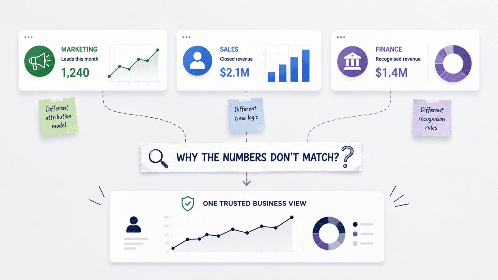
The challenge becomes obvious as businesses grow. A sales team may count a customer when a deal is signed. Finance may only count the customer after billing begins. Marketing may focus on acquisition, while customer success tracks retention and expansion. Each view serves a legitimate purpose inside its own function. Problems begin when those definitions arrive on the same dashboard without agreement about which one should guide decisions.
This issue became significant enough that companies started building dedicated metric-governance layers around their analytics systems. Airbnb’s engineering team explained how its Minerva metrics platform was designed to create consistency across dashboards, experimentation systems, and analytical workflows because different teams calculating the same metric in different ways created confusion and reduced trust. The goal was not simply cleaner reporting. It was creating one shared understanding of performance across the organisation.
The impact of unclear metrics extends beyond reporting accuracy. Once teams lose confidence in definitions, conversations begin drifting away from business performance and towards defending numbers. Time that should be spent discussing customer behaviour, profitability, growth, or operational efficiency gets consumed by debates over calculation logic. The dashboard becomes a stage for competing interpretations rather than a shared view of reality.
This is one reason modern data platforms increasingly emphasise semantic layers and governed metrics.
ThoughtSpot describes a semantic layer as a business representation of data that allows people to work from common definitions rather than rebuilding logic in every report. The technology matters, but the larger idea is organisational. Companies perform better when important metrics have a clear meaning that survives department boundaries.
The strongest analytics projects therefore spend more time defining metrics than many leaders expect. Once the business agrees what revenue means, how churn is calculated, when a lead becomes qualified, or how utilization should be measured, the dashboard becomes significantly easier to build. More importantly, the conversations around it become more productive because people can focus on what the numbers are saying rather than what the numbers are.
Stakeholder alignment usually looks easier in the kickoff meeting than it does during the build. Everyone wants better analytics, so the room feels united. Sales wants pipeline clarity, finance wants numbers it can reconcile, marketing wants attribution, operations wants capacity visibility, leadership wants executive KPIs, and the data team wants a model that will not collapse under every new request. All of those needs may be valid, but they do not automatically belong in the same first release.
This is where analytics projects start collecting hidden disagreements. One team expects a leadership scorecard, another expects a diagnostic tool, another expects a replacement for its weekly spreadsheet, and another assumes the dashboard will settle disputes that have existed for years.
The project keeps moving because nobody wants to slow down the build, but the dashboard quietly absorbs every unresolved trade-off. By launch, the report may contain plenty of useful metrics and still feel unsatisfactory because each stakeholder was imagining a different product.
The pattern is common in larger technology programmes. McKinsey’s work on digital transformations found that success is more likely when organisations use people in integrator roles who connect new digital methods with existing ways of working.
That idea matters for analytics because the technical build is only half the translation. Someone has to connect the dashboard to sales reviews, finance close, marketing planning, operational meetings, and executive decision-making, while also making clear which needs will wait.
Scope creep is often a symptom of this missed alignment. Atlassian’s guide to scope creep describes how uncontrolled changes increase the risk of delay, cost overruns, and project failure. In analytics, scope creep rarely arrives dramatically. It arrives as one more filter, one more stakeholder view, one more metric, one more drill-down, one more exception, until the dashboard becomes a compromise document rather than a sharp decision tool.
The stronger projects make trade-offs visible early. They decide which decision the first version must serve, which teams are primary users, which metrics are mature enough to show, and which requests belong later. That does not make the project smaller in ambition. It makes the first release coherent enough to earn trust, which is usually what gives the next release a chance to matter.
Dashboard adoption usually fails quietly. There is rarely a dramatic rejection. People attend the launch, say the report looks useful, ask for access, and perhaps use it for a week or two. Then the old habits return. The sales manager goes back to the CRM export before the pipeline call.
Finance keeps its reconciliation file open before the monthly review. Marketing pulls platform data into a spreadsheet before making budget notes. Operations trusts the tracker maintained by the team lead because it reflects the messy reality of work better than the official dashboard.
That behaviour is often treated as resistance, but it is usually a signal. Users do not abandon dashboards because they dislike analytics. They abandon them when the dashboard sits outside the rhythm of the work. If the report does not help someone run a meeting, answer a recurring question, replace a manual file, or make a decision with more confidence, it becomes one more tab in an already crowded workday.
Slack’s State of Work research found that 68% of workers spend at least 30 minutes a day switching between tools, which is exactly the environment into which many dashboards are launched. A report that adds another place to check without removing an old habit has to fight for attention from day one.
The same lesson appears in product usage data. Pendo’s Feature Adoption Report found that 80% of features in the average software product are rarely or never used, despite the time and money spent building them. Analytics projects face the same risk. A dashboard can be technically accurate, visually clean, and still become an unused feature if it does not solve a problem users feel in their normal workflow.
The better projects treat adoption as part of the build, not an announcement after launch. A sales dashboard should live inside pipeline reviews, not beside them. A finance dashboard should reduce reconciliation work, not create another number to validate.
A marketing dashboard should help budget conversations happen faster, not become a prettier export from ad platforms. An operations dashboard should show the pressure managers actually act on, not only the activity that is easiest to measure.
When a dashboard fits the work, adoption feels natural because the report helps people do something they already needed to do. When it does not, training sessions and reminder emails can create temporary usage, but the business will drift back to the tools and spreadsheets that still feel closer to the decision.
Analytics projects often decay after launch because the organisation treats the go-live date as the finish line. The dashboard has owners during the build, meetings during implementation, and urgency while leadership is watching.
Then the project moves into daily business life, where numbers need maintenance, definitions need review, source systems change, users ask questions, and someone has to decide what happens when the dashboard disagrees with a spreadsheet people still trust.
The UK government’s Data Quality Framework makes a useful point that applies well beyond the public sector: data quality depends on people, processes, and responsibilities, not just technical checks. That is the part many analytics projects underestimate.
A dashboard can be built by a data team, but it cannot stay trusted unless the business knows who owns the metric, who fixes source-system behaviour, who approves definition changes, who validates important numbers, and who tells users which report is official.
Without that operating model, analytics becomes dependent on informal labour. One analyst remembers the logic behind a metric. One finance manager maintains the reconciliation file. One sales operations person knows why certain CRM fields are unreliable.
One department head keeps asking for corrections before a leadership review. The system appears to work because capable people are holding it together manually, but that is fragile. When those people leave, get busy, or stop pushing, the dashboard slowly drifts away from the business it was meant to represent.
Booking.com is often discussed as a company with a mature experimentation culture, and its engineering team has written about running large numbers of concurrent experiments across product decisions. The useful lesson is not simply that the company runs many tests.
It is that analytics at that scale needs an operating rhythm: agreed methods, ownership, interpretation, review, and a culture where evidence is built into how decisions are made. The same principle applies to ordinary business dashboards. The report matters because it sits inside a way of working.
A good analytics operating model makes trust repeatable. It gives the company a way to maintain definitions, handle exceptions, retire old reports, train users, review adoption, and resolve disputes before every disagreement becomes a fresh argument. Without it, even a well-built analytics project becomes a temporary improvement. The screen stays live, but the confidence around it slowly fades.
Analytics projects attract requests because every team has a number it wants to see. The Project Management Institute defines scope creep as uncontrolled expansion to product or project scope without adjustments to time, cost, and resources, and analytics projects are especially vulnerable because dashboards feel easy to extend.
Adding another chart or filter can look harmless in a review meeting. The real cost appears later, when the report becomes slower, harder to read, harder to validate, and less clear about the decision it was meant to support.
Good analytics scope is not about refusing useful information. It is about protecting the main decision from being buried under every possible view. A CEO reviewing company performance does not need the same level of detail as a sales operations analyst diagnosing deal-stage movement.
A marketing head deciding next month’s budget does not need every platform metric on the executive page. A delivery manager managing backlog needs operational pressure, not a polished KPI summary designed for board reporting. When those needs are forced into one dashboard, the result is usually a report that everyone recognises and nobody fully relies on.
Product teams have learned this lesson the hard way. The Pendo Feature Adoption Report found that 80% of features in the average software product are rarely or never used, which is a useful warning for analytics teams as well.
More features, filters, cuts, and pages do not automatically create more value. They can make a dashboard feel comprehensive while pushing the user further away from the answer they opened it to find.
The stronger projects keep the first release focused enough to earn trust. They separate leadership views from operational views, diagnostic analysis from routine reporting, and future requests from what the business needs now. That discipline gives the dashboard a clearer job, and it gives users a better chance of knowing what to do when the number changes.
| Failure reason | How it usually shows up | What the business should watch for |
| Unclear business question | The dashboard looks complete, but nobody can say which decision it is meant to improve. | Reports that show activity without helping teams choose a next move. |
| Tool-first thinking | The BI platform is implemented, access is granted, and old reports are recreated in a cleaner interface. | Early excitement followed by the same old debates over numbers, definitions, and ownership. |
| Poor data quality | Source data carries missing fields, duplicate records, stale statuses, inconsistent names, or offline corrections. | Analysts spending more time defending numbers than explaining what changed in the business. |
| Undefined metrics | Teams use the same words, such as revenue, customer, churn, lead, margin, or utilization, with different meanings. | Meetings where people argue over calculation logic before they can discuss performance. |
| Weak stakeholder alignment | Every team expects the project to solve a different problem, and those expectations are not settled early. | Dashboards that become crowded, slow, and politically safe because every request was included. |
| Low adoption | Users attend the launch but return to spreadsheets, CRM exports, finance files, or old reports after a few weeks. | Dashboards that exist outside review meetings, planning cycles, and the real rhythm of work. |
| No operating model | The project goes live, but no one owns metric changes, data-quality issues, user questions, or report retirement. | A dashboard that slowly loses trust because maintenance depends on informal effort. |
| Scope creep | A focused project expands into a catch-all reporting surface for every team and every metric. | Reports that look comprehensive but make the main decision harder to see. |
| Hidden manual work | Final numbers still depend on spreadsheet fixes, private reconciliation files, or undocumented adjustments. | Leadership dashboards that require a second manual check before anyone trusts them. |
| No decision habit | The dashboard is reviewed, but the business does not change what it does after seeing the numbers. | Analytics becoming a reporting ritual rather than a better way to manage the business. |
Amazon’s “working backwards” method is useful for analytics because it starts with the customer outcome before the team commits to the product. In Amazon’s own explanation of the approach, teams begin by writing a future-facing press release and FAQ to clarify what problem is being solved and why it matters to the customer.
Analytics projects need the same discipline. The “customer” may be a sales leader, CFO, marketing head, operations manager, or CEO, but the question is still the same: what decision should become easier, faster, or more reliable because this project exists?
This framing changes the project from the beginning. A request for a revenue dashboard becomes more useful when the team knows whether leadership is worried about forecast reliability, margin erosion, delayed collections, customer concentration, or weak expansion.
A request for a marketing dashboard becomes sharper when the real decision is whether to cut underperforming channels, shift budget to higher-quality pipeline, or understand why paid leads are not converting after handoff. The dashboard title may be the same, but the build becomes completely different once the decision is clear.
The strongest analytics teams spend time in that uncomfortable middle ground between business frustration and technical delivery. They listen for the decision hidden inside the request, then shape the data work around it.
If the concern is sales forecasting, the project has to care about stale deals, close-date accuracy, stage movement, historical conversion, pipeline coverage, and forecast variance. If the concern is delivery capacity, the project has to care about workload, backlog, complexity, utilization, SLA risk, and staffing pressure. The dashboard becomes useful because it is built around the way the business actually feels risk.
This is also why successful analytics work often looks less dramatic from the outside than failed analytics work. The best teams may build fewer dashboards, but the ones they build become part of review meetings, planning cycles, budget decisions, and performance conversations. They do not chase every possible chart. They keep asking whether the report is helping someone make a better call than they would have made without it.
A decision-first approach gives the project a natural filter. It tells the team which metrics belong, which ones can wait, which source systems matter, how fresh the data needs to be, which users need detail, and which old reports should disappear after launch. Without that filter, analytics projects drift toward completeness. With it, they move toward usefulness.
Analytics projects often try to grow before they are governed. The first dashboard gains attention, more teams ask for access, new data sources are connected, and soon the company has a larger reporting estate without a stronger way to control meaning.
At that stage, growth can feel like success because more people are using data, but the cracks widen if the business has not settled ownership, definitions, validation, and change control.
The banking industry learned this lesson under much higher pressure after the financial crisis. The Basel Committee’s BCBS 239 principles for risk data aggregation and risk reporting were created because large banks needed stronger governance, accuracy, completeness, timeliness, and adaptability in the way risk information moved through the organisation.
The context was banking, but the principle travels well into business analytics. When important decisions depend on data, scale without control becomes a risk in itself.
Many companies reach the same problem in a less regulated form. A sales dashboard grows into regional reporting, then forecasting, then revenue views. A marketing dashboard expands from campaign metrics to attribution, pipeline, CAC, and customer value.
Finance asks for reconciliation, operations asks for capacity, leadership asks for executive KPIs, and suddenly one analytics project is feeding half the business. If the definitions were never governed properly at the start, every new user increases the chance of confusion.
Governance does not need to begin as a heavy corporate programme. In a practical analytics project, it begins with the few numbers that carry the most consequence. Revenue, churn, pipeline, margin, utilization, lead quality, customer count, and capacity should not be left to dashboard-level interpretation.
They need clear owners, approved definitions, known sources, documented exceptions, and a visible process for change. Without that discipline, the business may scale reporting faster than it scales trust.
The stronger teams treat governance as the price of making analytics useful beyond the first enthusiastic group of users. Once a metric becomes important enough to influence budgets, hiring, forecasts, pricing, delivery, or leadership reviews, it needs more than a chart. It needs a governed place in the way the company works.
Good tools still matter because analytics teams cannot build trust on fragile infrastructure forever. A slow BI platform, brittle pipelines, weak access controls, poor documentation, or an underpowered warehouse can turn even a well-scoped project into daily friction.
The problem starts when software is expected to carry work that belongs to the business. The right tool can strengthen a good analytics operating model, but it cannot create that model on its own.
Siemens is a useful example because its analytics story is not only about buying a platform. Snowflake’s case study on Siemens describes how the company created the Siemens Data Cloud with more than 600 projects running across business divisions.
That scale needs serious technology, but the technology works because it sits inside a wider architecture for centralising data, supporting different business teams, and making data usable across divisions. The platform matters because the business has enough structure around it to make scale meaningful.
The same point appears at the data-team level. dbt Labs’ 2024 State of Analytics Engineering report found that teams were prioritising investment in data quality, observability, data platforms, and data catalogs. Those are not cosmetic tool choices. They are the systems that help data teams keep reporting reliable as more users, sources, models, and AI use cases depend on the same foundation.
Weak tooling creates its own drag. Fivetran’s research with Wakefield found that data engineers spent an average of 44% of their time manually building and maintaining pipelines. That time is not neutral.
It is time not spent improving models, validating metrics, helping stakeholders interpret movement, or building the next decision-support layer. Poor tools can trap capable teams in maintenance mode, while good tools can free them to work closer to the business problem.
The sequence matters. A company should clarify the decision, define the metrics, fix the source problems that matter, agree ownership, validate the numbers, and design the adoption rhythm.
Then the tool becomes powerful because it is multiplying something solid. Without that foundation, even the best platform becomes another expensive place where weak definitions, poor data habits, and unclear ownership show up faster.
Analytics projects fail when companies underestimate the business work around the data. They invest in platforms, dashboards, warehouses, pipelines, and reporting layers, but the harder work sits in the habits of the organisation: how people define success, how they settle disputes, how they maintain source systems, how they review performance, and how they change decisions when the numbers move.
That is why the same project can look technically successful and commercially weak at the same time. The data may load, the dashboard may refresh, and the visual layer may look impressive, while users still hesitate before trusting the report in a serious meeting.
The gap is not usually a dramatic technical breakdown. It is a slow loss of confidence caused by unclear questions, loose definitions, weak ownership, hidden manual work, poor adoption, and a dashboard that never fully becomes part of how the business runs.
A stronger way to judge analytics success is to look at what changes after launch. Does the sales team discuss deal risk earlier? Does marketing shift the budget with more confidence? Does finance spend less time reconciling numbers before reviews?
Do operations see pressure before it becomes a delivery issue? Does leadership spend less time asking which report is correct and more time deciding what to do next? Those are better signals than whether the dashboard went live on time.
The real failure, then, is not that companies choose weak tools. Many choose good ones. The failure is treating analytics as a reporting output instead of a decision system. Good analytics work gives the business a shared language, a trusted view of performance, and a rhythm for acting on what changes. Without that, even a polished dashboard becomes another screen people check, question, and eventually work around.
Analytics projects fail because good tools cannot fix unclear business questions, poor data quality, undefined metrics, weak ownership, and low adoption. A BI tool can display data, but it cannot decide what the company means by revenue, churn, customer, lead, utilization, or margin. It also cannot force teams to change how they work.
The project succeeds only when the tool is part of a wider operating model. That model needs clear decisions, approved metrics, trusted sources, validation checks, stakeholder alignment, user training, and ownership after launch. Without those layers, even a strong dashboard becomes another report people question.
Tool-first thinking is the belief that buying or implementing a BI platform is the same as building analytics capability. It usually starts with software selection, dashboard design, data connections, and user access before the business has clarified decisions, definitions, ownership, and adoption.
This approach often creates visible progress early and disappointment later. The dashboard exists, but users still argue over numbers, export to Excel, and ask which report is official. A better approach starts with the business decision and then builds the data system needed to support it.
Unclear scope makes the dashboard answer too many questions badly. A project may start as a sales dashboard, then expand into marketing, finance, operations, customer success, and executive reporting because every stakeholder wants their own view. The result is usually cluttered, slow, confusing, and hard to act on.
Clear scope does not mean small ambition. It means the project knows which decision it is improving first. Once that decision is served well, the team can expand into related views. Without that discipline, analytics projects turn into reporting junk drawers.
Data quality matters because analytics depends on the reliability of the input. If CRM data is incomplete, campaign names are inconsistent, customer IDs do not match, duplicate records are common, or finance adjustments sit outside the system, the dashboard will inherit those problems.
Gartner notes that many data, analytics, and AI initiatives fail because of poor data quality. The business impact is simple: users stop trusting the numbers. Once trust breaks, they go back to spreadsheets and manual checks.
A metric owner is the person or team responsible for the business meaning of a KPI. They decide what the metric includes, excludes, and represents. For example, finance may own recognized revenue, sales may own qualified pipeline, and customer success may own churn definitions.
Metric ownership matters because analytics projects fail when no one has authority to settle disputes. If every team defines the metric differently, the dashboard becomes political. A metric owner gives the company a clear path for approving and changing definitions.
Users ignore dashboards when the reports do not fit their workflow, answer their real questions, or replace the tools they already trust. A dashboard may be accurate, but if it is not used in a meeting, decision, review cycle, or operating rhythm, it will become background noise.
Adoption improves when the dashboard is built around a specific role and decision. A sales manager needs pipeline action. A finance leader needs variance and reconciliation. A marketing leader needs channel quality and budget signals. Users adopt analytics when it helps them work better.
Companies can prevent failure by starting with the decision rather than the tool. They should define the business question, approve metrics, identify source systems, fix data quality issues, assign owners, validate outputs, train users, and connect dashboards to review rhythms.
They should also retire old reports and track adoption. A new dashboard should replace something or improve a decision. If it simply adds another place to look, it may increase confusion rather than reduce it.
Governance makes analytics repeatable. It defines who owns metrics, which sources are approved, how definitions change, which dashboards are certified, how data-quality issues are handled, and how users know which report to trust.
Governance fails when it feels abstract or disconnected from business pain. It works better when tied to real problems, such as revenue mismatch, lead-quality disputes, Excel dependency, or AI projects blocked by unreliable data.
Analytics projects become too complex when every stakeholder adds requirements without a clear priority. Dashboards then try to serve executives, managers, analysts, finance, sales, marketing, and operations at once. The result is often a heavy report that nobody fully owns or uses.
The solution is layered design. Executive dashboards should stay focused. Operational dashboards should support team management. Diagnostic views should support analysts. Exploration should remain separate. Not every metric belongs on the main dashboard.
The real measure is whether the project improves decisions. A dashboard going live is not enough. More users logging in is useful, but still not enough. The project should reduce reporting disputes, replace manual work, improve decision speed, increase trust, and create better business actions.
A successful analytics project changes behavior. Teams use the same metrics, review performance with less argument, understand why numbers move, and act earlier. That is the difference between reporting output and analytics value.
Aug 04, 2026 / 27 min read
Aug 04, 2026 / 22 min read
Jul 31, 2026 / 24 min read