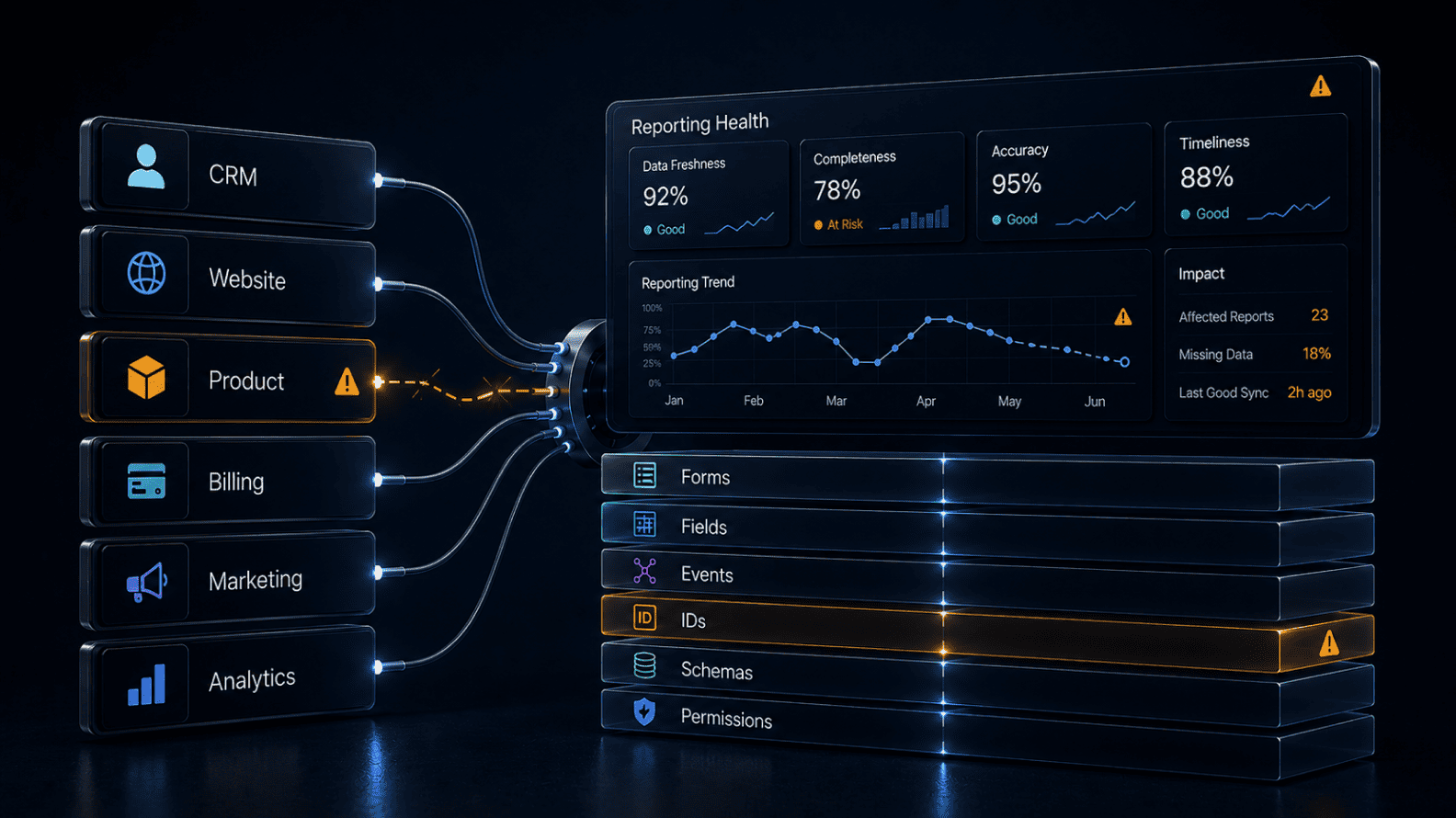
Why Reporting Breaks After Product, CRM, or Website Changes
Jun 26, 2026 / 27 min read
June 26, 2026 / 34 min read / by Team VE

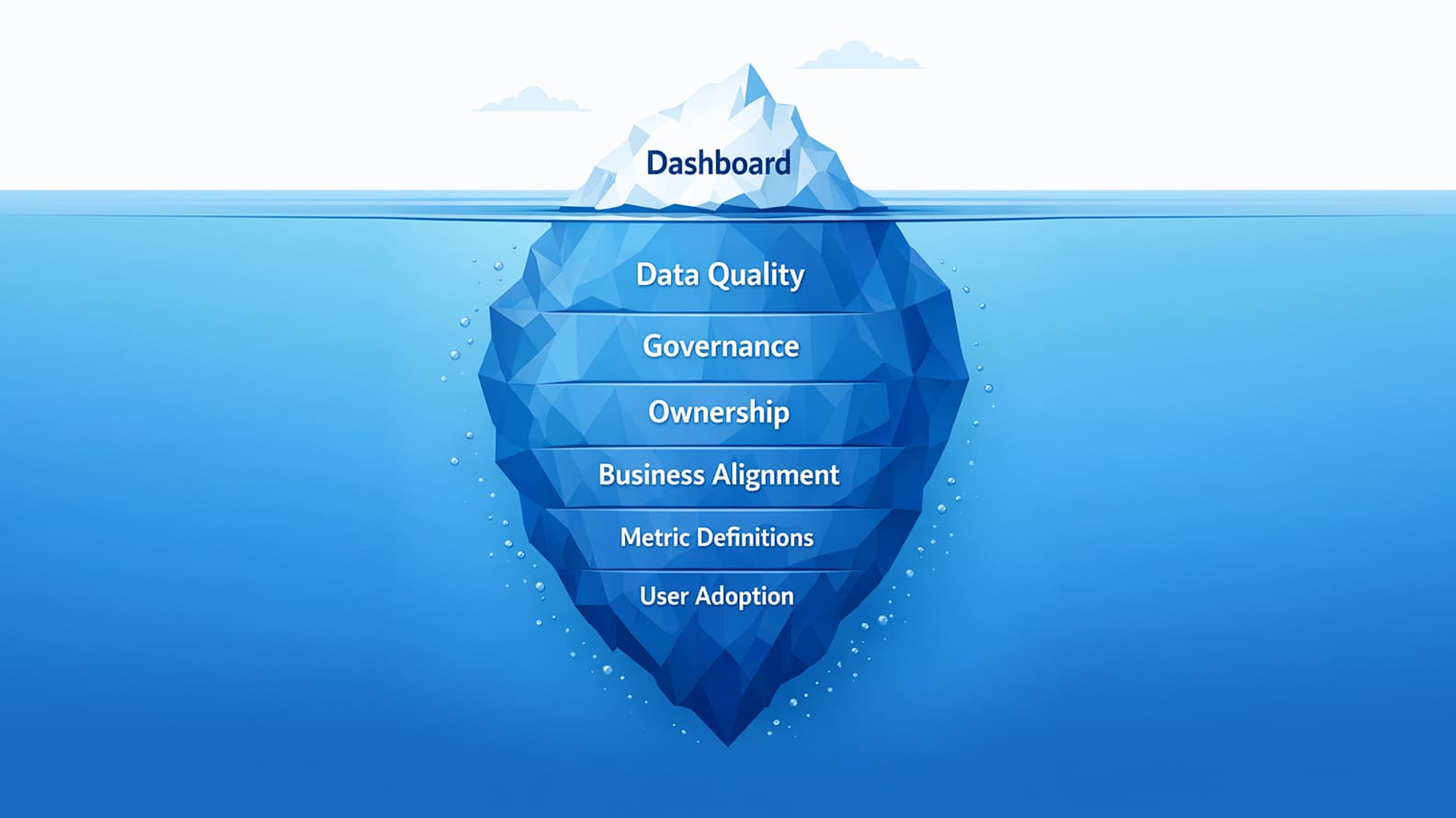
The dashboards that earn trust inside a business are rarely the ones with the most charts. They are the ones whose numbers can withstand difficult questions in important meetings.
Every leadership team has experienced a version of the same moment. Revenue on the dashboard does not quite match finance. Marketing reports strong lead growth, but sales struggles to find the opportunities behind the numbers.
Product usage appears to surge after a release, only for someone to discover that an event started firing twice. The technology is working, the reports are loading, and yet confidence begins to erode because nobody is entirely sure whether the number on the screen still represents reality.
That uncertainty explains why mature analytics teams spend so much time on verification. They reconcile reports with source systems, review individual records, monitor data freshness, investigate anomalies, validate metric definitions with business owners, and keep checking long after a dashboard goes live.
The process looks less like software implementation and more like financial control, because once a number starts influencing budgets, forecasts, hiring plans, or customer decisions, trust in that number becomes a business asset in its own right.
Analytics data verification is the practice of building enough evidence around a number that the business can use it with confidence. That evidence comes from understanding where the data originated, how it moved through systems, how business rules shaped the final metric, and whether the result still reflects what happened in the real world.
Verification combines technical checks with business judgment, which is why finance teams, sales operations, marketers, product managers, and analysts all play a role in deciding whether a dashboard is ready to support important decisions.
In February 2018, the Dutch bank ING paid a €775 million settlement after investigations found serious shortcomings in anti-money-laundering controls, including failures in how unusual transactions were identified and escalated.
The case, later described by the Dutch Public Prosecution Service, was about compliance and financial crime, but it also reflected a broader truth about modern organisations: once a number enters an important decision-making process, people assume that somebody, somewhere, has already verified it. Trust accumulates around systems long before most users understand how the underlying evidence was assembled.
The same instinct exists inside ordinary businesses, albeit with lower stakes. A revenue figure appears in a board deck, a sales pipeline number shapes next quarter’s hiring plans, or a marketing dashboard influences budget allocation for the next campaign cycle.
By the time the discussion reaches senior leaders, the expectation is rarely that the data is perfect. The expectation is that the obvious questions have already been asked, the major inconsistencies have been investigated, and the number represents the business closely enough to support action.
That expectation explains why analytics verification feels closer to internal audit than software testing. The exercise is not about proving that a dashboard works in a technical sense. It is about building confidence that the information survives scrutiny from people who understand the business from different angles.
Finance wants to know how adjustments were handled, sales wants confidence in pipeline quality, marketing wants to understand whether tracking changed after a website release, and operations wants assurance that the underlying workflow still matches the report. Each question adds another layer of evidence around the number itself.
The organisations that handle this well tend to treat verification as an ordinary part of management discipline rather than a specialist data activity. The UK Government’s Data Quality Framework makes a similar point by connecting data quality with accountability, ownership, and fitness for purpose instead of reducing it to technical correctness alone.
The principle travels well beyond government systems. A dashboard earns trust when people know where the number came from, how it was checked, who owns it, and which assumptions sit behind it.
That is why the first serious question in analytics is rarely “Is this dashboard finished?” The more useful conversation begins when somebody asks whether the number would still hold up if an experienced stakeholder challenged it in a room full of decision-makers. Verification exists to make sure the answer is yes.
The same dashboard can feel reliable in one room and dangerously thin in another. A marketing team looking at campaign movement during the day may accept that some conversions are still settling, while a finance team preparing a leadership revenue view will want a much tighter chain of proof around adjustments, credits, recognition periods, and source reconciliation. That difference is why verification begins with the decision the number is expected to support.
The MIT Total Data Quality Management programme has long treated information quality as something tied to use, ownership, and context, which is exactly how analytics works inside a business: the standard of evidence changes when the number moves from exploration into action.
A customer-success alert that flags accounts for outreach needs record-level confidence because one wrongly flagged customer can create unnecessary work and a strange client conversation. A sales forecast needs scrutiny around stale opportunities, owner mapping, close-date discipline, and stage logic because those details shape hiring plans and revenue expectations.
A product dashboard needs confidence in event definitions and identity mapping because roadmap discussions can easily drift if passive usage is mistaken for real adoption. The verification process grows out of those business consequences, rather than from a generic idea of whether the dataset is clean.
This is why mature analytics teams spend time with business owners before they approve the dashboard. They want to know how the number will be used, which edge cases have caused arguments before, what level of uncertainty the team can live with, and which records would immediately damage trust if they appeared incorrectly.
Collibra’s explanation of data quality dimensions makes a useful distinction across accuracy, completeness, consistency, timeliness, validity, and uniqueness, but in a real business those dimensions only become meaningful when connected to the decision at hand.
A missing lead source may be tolerable in early campaign exploration and unacceptable in budget allocation. A delayed support ticket feed may be harmless in monthly reporting and damaging in same-day staffing.
Once that decision context is clear, the checks become more intelligent. Revenue dashboards draw attention to invoices, refunds, currency treatment, and finance sign-off. Sales dashboards push the team toward stale deals, duplicates, missing owners, and stage definitions. Marketing dashboards require tracking QA, lead-source mapping, campaign taxonomy, and CRM handoff review.
Product dashboards lead naturally to event sampling, user identity, release notes, and internal-user exclusions. Verification becomes stronger because the team is no longer testing data in isolation; it is testing whether the number can carry the weight the business is about to place on it.
One of the reasons accountants still perform reconciliations in an age of automated finance systems is that software can move data perfectly and still produce different versions of the same business event.
Anyone who has closed monthly accounts knows the experience: the ledger balances, the bank statement looks right, and yet somebody keeps asking where a particular adjustment came from. The exercise is rarely about finding dramatic mistakes. It is about establishing a shared understanding of which number the organisation considers authoritative.
Analytics teams inherit the same responsibility. A sales dashboard may show 3,200 open opportunities while the CRM reports 3,350. A support dashboard may lag behind the helpdesk platform because one ticket channel updates differently from the others.
Revenue figures in BI tools may diverge from accounting systems because refunds, tax treatment, or currency adjustments follow business rules that live outside the raw transaction data. None of these situations automatically signals a problem, but every difference deserves an explanation that people can understand and defend in a meeting.
This instinct is deeply embedded in financial practice. The Association of Chartered Certified Accountants (ACCA) treats reconciliation as a core control because organisations need confidence that reports remain connected to the systems that create economic reality in the first place.
The same principle applies to analytics. A dashboard earns trust when users know how it relates to the system of record and why any intentional differences exist.
The explanation often matters more than the match itself. A pipeline dashboard may exclude opportunities that have remained untouched for six months because sales leadership agreed that inactive deals distort forecasting. A finance report may present net revenue after credits and refunds because that is the figure leadership uses for planning.
A product dashboard may remove internal employee activity to keep usage patterns closer to customer behaviour. These choices are perfectly reasonable, provided somebody can explain them without opening three different spreadsheets and reconstructing the logic on the spot.
Companies that do this well build a habit of asking a simple question whenever a new dashboard goes live: if the business owner compares this report with the original system tomorrow morning, what differences will they see, and will those differences make sense to them?
The answer becomes the first layer of confidence around the numbers, because reconciliation is rarely about proving perfection. It is about making sure everyone starts from the same version of reality before more sophisticated analysis begins.
Large numbers create an impression of certainty that individual records often challenge. A dashboard may report ten thousand new leads for the quarter, yet a closer look at a handful of records can reveal missing source fields, duplicated submissions, incorrect campaign attribution, or opportunities that were never meant to enter the funnel in the first place. The aggregate looks convincing because aggregation naturally smooths over the awkward details that live underneath it.
Healthcare researchers have understood this instinct for decades. The Johns Hopkins Armstrong Institute for Patient Safety and Quality places enormous emphasis on chart reviews and case-level examination because broad statistics rarely tell the whole story about how systems behave in practice.
Analytics teams face a similar challenge. Looking at individual invoices, tickets, orders, product events, or customer records often reveals patterns that no summary metric would ever make obvious.
The value of sample checking comes from returning the discussion to something tangible. A revenue figure becomes easier to trust when analysts can trace a handful of large invoices through billing, refunds, currency treatment, and recognition rules. A sales pipeline feels more credible when someone reviews old opportunities, recently reopened deals, and accounts with unusual ownership histories.
Marketing teams gain confidence when they inspect leads from new landing pages instead of relying entirely on campaign totals, while product teams frequently discover instrumentation issues only after following specific user journeys through the event stream.
Experienced teams rarely depend on purely random samples. They deliberately seek out the records that carry the greatest business risk or the highest chance of disagreement. Large transactions receive attention because they influence financial outcomes disproportionately. Recently changed records deserve scrutiny because process updates often introduce unexpected behaviour.
Edge cases matter because leadership meetings almost always revolve around exceptions rather than averages. The purpose is not to inspect every row in a warehouse. It is to build enough evidence that the numbers hold together when someone inevitably asks for an example behind the metric.
That habit changes the tone of analytics conversations. Instead of defending abstract totals, teams can point to real customers, real invoices, real opportunities, and real product interactions. The dashboard remains important, but confidence increasingly comes from knowing that the business objects underneath it tell the same story as the charts on the screen.
Most business users notice bad data when the number looks strange. Stale data is harder to detect because the number often looks perfectly reasonable. Yesterday’s revenue still resembles today’s revenue, the support queue still contains tickets, and the sales pipeline still appears healthy enough to survive a quick glance in a leadership meeting. The problem emerges later, when people discover that the business moved faster than the dashboard tracking it.
The airline industry has lived with this reality for decades. Operational control centres depend on information that changes by the minute, which is why the International Air Transport Association’s guidance on operational data management places such emphasis on timeliness and data availability.
A maintenance report that arrives hours late may still be accurate in a technical sense, yet its value to decision-makers diminishes rapidly once conditions on the ground have changed. Business analytics works in much the same way. The usefulness of a number depends partly on how closely it reflects the moment in which people need to act.
Different decisions naturally demand different standards. A finance dashboard supporting month-end reporting can wait until adjustments, refunds, and reconciliations are complete because stability matters more than speed. Marketing teams monitoring campaigns throughout the day often accept that conversion data will settle over time, provided everyone understands the lag.
Customer-support leaders making staffing decisions need fresher information because a backlog that existed six hours ago may bear little resemblance to the situation unfolding right now. The context determines what “fresh enough” actually means.
Experienced analytics teams therefore pay close attention to the movement of data through the entire chain rather than focusing only on the dashboard refresh time. A report may update at nine in the morning while one of its source systems is still carrying yesterday’s records.
A CRM sync may complete successfully even though a downstream transformation failed overnight. A payment platform may have processed refunds that have not yet appeared in revenue reporting. The number on the screen remains coherent, but the story behind it has already begun to drift away from current business conditions.
The strongest organisations make freshness visible instead of assuming users will infer it. The Data Governance Institute’s work on data quality and stewardship highlights timeliness as one of the fundamental characteristics of trustworthy information, precisely because decisions lose value when they depend on outdated context.
Good dashboards therefore communicate when critical sources were last updated, whether the reporting period is final or still evolving, and which parts of the data ecosystem may still be catching up. Those small signals help business users understand not only what the number says, but also how confidently they should act on it at that particular moment.
Growth numbers carry a certain emotional weight inside organisations. More leads, more customers, more orders, more active users, more tickets resolved, more product engagement. When those figures move in the right direction, people naturally look for explanations in campaigns, strategy, execution, or market conditions. Duplicate data complicates that story because it can create the appearance of momentum without anyone deliberately manipulating the numbers.
The challenge is familiar in many industries. The World Health Organization’s guidance on health information systems repeatedly emphasises the importance of unique identifiers because duplicate patient records distort planning, resource allocation, and outcomes measurement.
Business systems face a similar problem. A customer appearing twice in a CRM, an invoice loaded multiple times after an integration retry, or an event firing repeatedly after a product release can all reshape the picture that leaders see when they open a dashboard.
The mechanics are rarely dramatic. A prospect submits two forms using slightly different email addresses and enters the funnel twice. A sales representative creates a new opportunity because the original record is difficult to find. A payment system retries a transaction and sends duplicate events downstream.
A support issue arrives through chat and email, creating two tickets for the same customer problem. Individually, these cases seem small. At scale, they influence the metrics that organisations use to judge performance, forecast growth, and allocate investment.
Different parts of the business also define uniqueness in different ways, which makes duplicate checking more nuanced than simply removing repeated rows. Finance teams usually care about invoice IDs and transaction identifiers. Sales organisations focus on opportunities, accounts, and customer ownership.
Marketing teams worry about email addresses, campaign responses, and lead attribution. Product analytics depends on user identities, account relationships, and event streams that connect behaviour across devices and sessions. The validation process follows those business definitions because each one shapes a different decision.
The Data Management Association’s DAMA-DMBOK framework treats uniqueness as one of the foundational dimensions of data quality for precisely this reason. Reliable information depends on knowing what should exist once and how the organisation recognises that object across systems.
Companies that take this seriously spend less time explaining unexpected spikes in performance and more time understanding the genuine changes happening in the market, because the numbers in front of them reflect actual business activity rather than accidental repetition hidden inside the data pipeline.
Some data problems do not announce themselves through broken fields or failed pipelines. They arrive as numbers that are technically valid and commercially strange. A lead source suddenly shifts towards “Unknown” after a website update. Support tickets from one channel fall sharply while every other channel looks normal.
Product events double after a release even though traffic has not changed. Revenue drops in one currency while the rest of the business remains steady. These movements can be real, but they deserve attention because they do not fit the pattern the business has learned to expect.
Financial markets offer a useful parallel. Exchanges and regulators use surveillance systems because unusual trading behaviour can emerge in forms that fixed rules alone may not catch.
Nasdaq describes its market surveillance technology as a way to detect unusual activity across large volumes of transactions, which is the same basic instinct analytics teams need when they monitor business data. A system can pass ordinary validation checks and still produce movement that feels wrong when viewed against history, seasonality, traffic levels, or known business events.
Anomaly review works because it treats historical behaviour as part of the evidence. If weekday lead volume normally sits within a stable range and suddenly drops by 70 percent, the team needs to know whether demand collapsed, tracking broke, a form stopped submitting, or a campaign paused.
If product usage jumps on the same day a release changed event logic, the rise may say more about instrumentation than adoption. If direct traffic grows sharply after a domain migration, the explanation may sit in referral loss rather than brand demand. The number becomes more useful once the team understands which story explains the movement.
Companies increasingly support this work with observability tools, but the judgment still matters. The Google Cloud architecture guidance on data quality and data observability connects reliability with monitoring for issues such as freshness, completeness, consistency, and unusual patterns, which is helpful because analytics failures often surface as changes in shape rather than obvious errors. A dashboard may continue to refresh while one category collapses, one source stops sending records, or one field begins filling with unexpected values.
The best anomaly reviews are calm rather than alarmist. They do not treat every spike as a crisis or every dip as a broken system. They ask whether the movement has a credible business explanation, whether a technical change happened around the same time, and whether the affected metric is important enough to pause decisions until the cause is clear. That habit protects companies from reacting too quickly to measurement noise and from missing real operational changes that deserve attention.
Analytics teams spend their time thinking about schemas, joins, refresh schedules, event structures, and transformation logic. Business teams spend their time thinking about customers, quotas, refunds, campaigns, product releases, and operational pressure. Both perspectives are essential because the meaning of a number often depends on context that never appears in the warehouse itself.
Anyone who has worked through a quarterly review has seen this happen. Sales notices that pipeline quality changed because qualification criteria were tightened earlier in the month. Finance explains that revenue movement reflects a wave of credit notes from a large customer renewal.
Marketing points out that lead attribution shifted after campaign taxonomy was standardised across regions. Product teams remember that an onboarding flow was redesigned, changing how activation events should be interpreted. The dashboard captures the result, but the people closest to the work understand the story behind the movement.
The importance of domain expertise has been well established outside analytics as well. The National Academies of Sciences report on data governance and stewardship emphasises that reliable information systems depend on the people who create, interpret, and use the data, not simply on technical controls. Business analytics follows the same principle. Numbers gain meaning through the operational knowledge that surrounds them.
This is why experienced teams bring business owners into the validation process long before a dashboard reaches a wider audience. Instead of asking whether a report “looks right,” they walk through real examples and edge cases. Which opportunities should count towards the pipeline? How should reopened deals appear?
When does a paused subscription become churn? Should refunded revenue reduce the original period or the current one? Does a login event represent genuine product adoption, or is it simply a routine action that inflates engagement metrics? Those conversations surface assumptions that rarely emerge from SQL queries or automated tests alone.
The strongest dashboards therefore carry something more valuable than technical correctness. They reflect a shared understanding between analysts and the people who run the business every day. When that alignment exists, meetings spend less time debating definitions and more time discussing actions, priorities, and trade-offs.
Trust develops because everyone involved recognises their own reality in the numbers on the screen, and that recognition is often the difference between a dashboard that gets admired and one that genuinely influences decisions.
Manual validation becomes fragile once dashboards multiply. A company may begin with one trusted revenue report, then add sales pipeline, campaign performance, customer health, product usage, support operations, finance variance, and leadership scorecards, each drawing from different systems and changing at different speeds.
At that point, trust cannot depend on one analyst remembering to check every table, every field, every duplicate pattern, and every refresh window before a meeting. The verification habit has to become repeatable enough that important failures are caught before users find them in the dashboard.
This is where automated data-quality checks earn their place. Amazon’s open-source Deequ library was built to define and test expectations around large datasets, including checks for completeness, uniqueness, and distribution changes, which is exactly the kind of discipline analytics teams need when business reporting depends on pipelines that run every day.
A rule can catch a missing customer ID, a sudden rise in null values, a duplicate invoice key, or a product-event volume that has moved outside its normal range long before the issue becomes a leadership debate.
Automation is strongest when the failure pattern is known. If invoice IDs should be unique, the system can test uniqueness. If revenue cannot be negative unless the record is marked as a refund or credit, the rule can check that condition. If a source table usually receives new data by 7 a.m., the pipeline can flag a late arrival.
If a product event normally sits within a stable range, a sudden movement can be marked for review. These checks reduce the amount of routine checking humans have to do, which gives analysts more time to investigate the cases where judgment matters.
The judgment layer remains important because real business movement often looks unusual before anyone has named it. A revenue spike may come from a genuine enterprise deal, a duplicated load, a currency conversion issue, or a migration record that should have been excluded.
A fall in support tickets may reflect improved product quality, a broken channel integration, or a process change that moved issues elsewhere. The ISO/IEC 25012 data quality model is useful here because it treats quality through multiple characteristics such as accuracy, completeness, consistency, credibility, and currentness, reminding teams that validation is broader than a pass-fail technical test.
The best analytics teams use automation as an early-warning system rather than a substitute for thinking. Machines catch the patterns that can be expressed clearly, while analysts and business owners examine the movements that need context. That balance keeps verification practical at scale without turning dashboards into black boxes that everyone trusts until the first serious question exposes a gap.
The final review before a dashboard goes live often tells you more about an organisation’s relationship with data than the technology stack underneath it. Some teams treat approval as a visual exercise, checking whether filters work, charts render correctly, and stakeholders like the layout.
Others approach the moment with the same seriousness they would bring to a financial report, asking how the number was built, which assumptions sit behind it, and whether the business is prepared to act on what it sees.
That instinct has parallels in other high-reliability environments. The aviation industry relies heavily on pre-flight checklists, not because pilots lack expertise, but because complex systems benefit from deliberate verification before decisions carry real-world consequences.
The Federal Aviation Administration’s guidance on risk management and safety assurance follows the same philosophy. All important actions deserve a structured review process that reduces the chance of avoidable mistakes.
Business dashboards operate on a different scale, yet they influence budgets, forecasts, customer outreach, hiring plans, and operational priorities, which makes a thoughtful approval process equally valuable.
The checks themselves vary according to the purpose of the report. A sales dashboard needs confidence that pipeline stages reflect agreed definitions, stale opportunities are handled consistently, ownership mappings are current, and CRM totals reconcile with reporting logic.
Finance teams care about period definitions, adjustments, credits, refunds, currency treatment, and sign-off from the people responsible for the numbers. Marketing dashboards require confidence in attribution rules, lead-source mapping, campaign taxonomy, website tracking, and CRM handoffs. Product teams spend time reviewing event definitions, identity resolution, internal-user exclusions, and changes introduced through recent releases.
Experienced organisations also document the assumptions that future users might otherwise rediscover through argument. The Data Governance Institute’s stewardship framework emphasises clarity around ownership, accountability, and decision rights because trust becomes more durable when people understand who approved the metric, which system serves as the source of truth, and how exceptional cases are handled.
A dashboard that carries this context tends to survive leadership scrutiny far more comfortably than one that depends on institutional memory or a single analyst’s explanations.
The approval process does not need to become bureaucratic. It simply needs to leave behind a clear answer to a few important questions. What was tested? Which business owner reviewed the logic? What limitations still exist?
When should the dashboard be reviewed again? Those answers create continuity long after the launch meeting ends, allowing future teams to inherit confidence instead of rebuilding it from scratch every time a critical number comes under scrutiny.
A dashboard can be correct on the day it is approved and still become unreliable a month later. The source system changes, a CRM field is renamed, a website form is redesigned, a finance adjustment rule is updated, a product event is modified during a release, or a pipeline begins arriving later than it used to. None of these changes necessarily breaks the dashboard in an obvious way, which is why verification has to continue after launch.
Engineering teams understand this idea well because software health is watched continuously once a system enters production. The Google SRE book describes monitoring as the practice of collecting, processing, aggregating, and displaying real-time quantitative data about a system, and analytics data needs a similar habit once reports become part of business decision-making.
A dashboard that influences revenue reviews, staffing plans, campaign budgets, or customer outreach should not depend on users noticing problems by accident during a meeting.
Ongoing monitoring usually begins with the failure patterns most likely to damage trust. Freshness matters because late source data can make a current report behave like an old one. Row volume matters because a sudden drop may indicate a broken feed rather than a real business slowdown.
Schema changes matter because one renamed field can quietly damage downstream logic. Null spikes, duplicate increases, rejected records, strange category movement, and unusual metric shifts all deserve attention because they often reveal problems before stakeholders feel the impact.
The challenge is that business processes keep changing faster than documentation. Sales teams adjust qualification rules, marketing updates campaign taxonomies, finance changes how a class of adjustments is treated, product teams redesign flows, and operations teams introduce new ticket categories.
If monitoring only checks whether pipelines run, it will miss the richer forms of drift that emerge when the business changes how data is created. Reliable analytics monitoring therefore combines technical signals with periodic business review, so the system keeps reflecting how the company actually works.
The payoff is felt in the meetings that never become arguments. A team catches a late CRM sync before the pipeline review begins. A null spike in lead source is investigated before the campaign report reaches leadership. A duplicate invoice load is flagged before revenue appears inflated.
A product-event change is reviewed before adoption metrics are presented as growth. Good monitoring gives the business a quieter kind of confidence: fewer surprises, fewer defensive explanations, and a stronger sense that the dashboard is still earning the trust placed in it.
The best validation workflows feel less like compliance theatre and more like good editorial judgment applied to numbers. Before a report is allowed to influence decisions, someone has to understand the story it is telling, check whether the evidence supports that story, and make sure the people who know the business recognise what they see. When that discipline is missing, dashboards can become persuasive long before they become reliable.
A practical workflow usually begins with the decision the dashboard will support, because that decision determines the level of proof required. From there, the team identifies the source systems, compares the dashboard against those systems, follows selected records through the logic, checks whether the data is fresh enough, investigates duplicates and anomalies, and asks the business owner to review the meaning.
The European Central Bank’s data quality framework for statistics is useful here because it treats quality as a combination of accuracy, reliability, timeliness, consistency, and fitness for purpose, which is much closer to how business users experience trust than a narrow technical pass or fail.
The workflow also needs to preserve memory. A dashboard approved today should not depend entirely on the analyst who built it remembering why certain records were excluded or why one source was chosen over another.
Validation notes, ownership details, known limitations, sign-off history, and change records give future users a way to understand the report without reconstructing the entire project from old messages and spreadsheet comments. That memory becomes especially valuable after team changes, system migrations, website releases, or metric-definition updates.
For high-impact dashboards, the workflow should leave behind enough evidence for someone to answer serious questions calmly. If revenue differs from the billing platform, the team can explain the treatment of credits, refunds, taxes, timing, or currency.
If pipeline differs from the CRM, the team can point to stale-deal rules, stage mapping, or duplicate handling. If marketing conversions move after a website change, the team can show tracking checks and lead-source validation. The value lies in removing panic from the moment when the number is challenged.
Companies that treat validation this way usually move faster over time, even if the first review takes longer. They avoid rebuilding trust from scratch before every leadership meeting, reduce the number of private spreadsheets created for reassurance, and give business users a clearer sense of which numbers are ready for action. Verification becomes part of the operating rhythm rather than a rescue exercise after someone says the dashboard looks wrong.
Companies verify analytics data by building evidence around the number before they let it influence decisions. The usual work includes comparing dashboard totals with source systems, reviewing individual records, checking whether data arrived on time, looking for duplicates, investigating unusual movement, confirming the metric definition with the business owner, and continuing to monitor the dashboard after launch.
The seriousness of the check depends on the decision. A leadership revenue dashboard needs stronger proof than an exploratory campaign view, while a customer-risk alert needs record-level confidence because it may trigger action against a specific account. The best teams do not treat every report the same. They match the verification standard to the business consequence of getting the number wrong.
Source reconciliation means comparing the dashboard with the system that originally owns the data. A CRM pipeline dashboard may be compared with CRM opportunity totals, a revenue dashboard with billing or accounting data, a support dashboard with the helpdesk system, and a marketing dashboard with website forms or CRM lead records. When numbers differ, the team needs a clear explanation that users can understand.
A difference is not automatically an error. The dashboard may apply agreed business logic, such as excluding inactive opportunities, removing internal test users, or showing net revenue after refunds and credits. Reconciliation becomes valuable because it makes those differences visible and explainable before stakeholders discover them in a meeting.
A dashboard can look fine because the BI tool is doing its job: loading charts, applying filters, and displaying the data it receives. The problem may sit earlier in the chain. A source sync may be stale, a transformation may apply the wrong logic, a join may duplicate records, a field may have changed, or a tracking event may have started firing differently after a release.
That is why dashboard accuracy cannot be judged from the surface alone. The number has to be traced back through the source, pipeline, model, definition, and business rule that created it. A clean interface can still carry weak data if the system behind it has not been checked properly.
Sample checks involve reviewing selected records behind a dashboard total to see whether the aggregate number is built from real business objects that make sense. An analyst may inspect invoices behind revenue, opportunities behind pipeline, leads behind campaign performance, tickets behind support metrics, or product events behind usage numbers.
These checks matter because totals can hide record-level problems. A dashboard may reconcile at a high level while specific records contain missing fields, incorrect mappings, duplicate entries, edge-case errors, or wrong date logic. Reviewing real records brings the validation closer to how the business actually operates.
Freshness matters because a number can be technically correct and still arrive too late for the decision being made. A support dashboard used for staffing needs recent data, while a finance dashboard used after month-end close may prioritise completeness and reconciliation over speed. The same delay can be harmless in one context and damaging in another.
Good dashboards make freshness visible. Users should know when important source systems last updated, whether downstream models refreshed after the source data arrived, and whether the period they are looking at is final or still settling. That context helps people decide how confidently they should act on the number.
Duplicate records can make performance look stronger or weaker than reality. Duplicate leads may inflate demand, duplicate invoices may overstate revenue, duplicate product events may exaggerate usage, and duplicate support tickets may distort workload. The dashboard may count everything correctly from a technical perspective while still misrepresenting the business because the underlying entities were repeated.
Duplicate validation depends on what the business is measuring. Finance may care about invoice IDs, sales may care about opportunity IDs, marketing may care about lead emails and campaign responses, and product teams may care about user IDs, account IDs, or event uniqueness. The right duplicate check begins with knowing what should exist only once.
Anomaly review looks for unusual movement that fixed validation rules may miss. A field may suddenly fill with “Unknown,” one region may drop sharply, product events may double after a release, or direct traffic may rise after a domain change. The values may be valid in a technical sense, but their movement deserves investigation because it does not match normal business behaviour.
The purpose is to understand whether the anomaly has a business explanation or a data-system explanation. A real campaign launch, pricing change, product update, customer churn event, or operational shift can all create unusual movement. So can broken tracking, delayed pipelines, schema changes, duplicate loads, or missing fields. Anomaly review helps teams separate signal from measurement noise before decisions are made.
Approval should include both the analytics team and the business owner responsible for the metric. Data teams can validate structure, joins, freshness, lineage, transformations, and technical checks. Business owners understand the practical meaning of the number, including edge cases, exclusions, process changes, and the decisions the dashboard is meant to support.
For example, finance should review revenue logic, sales operations should review pipeline logic, marketing should review lead-source and campaign logic, product should review event definitions, and support leaders should review ticket and SLA logic. A dashboard becomes more trustworthy when the people who understand the business recognise their reality in the numbers.
Repeatable checks should be automated wherever possible because manual validation becomes fragile as dashboards multiply. Freshness checks, duplicate checks, null thresholds, accepted values, schema changes, row-count movement, and basic distribution checks can often run without waiting for someone to remember them before a meeting.
Automation still needs human judgment around interpretation. A revenue spike may be a real enterprise deal, a duplicate load, a currency problem, or a migration issue. A fall in support volume may reflect better product quality or a broken intake channel. Automated checks are strongest when they alert people early enough to investigate, not when they are treated as a replacement for business review.
Before approving a dashboard, companies should check whether the report reconciles with the source system, whether individual records behave as expected, whether data is fresh enough, whether duplicates are controlled, whether anomalies have been reviewed, whether definitions match business meaning, and whether a responsible stakeholder has signed off on the logic.
The approval should also leave behind a small record of what was tested, what passed, what limitations remain, who owns the metric, and when the dashboard should be reviewed again. That record helps future users trust the report without having to rebuild the entire verification story from scratch.
Jun 26, 2026 / 27 min read

Jun 26, 2026 / 28 min read
Jun 26, 2026 / 35 min read