Why Marketing, Sales, And Finance Reports Do Not Match
Aug 04, 2026 / 27 min read
A trustworthy dashboard is not the one that looks the cleanest. It is the one whose numbers can survive a serious question from finance, sales, operations, marketing, customer success, or leadership.
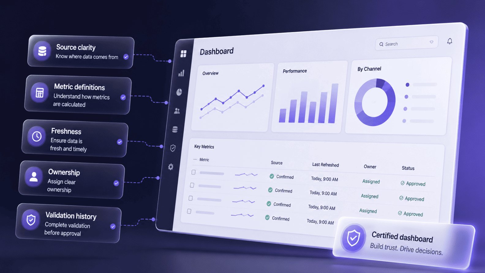
A dashboard becomes trustworthy when users can understand where the data came from, how the metric was calculated, when the data refreshed, what filters or exclusions apply, who owns the number, and what validation happened before the dashboard was approved. Visual design matters, but only after the number has earned confidence.
Many dashboards fail because they look finished before the reporting logic is ready. A revenue chart can hide a bookings-versus-recognized-revenue dispute. A lead dashboard can mix raw enquiries with qualified pipeline. A product dashboard can count logins when the business actually needs meaningful usage. The screen looks calm while the system behind it carries risk.
Trust is a chain. Source systems, pipelines, warehouses, semantic models, dashboards, ownership, access rules, validation checks, and change history all have to work together. A working draft can help an analyst explore a question, but a certified leadership dashboard needs stronger proof.
A trustworthy dashboard is a reporting view whose source, metric logic, refresh timing, filters, ownership, access rules, validation history, and intended decision are clear enough for users to rely on it without guessing. It does not need to answer every question. It needs to answer its intended question reliably.
A dashboard should be treated with caution after CRM migrations, ERP upgrades, KPI definition changes, product event changes, ETL failures, schema changes, data backfills, or open data incidents. It can still load and display familiar numbers, but the business should not assume the dashboard is safe until the affected sources, metrics, filters, and refresh jobs have been reviewed again.
A dashboard often earns confidence too early. It lands in a review with clean KPI cards, a neat trend line, a few filters, and a familiar company logo. The report opens quickly, the charts respond, and the room feels as if the business has finally brought order to the mess of systems underneath. The danger is that the screen can look finished while the reporting chain behind it is still fragile.
Then the first serious question arrives. Finance asks whether revenue means booked, billed, collected, or recognized. Sales asks why pipeline does not match the CRM view. Marketing asks whether duplicate form fills were removed.
Customer success asks why churn is counted by cancellation date instead of contract-end date. Operations asks whether every support channel is included. The dashboard has not visibly broken, but confidence starts to weaken because the report cannot explain itself.
Dashboards carry authority. Users assume someone checked the source, approved the formula, tested the refresh, and made the filters obvious. When those assumptions are wrong, the dashboard becomes a confidence machine for a weak number. The risk is not theoretical.
In 2020, Public Health England said 15,841 COVID-19 cases were missing from daily reported figures because of a technical issue in the data load process. Most companies are not making public-health decisions, but the reporting lesson travels well: a silent break upstream can leave the final dashboard looking more trustworthy than it really is.
A useful trust model starts before the dashboard: Source system -> data pipeline -> data warehouse -> semantic layer or modeled dataset -> dashboard -> business decision. A break at any layer can change the final number.
A CRM field may be renamed, a source table may arrive late, a transformation may duplicate records, a semantic model may use the wrong date, or a dashboard may hide an important exclusion. The chart can still render while the decision becomes unsafe.
Consider a sales forecast dashboard. Opportunities begin in the CRM, move through a pipeline into the warehouse, get cleaned into stage and owner logic, then become measures such as weighted pipeline, stale deals, win rate, and forecast category. If the dashboard does not tell users which source and model it uses, they may compare it with a finance report that answers a different question. Difference is not the enemy. Unexplained difference is.
A trustworthy dashboard gives business users enough traceability without drowning them in engineering detail. It should show which source owns the number, whether the model is approved, when the data refreshed, what period is provisional, and which decision the dashboard is fit to support.
A dashboard should never make users guess where the number came from. CRM data is usually closer to sales activity. Billing data is closer to invoices. Finance data is closer to recognized revenue and close controls. Product-event data is closer to usage. Support platforms are closer to ticket behavior. Website analytics are closer to traffic and acquisition. The source decides what the metric can safely mean.
Crowded BI environments make this harder because users often see several reports with similar names. Microsoft explains that Power BI endorsement helps users find trustworthy and authoritative content when organizations have large amounts of BI content available for sharing and reuse.
That is a practical business problem, not just a product feature. When dashboards multiply, users need signals that tell them which reports are official, which are departmental, and which are experimental.
Source clarity does not need to look technical. A sales report may say, “Source: CRM opportunities, refreshed hourly, excludes test accounts.” A finance report may say, “Source: finance system, recognized revenue after monthly close.” A marketing dashboard may say, “Source: ad platforms and CRM campaign mapping, current month provisional.” Those notes protect decisions because they stop users from treating every familiar label as the same business truth.
A dashboard is not trustworthy because it shows a metric. It becomes trustworthy when the metric is defined well enough that two analysts would calculate the same result from the same source. Revenue, lead, customer, conversion, churn, margin, utilization, active user, retention, and pipeline all look obvious until different teams use them in different ways.
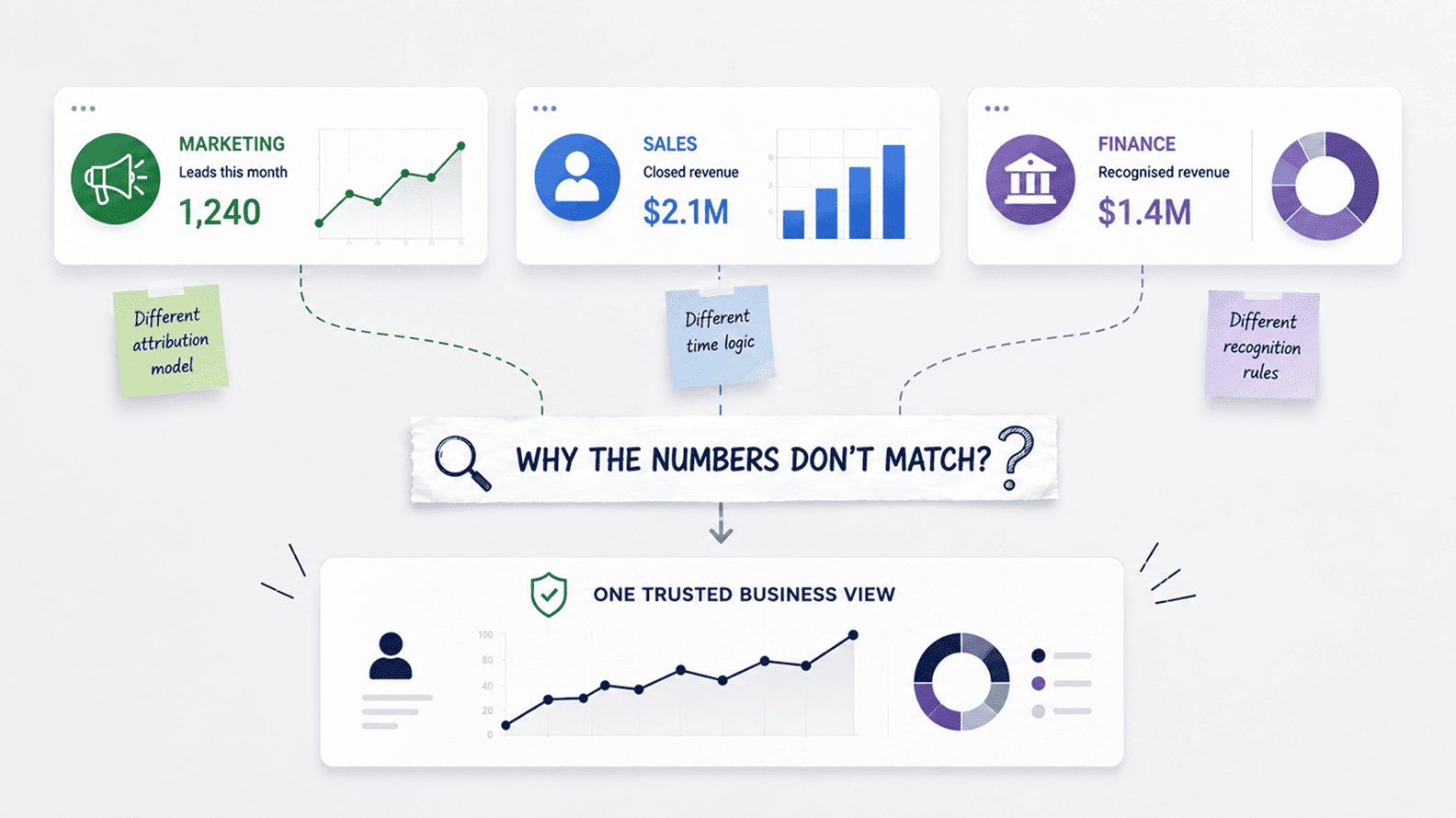
Revenue is the cleanest example. Sales may use booked revenue by close date because it helps forecast work and commissions. Finance may use recognized revenue by accounting period because it supports reporting discipline.
Leadership may ask about collected cash because liquidity matters. Delivery may look at gross margin because a big deal can raise revenue while straining capacity. The dashboard label says revenue, but the meeting contains several different business events.
Semantic consistency matters because dashboards become fragile when every report rebuilds the same KPI separately. Google Cloud has argued that Looker semantic modeling helps define governed business logic so users and AI systems work from trusted definitions rather than infer meaning from raw tables. The tool is less important than the principle: official metrics should not be reinvented inside every dashboard.
| Metric element | What users need to know | Why it protects trust |
| Formula | The exact calculation used for the KPI. | Stops teams from rebuilding the same label differently. |
| Source | The approved system, table, model, or dataset. | Prevents CRM, finance, product, and marketing numbers from being treated as interchangeable. |
| Date logic | The date field and reporting period used. | Prevents close-date, invoice-date, created-date, and recognition-period disputes. |
| Scope | Which records count and which records are removed. | Makes exclusions such as refunds, test records, duplicate leads, internal users, or spam tickets visible. |
| Owner and use case | Who approves the definition and which decision it supports. | Prevents directional metrics from being used as official leadership numbers. |
A dashboard number without freshness context is unfinished. CRM data may refresh every hour, billing data may load overnight, product events may stream continuously, finance numbers may become official only after close, and ad platforms may revise attribution after the first report is pulled. When these numbers sit together, users may assume they are equally current. They rarely are.
Freshness changes the decision. A same-day campaign dashboard can help a marketing team catch tracking problems, but it should not be treated like a final acquisition-cost report. A support dashboard used for staffing needs near-current ticket data. A board dashboard needs stable numbers and clear close rules. A revenue dashboard may need separate labels for current-month estimate and finance-approved actuals.
Filters create the same issue. A dashboard may exclude refunds, closed-lost opportunities, internal users, spam tickets, duplicate leads, trial accounts, inactive customers, or cancelled invoices. Those exclusions may be correct, but they should not be hidden. A simple note such as “Current month is provisional; internal users, test accounts, spam leads, and cancelled invoices are excluded” can prevent a meeting from treating a governed slice as the whole universe.
A dashboard should leave evidence that it was checked. Pre-launch testing should include source reconciliation, sample-record checks, duplicate checks, date-logic checks, filter checks, access checks, and owner approval. A finance dashboard should reconcile with finance-approved totals or clearly explain differences.
A marketing dashboard should be checked against form submissions, campaign mapping, and CRM lifecycle stages. A product dashboard should be validated against event tracking and identity resolution.
Validation should continue after launch because dashboards decay when systems change. A field is renamed, an ETL job fails, a source API changes, a product event is replaced, a CRM migration alters history, or a data backfill restates numbers. Important dashboards need monitoring for refresh failures, schema changes, row-count drops, null spikes, duplicate growth, and unexpected KPI movement.
Great Expectations describes a validation workflow in which checkpoints validate data, save validation results, run configured actions, and create Data Docs. A company may use another tool, but the operating idea is valuable: validation should create a record another person can inspect later. “We checked it” is much weaker than visible evidence of what was checked, when, and by whom.
Dashboards age even when nobody edits them. Sales stages change, products are renamed, pricing changes, regions are added, campaign taxonomy shifts, finance rules change, CRM fields are retired, and product events are replaced. The dashboard still opens, which is precisely why orphaned dashboards are dangerous. Availability does not prove the logic is current.
A trustworthy dashboard needs a metric owner, source owner, and report steward. The metric owner approves business meaning. The source owner understands the system where data is created. The steward maintains usability, documentation, refresh health, access, and lifecycle.
Tableau defines governance as the combination of controls, roles, and repeatable processes that creates trust and confidence in data and analytics, which captures why dashboard trust is organizational as much as technical.
High-value dashboards should be reviewed on a schedule and after major business or system events. Quarterly review may be enough for many management dashboards. Finance, board, customer-reporting, and revenue dashboards may need tighter review around close cycles.
Any dashboard affected by a CRM migration, ERP upgrade, schema change, KPI revision, data incident, or product-event change should be reviewed before users treat it as official again.
Dashboard trust also depends on who can see, edit, export, and reuse the data. A report may contain customer-level revenue, sales rep performance, margin, employee information, renewal risk, support issues, or product usage tied to named accounts.
If access is loose, the dashboard becomes a confidentiality and compliance risk. If access is too restrictive, teams create side reports and spreadsheet copies, weakening governance from the other direction.
Good access control follows the sensitivity of the data and the decision. Leadership may see company-wide revenue, regional managers may see their region, sales reps may see their own accounts, finance may see margin and adjustments, and marketing may see campaign performance without sensitive customer-level finance fields.
Microsoft explains that Power BI row-level security restricts data access for specific users of a semantic model by applying filters at the row level, which is one practical version of a broader trust principle.
AI assistants and self-service analytics make these controls more important. If users can ask natural-language questions over BI models or create their own reports from certified datasets, the business needs stronger source, metric, and permission boundaries. Exploration is useful only when it happens inside a governed environment.
Design still matters because trustworthy data can be made confusing by a bad interface. Too many metrics, unclear labels, poor hierarchy, hidden filters, cluttered drill-downs, and weak grouping all damage adoption. Users may stop trusting a dashboard simply because they cannot tell what matters or because every click feels like a guessing game.
But design cannot compensate for weak data controls. A beautiful revenue trend with undefined logic is still ambiguous. A clean KPI card showing stale data is still stale. A polished usage dashboard with internal users included is still misleading. Design earns its place after source clarity, metric definition, validation, ownership, freshness, scope, and access are handled.
A trustworthy design moves the user from number to decision. It puts the most important metric first, gives context around movement, makes filters visible, labels provisional periods, separates monitoring from certified reporting, and avoids false precision. Directional data should not be dressed like audited finance. Partial-week data should not be compared casually with full prior weeks.
A dashboard should not become official simply because it was published. Before a report is used for leadership, finance, sales, marketing, operations, customer reporting, or staffing decisions, it should pass a basic acceptance standard. The point is not to slow work down. It is to stop dashboards from becoming official by accident.
| Trust factor | Acceptance question | What good looks like |
| Source clarity | Can users see where the data comes from? | Source system, model, and major limitations are visible or linked. |
| Metric definition | Can users inspect how the KPI is calculated? | Formula, date logic, scope, owner, and use case are documented. |
| Freshness | Can users tell whether data is current, delayed, provisional, or final? | Dashboard and source-level refresh context is shown for critical reports. |
| Validation history | Is there evidence the dashboard was checked? | Reconciliation, sample checks, duplicate checks, owner approval, and issue history are recorded. |
| Ownership | Does someone maintain the dashboard after launch? | Metric owner, source owner, steward, and review cadence are named. |
| Access control | Do users see only what they should see? | Roles, row-level rules, export permissions, and edit rights match data sensitivity. |
| Decision fit | Is the dashboard approved for this decision? | Exploratory, operational, leadership, finance, and certified dashboards are clearly distinguished. |
The strongest acceptance test is practical: can the dashboard survive a serious business meeting without an analyst translating every caveat live? If finance challenges revenue, the report should explain source, recognition logic, close timing, and exclusions.
If sales challenges pipeline, it should explain stage logic and stale-deal treatment. If marketing challenges conversions, it should explain event mapping and lead qualification. If operations challenges backlog, it should explain channel coverage and freshness.
Source -> Definition -> Freshness -> Scope -> Validation -> Ownership -> Access -> Decision. That is the practical trust model. Skip one link and the dashboard may still look good. Strengthen each link and the report becomes a shared operating view of the business.
A dashboard becomes trustworthy when users can understand the source, metric logic, refresh timing, filters, exclusions, owner, approval status, and validation history. Trust comes from traceability and evidence, not from visual polish alone. Important dashboards should make that trust layer visible or easy to inspect from the report itself.
A dashboard can look polished while the source is stale, the metric is undefined, the refresh failed, or hidden filters are changing the number. Design improves usability after the data is reliable. It does not create reliability by itself.
A dashboard should show the source system, model or dataset, refresh timing, and major source limitations. CRM revenue, billing revenue, collected cash, and finance-recognized revenue may all be valid numbers, but users should know which one they are seeing.
Metric definitions stop teams from calculating the same KPI differently. A useful definition includes formula, source, date field, inclusions, exclusions, grain, owner, and intended use. If two analysts cannot calculate the same result from the definition, the metric is not ready for official reporting.
Dashboard freshness means how current the data is and whether the period is provisional or final. A support dashboard may need near-current ticket data, while a finance dashboard may need reconciled numbers after close. Users should not have to guess whether the number is live, delayed, estimated, or final.
A dashboard should be checked against source totals, sample records, duplicate logic, date logic, filters, freshness expectations, access controls, and stakeholder approval. Validation should leave a record so users know what was checked, when it was checked, and who approved it.
Dashboard ownership usually has three parts: a metric owner for business meaning, a source owner for the system where data is created, and a steward for the report itself. Without ownership, dashboards decay as processes, fields, definitions, and source systems change.
Access controls protect sensitive data and prevent unofficial versions from spreading. Users should see the data they are authorized to use, and they should not be able to edit, export, or republish official metrics without controls.
A dashboard should be reviewed after CRM migrations, ERP upgrades, schema changes, KPI revisions, product-event changes, pipeline failures, data incidents, or major reporting disputes. Important dashboards should also have scheduled reviews, often quarterly or around finance close cycles.
A strong checklist covers source clarity, metric definitions, refresh timing, visible filters, ownership, validation history, access control, change history, and decision fit. The practical test is whether the dashboard can survive a serious meeting without an analyst explaining every caveat live.
Aug 04, 2026 / 27 min read
Aug 04, 2026 / 22 min read
Jul 31, 2026 / 24 min read