Why Marketing, Sales, And Finance Reports Do Not Match
Aug 04, 2026 / 27 min read
July 10, 2026 / 19 min read / by Team VE

More dashboards do not always mean better visibility. In many companies, they mean more versions of the truth, more duplicated metrics, more stale reports, and more meetings spent asking which number to trust.
Companies usually build more dashboards for the right reason. Leadership wants visibility, teams want faster answers, and the analyst is asked to turn recurring questions into reports. Sales gets pipeline, marketing gets campaigns, finance gets revenue, operations gets capacity, customer success gets renewals, and leadership gets a summary view.
Clarity breaks when those dashboards grow faster than governance. Each report may use its own source, date logic, metric definition, filters, refresh timing, and owner. The business now has more data on the screen, but more arguments in the meeting.
The answer is a better dashboard system: certified decision dashboards, clearly labeled exploratory reports, shared metric definitions, named owners, usage review, and retirement rules. The aim is not fewer dashboards for the sake of neatness. The aim is fewer competing truths.
Dashboard sprawl is the uncontrolled growth of dashboards, reports, scorecards, and BI views across a business. It happens when teams create reporting views faster than they define metrics, certify sources, assign owners, monitor usage, retire stale content, or document which dashboard should be used for which decision.
Dashboard sprawl usually begins with a sensible request. A company grows, teams become busier, and leaders no longer want to wait for month-end explanations. The sales head wants pipeline movement before the quarter slips.
Marketing wants to know whether campaign spend is producing qualified opportunities. Finance wants revenue, margin, refunds, and cash to tell one story. Operations wants capacity pressure before missed deadlines appear. Each dashboard is created to solve a real problem.
Then the business keeps moving. A regional sales manager wants the same pipeline view with a different territory split. Marketing wants campaign performance by source, audience, country, landing page, and lifecycle stage. Finance wants booked revenue, billed revenue, collected cash, and recognized revenue because each answers a different commercial question.
Leadership asks for a simplified Monday dashboard, but that dashboard pulls from departmental views that were never governed together. The old dashboards remain because someone may still need them. The new dashboards arrive because the meeting is tomorrow.
The dashboard was supposed to be a window. It becomes a hall of mirrors. Every team has a number, every number looks official, and every chart carries the visual weight of certainty. Yet the company is less certain because the reports do not agree, and nobody can immediately tell which dashboard carries authority.
Self-service analytics is not the enemy here. Teams should be able to ask fresh questions without waiting weeks. The risk appears when self-service becomes report multiplication without rules. Tableau Blueprint describes governance as the standards, processes, and policies that help maintain data security, integrity, and confidence in analytics. In ordinary business language, governance is the difference between giving teams freedom to explore and letting every exploration become a new company truth.
The pressure to bring data into every conversation is rising. A 2025 Salesforce survey found that 76 percent of business leaders feel growing pressure to back arguments and claims with data, while 57 percent feel in competition with colleagues to prove their value with data.
Salesforce framed this as a data-trust issue. Inside dashboard-heavy companies, the same pressure produces a familiar behavior: every team arrives with a dashboard, and the meeting shifts from performance to provenance.
Every dashboard carries a point of view. A sales dashboard may organize revenue by opportunity close date because sales wants to understand commercial momentum. A finance dashboard may organize revenue by invoice date or recognition period because finance needs accounting accuracy.
A marketing dashboard may organize leads by first submission date because campaign teams want to track demand creation. A customer success dashboard may organize churn by renewal date because that is when action is required. These choices are useful locally. They become confusing when the company treats them as one shared truth.
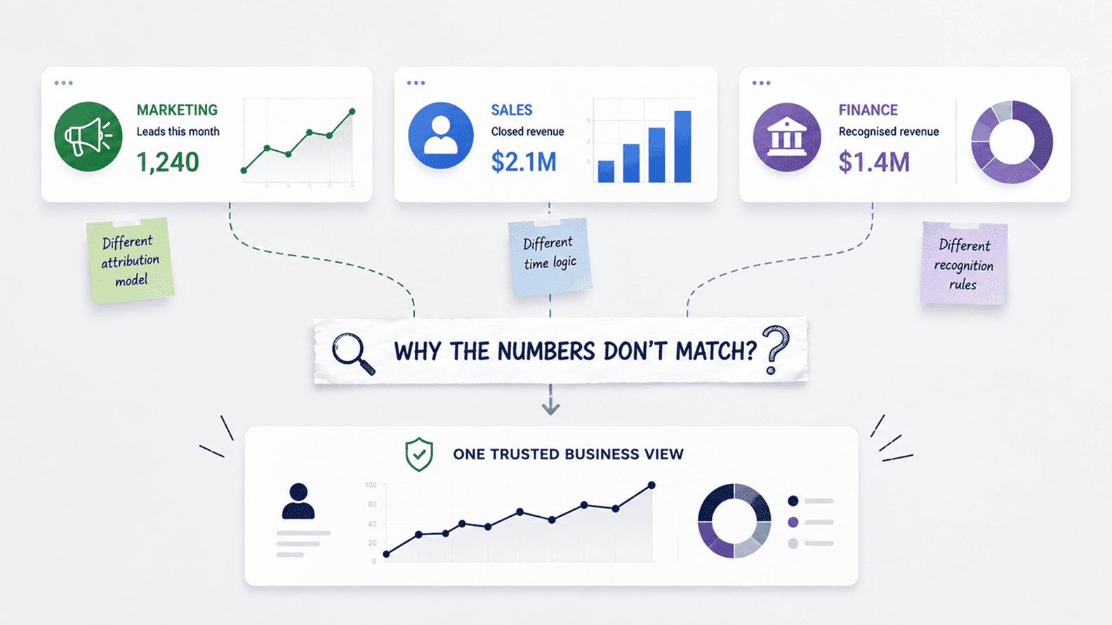
Revenue shows the pattern clearly. Sales may report a strong quarter because closed-won bookings improved. Finance may show a lower number because invoices have not been issued, payment has not arrived, or revenue must be recognized over time.
The CEO sees two dashboards with the same label and different totals. The problem is often described as a data issue, but the deeper issue is language. Booked, billed, collected, and recognized revenue can all be valid. Calling all of them revenue without context turns valid measures into competing stories.
Lead dashboards do the same damage. Marketing may count form submissions. CRM may count new contacts. Sales may count accepted leads. Leadership may care only about qualified pipelines. A campaign dashboard may include raw inquiries, while a sales productivity dashboard removes students, vendors, spam, duplicates, and low-fit accounts. Both can be useful, but they should never appear under the same KPI name without qualification.
Dashboard sprawl and metric drift feed each other. Every report creates another place to change a filter, choose a date field, exclude a status, or rebuild a measure inside the BI tool. Google Cloud has described Looker’s semantic model as a way to define metrics once and use them everywhere for stronger governance, security, and trust. That matters because dashboard confusion is rarely about charts alone. It is about the number of definitions hiding behind familiar labels.
A business does not need a new dashboard for every question. It needs reliable views for recurring decisions and enough flexible space for investigation. A weekly sales review needs an official pipeline dashboard. A monthly finance review needs revenue and margin tied to finance definitions.
A support huddle needs queue and SLA freshness. A campaign review needs lead quality and pipeline contribution, not only traffic and form fills. A leadership meeting needs a compact view of certified KPIs.
Sprawl grows around the edges. Someone duplicates a report and changes the filter. Someone builds a temporary board-deck view. Someone keeps an old dashboard because it has one useful chart. Someone shares an exploratory view in Slack, and six months later a new manager assumes it is current. The workspace becomes a graveyard of old questions and half-finished answers, all still searchable.
For users, abundance becomes a cognitive load. A sales manager searching for a pipeline finds five similar reports. A marketer cannot tell whether to use the campaign dashboard, attribution dashboard, lead dashboard, or executive growth dashboard. People develop social shortcuts: ask Priya which one is current, use the version Rahul shared, ignore the report in the old workspace. That is not a data-driven organization. It is tribal knowledge with charts.
Modern BI platforms recognize this problem. Microsoft explains Power BI endorsement as a way to help users find high-quality content when organizations have large amounts of BI content available for sharing and reuse. Promoted and certified labels exist because users need trust signals when reports multiply. Without them, every dashboard in search results can look like the final answer.
An obviously broken dashboard usually gets attention. A chart fails to load, a number disappears, or a filter returns no records. The defect is visible, so someone raises a ticket. The more dangerous dashboard is the one that still loads after the business logic behind it has expired.
A stale dashboard can keep its title, layout, filters, and KPI labels long after the company has changed. Sales stages may have been redesigned. A CRM migration may have moved fields and altered lifecycle history. An ERP upgrade may have changed invoice or revenue logic. Marketing may have replaced campaign taxonomy. Product may have retired old events. The dashboard still opens, so users assume it still describes the current business.
Old dashboards are easy to discover and hard to contextualize. Search finds them. Old meeting notes link to them. New employees inherit them. Managers copy charts into decks. Someone duplicates an outdated report and builds a new dashboard on stale logic. The old report stops being archive material and becomes a distribution channel for expired assumptions.
A healthy dashboard ecosystem needs lifecycle management. Reports should have owners, review dates, certification status, and retirement rules. Project-specific dashboards should be marked as project-specific. Replaced dashboards should redirect users to the current version. Exploratory reports should not look like leadership reports. Unmaintained reports should be archived. Governance has to cover deletion as seriously as creation.
A dashboard is a promise. It promises that someone will keep the source alive, the metric definition current, the refresh schedule monitored, the filters understandable, the access rules appropriate, and the design usable. When a company creates dashboards faster than it assigns that responsibility, it creates maintenance debt.
The debt stays hidden at first. The report works, users like it, and the analyst moves on. Then a source field changes, a pipeline runs late, a new region is added, a pricing model changes, or a product line launches. The dashboard needs maintenance, but no one owns it clearly enough to act. The report keeps loading while its logic drifts away from the business.
This is the hidden cost of speed. Building a new dashboard is often faster than fixing the reporting system, especially when a meeting is close. But each quick report becomes future complexity. Power BI usage metrics documentation points to a more disciplined habit: review actual usage, identify which report pages are useful, and decide what should be improved or phased out. Usage data turns dashboard cleanup from opinion into evidence.
Leadership dashboards are supposed to simplify the business. They often arrive after every function has already created its own version of the truth. Sales contributes pipeline, marketing contributes leads, finance contributes revenue, product contributes usage, operations contributes capacity, and customer success contributes retention risk. The executive dashboard brings those numbers together into one polished operating view.
The danger is that a polished executive page can make unresolved disagreement look settled. If each KPI uses a different source, date field, refresh cadence, owner, and level of validation, the dashboard is visually unified but logically fragmented. Leaders may read it as one coherent picture of the business when it is actually a collage of departmental assumptions.
The executive dashboard should be the top layer of a governed reporting system, not a shortcut around governance. Before a KPI reaches leadership, the company should know which definition is official, who owns it, which source it uses, how often it refreshes, what it excludes, and whether the number is provisional or final. Fewer leadership metrics with stronger definitions will usually beat a crowded page filled with weak authority.
BI tools make it easy to duplicate reports, create workspaces, connect datasets, share links, and save personal views. Yet the deeper cause is human behavior. People create dashboards when they want control over a question the official reporting system does not answer quickly enough.
A sales manager builds a private pipeline view because the official dashboard does not match how the team reviews deals. Finance keeps its own revenue model because it does not trust CRM logic. Marketing builds a campaign dashboard because the executive view hides channel detail. Operations maintains a spreadsheet because the BI backlog is too slow. Each action is rational locally. Together, they create fragmentation.
Dashboards also become a way to avoid hard alignment. Instead of settling what revenue means for a specific review, teams maintain separate revenue dashboards. Instead of agreeing on qualified lead logic, marketing and sales keep separate funnel views.
Instead of deciding whether customer means account, payer, workspace, or legal entity, each team reports its own count. The dashboard becomes a diplomatic escape route. Everyone keeps their number, and the conflict moves into the meeting.
A mature dashboard environment should not force every team into one universal report. A sales rep needs account-level action. A regional manager needs team performance. A CFO needs reconciled revenue and margin. A marketing manager needs channel quality. A product leader needs cohort behavior. A customer success manager needs renewal risk. One dashboard cannot serve all of these well.
The category of each dashboard should be obvious. Certified dashboards support recurring decisions with approved metrics. Operational dashboards help teams run daily or weekly work. Diagnostic dashboards support investigation.
Exploratory dashboards test early questions. Personal dashboards stay personal. Deprecated dashboards are marked clearly and removed from normal use. Harmful sprawl begins when these categories are invisible and every report looks equally official.
| Dashboard type | Purpose | Governance level |
| Executive dashboard | Certified view of company performance. | Highest governance, approved metrics, named owners. |
| Operational dashboard | Runs daily or weekly team work such as pipeline, tickets, capacity, or campaigns. | Governed metrics, visible freshness, clear audience. |
| Diagnostic dashboard | Investigates segments, exceptions, and causes. | Flexible, but marked as analytical. |
| Exploratory dashboard | Tests a question or new data source. | Low governance, limited sharing, not official. |
| Personal dashboard | User-specific working view. | Private or limited sharing. |
| Deprecated dashboard | Old report kept temporarily for reference. | Marked clearly, redirected or removed. |
The hierarchy protects both speed and trust. Teams can still explore, but users know which reports carry authority when decisions matter.
Most companies cannot fix dashboard sprawl because they do not know what they have. The first useful step is an inventory: dashboard name, owner, audience, source systems, key metrics, certification status, last refresh, last review, usage level, duplicate reports, and retirement recommendation. This work is rarely glamorous, but it quickly shows the true shape of the reporting environment.
The inventory usually exposes a few patterns. Some dashboards are heavily used and deserve certification. Some answer the same question with slightly different logic and should be merged. Some are exploratory views being treated as official reports. Some rely on deprecated sources. Some have no owner. Some have not been viewed in months. Some still influence meetings because the link sits inside a recurring calendar invite.
| Inventory field | What to capture | Why it matters |
| Owner | Business owner and report steward. | Prevents orphaned dashboards. |
| Decision supported | Meeting, workflow, or action. | Separates decision reports from clutter. |
| Source systems | CRM, finance, product, support, warehouse, or semantic model. | Reveals source conflicts. |
| Certification status | Certified, operational, diagnostic, exploratory, personal, or deprecated. | Gives users a trust signal. |
| Usage level | Views, viewers, and last used date. | Shows what to improve, merge, or retire. |
| Retirement recommendation | Keep, certify, merge, archive, delete, or redirect. | Turns cleanup into action. |
A certified dashboard is the report the organization agrees to use for a recurring decision. It uses approved metric definitions, trusted sources, documented filters, visible freshness, named ownership, validation checks, and a review cycle. It does not answer every possible question. It answers its intended question well enough that the business does not restart the trust debate every time the number appears.
Certification should be selective. Leadership reviews, finance reporting, sales forecasting, operations planning, customer reporting, and other high-impact decisions need certified views. Exploratory and diagnostic reports should remain flexible, but they should be labeled so users do not mistake them for official reports.
Once certified dashboards exist, meetings become cleaner. When two numbers disagree, the company can ask which dashboard is certified for that decision. That habit removes a lot of noise because people stop guessing which report the business has agreed to trust.
Sprawl becomes harder to control when every dashboard defines metrics independently. One report calculates revenue using close date, another uses invoice date, a third excludes a different status, and a fourth adds a manual adjustment. Business users see the same KPI label and different numbers.
A semantic layer or governed metrics layer reduces drift by moving core business logic into a shared place. Revenue, churn, customer count, lead conversion, active users, margin, utilization, and retention can be defined once and reused across dashboards. Different teams can still slice and explore, but official metrics inherit the same logic.
A simple reporting chain makes the trust risk visible: source systems create operational data, the warehouse organizes it, the semantic layer defines business meaning, and dashboards present the view. Trust can break at any stage. Dashboard sprawl becomes less dangerous when the most important logic is governed before it reaches the visual layer.
Dashboards do not retire themselves. A reporting environment needs rules because old reports compete for trust long after the original need has passed. A simple rule works: if a dashboard has no owner, no meaningful usage, no current decision, a deprecated source, or a certified replacement, it should be archived, redirected, or deleted.
| Signal | Action |
| No views in 90 days | Review for archive or deletion. |
| No owner | Assign an owner or deprecate. |
| Replaced by certified dashboard | Redirect users and archive the old version. |
| Uses deprecated source | Pause use until updated or remove. |
| Duplicates another dashboard | Merge useful views or retire one version. |
| Built for one-time project | Archive after project close. |
| Metric definition outdated | Remove from decision use until corrected. |
This is trust management, not housekeeping. A company that never deletes dashboards eventually asks users to choose between too many versions of the business.
A dashboard is useful when it shortens the distance between a question and a decision. A team asks what changed, the company has an approved metric, the dashboard shows it with context, users understand the number, and the discussion moves to action. Sprawl lengthens that path. The metric becomes contested, the dashboard becomes one of many, users ask for confirmation, and the decision slows.
The clearest warning sign is the return of manual trust checks. People export data to Excel, ask finance to confirm totals, send screenshots in Slack, rely on last month’s deck, or say, “Use the version Sarah uses.” The company may be surrounded by reports, but the real operating system is still personal memory and manual reconciliation.
Salesforce has linked modern data pressure to the reality of incomplete, outdated, or poor-quality data. Its data and analytics trends discussion argues that leaders are under pressure to create value from data while weak data foundations remain a barrier. Dashboard sprawl fits that pattern closely. The problem is not that leaders want more data. The problem is that reporting expands faster than the trust system behind it.
The real fix is a better dashboard system: inventory first, certification for decision dashboards, semantic discipline for shared metrics, named ownership, usage monitoring, validation records, and retirement rules.
A healthy system makes three things obvious: which dashboard is official, what the metric means, and who owns it. The strongest companies do not win by having the most dashboards. They win by having the fewest arguments over the dashboards that matter.
More dashboards create less clarity when each report uses different sources, definitions, filters, refresh schedules, date logic, or ownership rules. Users then see several versions of the same KPI and spend the meeting asking which number is right instead of deciding what to do.
Dashboard sprawl is the uncontrolled growth of dashboards and reports across a business. It happens when teams build new views faster than they retire old ones, certify official ones, document metrics, or assign owners. The result is a crowded reporting environment with duplicated, stale, or competing versions of important numbers.
Dashboards show different numbers for the same KPI because they may use different source systems, date fields, filters, refresh times, or definitions. Sales may show bookings, finance may show recognized revenue, and billing may show invoices. Each can be valid if labeled properly.
Start with a dashboard inventory, then identify owners, usage, duplicates, sources, certification status, and retirement candidates. Certify the reports used for recurring decisions, merge duplicate dashboards, archive stale ones, and label exploratory work clearly.
A certified dashboard is approved for a specific recurring decision. It uses trusted sources, approved metric definitions, documented filters, visible freshness, named owners, validation checks, and a review cycle. It is the dashboard people should use when the decision matters.
No. Certification should be reserved for dashboards used in leadership reviews, finance reporting, sales management, operations planning, customer reporting, or other high-impact decisions. Exploratory and diagnostic dashboards should remain flexible but clearly labeled.
Old dashboards are dangerous because they can still look valid after the underlying business logic has changed. CRM fields, sales stages, finance rules, product events, or campaign taxonomy may move on while the old report continues to load and influence decisions.
A semantic layer reduces confusion by centralizing metric definitions. Instead of rebuilding revenue, churn, conversion, active users, or margin in every dashboard, the company defines them once and reuses them across reports.
A dashboard inventory should include name, owner, audience, business purpose, source systems, key metrics, certification status, refresh schedule, last review date, usage level, duplicate reports, limitations, and retirement recommendation.
Govern the full dashboard lifecycle. Every important dashboard should have a purpose, owner, audience, source, metric definition, refresh rule, certification status, and review date. Old reports should be retired when they lose usage, ownership, source validity, or decision relevance.
Aug 04, 2026 / 27 min read
Aug 04, 2026 / 22 min read
Jul 31, 2026 / 24 min read