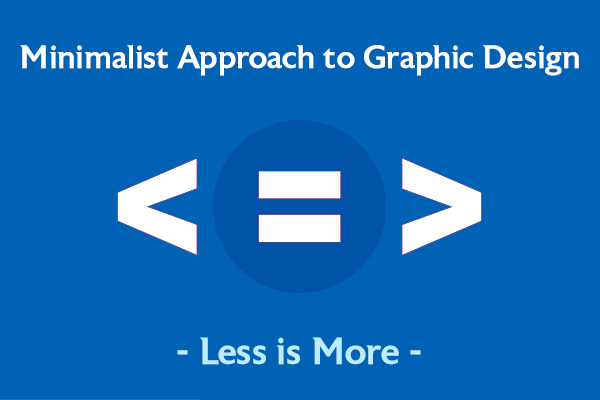
Less Is More, or How Minimalism Changed Graphic Design
We often equate the word minimal with simple. Minimalism, ironically, is complicated to explain. Often thrown around nonchalantly for art and design blogs, the concept of minimalism means different things to different people.
Minimalism, as a movement, began in revolt against the dominance of abstract expressionism. Minimalist design, as we know it today, came to life in the late 1960s to the early 1970s in the American visual art. Later on, it influenced the different forms of art and design, including fine arts, graphic design, fashion, architecture, and interior design.
Minimalism, at its heart, is intended to be purely functional. It reduces the basic design to its finest form, devoid of embellishments and unnecessary decorations.
Minimalist graphic design is focused on the “less is more” philosophy. It may sound like a cliché, but in reality, it is the quintessence of the minimalist school of graphic design.
Did You Know? The dictum, Less is More, was coined by the famous designer and architect Mies van der Rohe, one of the founders of modern architecture and a proponent of the simplicity of style.
Mastering the Art of Minimalist Graphic Design – Say More by Showing Less
Minimalism is all around us. Crisp. Clean. Timeless.
Even if you think you don’t exactly know what minimalist design involves, you must have seen it around. From the stunning minimal user interfaces of Twitter, Instagram, and Pinterest to minimalist packaging and printed products like Puma Fragrance and Waitrose Herbs, there are many impressive and successful minimalistic designs. Fans of the modern minimalist graphic design tend to believe that a message is best delivered when a design is concise!
Minimalism is about designing smarter. It focuses on function over visual cues. Characterized by simplicity and objectivity, minimalist graphic design is creating something where every detail/element of your composition serves a purpose, and if it’s not, then it shouldn’t be a part of the design.
When you master the art of minimalism, you master minimal designing.
“Perfection is achieved, not when there is nothing more to add, but when there is nothing left to take away.”
— Antoine de Saint-Exupery
Modern minimalist graphic design ideas have been widely embraced as the standard choice by startups and most well-known brands. Their profound interest in clean, elegant websites, classy social media feeds, and simple & effective UI/UX interface confirms minimalism is one trend that is here to stay.
Principles of Mastering Minimalism in Graphic Design
A minimal design works on the “bend until just before it breaks” rule, wherein the designer strips elements away from a piece, one by one, until the design becomes unworkable. This approach also helps to highlight what elements are absolutely necessary to the functioning of a design.
Taking away the “fluff” from a design, minimalism effectively communicates your message. It promotes clarity and understanding with higher user engagement.
Let’s discuss some of the guiding principles behind minimalist graphic design.
Simplicity works best
Simplicity has proven to be a trend that never goes out of style. Include just enough to get the message across so that users get curious to know more—this makes minimalism attractive for brands and consumers alike.
When you keep things simple, you are able to direct the viewer’s attention to the main element, conveying the exact idea behind the graphic. Do away with graphical elements that may distract the viewer, create clutter, or affect both usability and readability. Streamline your design using one (at most two) fonts, a relaxed color palette, and no unnecessary imagery or content on the page.
Say no to design tricks, which may include extra details you would add to pump up (read clutter) a graphic design. It could be crazy typefaces, image frames, textures, drop shadows, and more. The more you focus on plain fonts, color, and content, the more you get closer to minimalist graphics design.
Keep things balanced
Visual harmony is the key to a good design. In website design, it corresponds to the right balance of colors, shapes, and negative spaces, which should be evenly distributed throughout the layout.
With fewer graphic elements, it’s also easy to see the imbalance, especially when your design uses a lot of white space to draw more attention to specific elements.
To achieve balance in design, graphic designers mostly use grid layouts to ensure alignment and control the positions of all vital elements. The consistency in spacing and grouping upholds the spatial relationships and establishes visual harmony.
Appreciate neutrality
Minimalism prescribes the use of relaxed and short color palettes that work well together to pop out and arouse interest. Pick colors that complement the message and mood of your website, and highlight key elements in the design. The use of a few distinct lighter and more neutral colors can also help preserve a distinct visual identity.
Minimalist graphic designers can apply strokes of vibrant colors with a thought-out use of contrast. The black and white color palette is popular, although that isn’t the only option. You can also use monochrome, neutral, or even vivid color palettes as long as the rest of the design doesn’t feel too overwhelming to the eyes.
Be very selective with your fonts. Instead of distracting or bizarre font choices, stick to a single font that is clean and legible yet aesthetically pleasing.
Judicious use of negative space
Although negative space is just the white empty space in between visual elements, it is one of the most vital points of interest in minimalistic graphic design. And in this context, negative space is a positive.
Copious use of white or negative space can help draw viewer’s attention to the most important elements and makes the focal point of the content more crisp and intense with no distracting extras. Negative space often centers on a single image and minimal words, or a single message with an appealing typeface.
What’s important is not to remove so much that users have to unnecessarily search for the most important features they have come for—because that would defeat the purpose of your minimalist design altogether.
Negative space is often also called white space; it need not be always white. Several websites use full-color backgrounds to invigorate an empty space.
Once you master the fundamentals of minimalism, you can add meaningful aesthetics later. Only when the basics are executed right, including ornamentation can save a design.
Why Minimalist Style Graphic Design Is Taking Over?
The answer is simple. It is in vogue because it works so well for so many design projects. The focus on space, simplicity, and beautiful typography is refreshing.
Without the embellishments or even lack of some color palettes or peculiar typefaces, a design is never boring. Some of the most stunning and functional websites use minimal style graphic designing. It is classic and classy.
When a visitor lands on a minimalist design site, all the attention is on the content. The site prioritizes the bare necessities, making it easier for users to consume the content—one of the main objectives of a good design. Simple layouts, lots of spacing, and well-organized grid systems make the minimalist design trend so ubiquitous.
Furthermore, minimalist style graphic design is fast. With fewer elements, it helps speed up page loading times, which enhances user experience and SEO. Minimalist design also helps graphic designers achieve better compatibility across different devices, which means an extended reach of the target audience.
But what makes a non-minimalist (read complex) design less effective? A complex design can be visually exhausting as it won’t let your eyes settle on the important elements, because nothing stands out. Also, when you try to focus on too many things at the same time, you tend to lose focus and clarity of thought, making the design less persuasive. Simpler designs, on the other hand, encapsulate more than what they show.
Less is still more. Remember that.
Final Thoughts
The minimalism trend in graphic design will never get old. It will continue to evolve and change as design preferences always do, but the basics will remain the same.
Of course, creating great quality minimalist designs takes a lot of practice. You want your typography, imagery, colors, and other elements to come together effectively. No element in the design should needlessly compete with the other. So, when you are designing, give careful attention to the fundamental principles of minimalist design. Stop and ask yourself, “Is this element necessary? Am I using my negative space in the best way? Is the visual & typography conveying the right mood of the message?”
Are you looking to utilize the power of minimalist graphics to boost your business? Confused about how simple you can go without looking bald? Minimalist graphic design has a lot of benefits. If you are looking to take graphic and visual designing off your plate, you can hire dedicated graphics designer in India from a well-reputed graphic design company. The company would understand graphic designing to its core and can mix and match styles to get a simple graphic design that your customers love and meets your design project goals.